On this week's episode of The MacRumors Show, we talk through how the global memory shortage is forcing Apple's hand across multiple key products, killing configurations, delaying launches, and prompting spec decisions that would have seemed unlikely a year ago.
The pressure originates outside Apple's control. JPMorgan analysis cited by the
Financial Times found that memory could account for as much as
45% of an iPhone's component costs by 2027, up from around 10% today. Companies like Nvidia are reportedly outbidding consumer electronics makers for limited DRAM supply from Samsung, SK Hynix, and Micron, while cloud firms are locking in capacity with multi-billion-dollar upfront commitments. Apple, which buys memory for roughly 250 million iPhones per year, has shifted from a position where it could dictate terms to one where it must compete for supply, and component prices are being driven up as a result.
The consequences are already visible in the Mac lineup. Apple last week removed the Mac mini's 256GB storage option, pushing its starting price from $599 to $799. Days later, it eliminated Mac mini models with 32GB and 64GB of RAM and stripped the M3 Ultra Mac Studio to a single 96GB configuration, with delivery estimates for remaining Studio models at 9 to 10 weeks. The Mac Studio had already lost its 512GB memory option in March, and multiple configurations became entirely unavailable in April. On Apple's April 30 earnings call, CEO Tim Cook acknowledged that both machines would be "hard to get for months to come" and said Apple expects "significantly higher memory costs" in the current quarter.
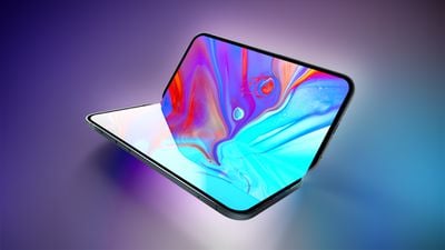
The MacBook Neo was sold out through April and Cook described demand on the earnings call as "off the charts." The MacBook Neo uses binned A18 Pro chips, adopting manufacturing rejects from the iPhone 16 lineup with one GPU core disabled, repurposed rather than discarded to keep costs low enough to hit the $599 price point.
Apple's initial production target is believed to be about five to six million units, but demand has since pushed the company to instruct suppliers to prepare for at least 10 million. TSMC's N3E production lines, where the A18 Pro was made, are now running at maximum capacity, with AI-related orders consuming much of the available output. A fresh manufacturing run for the A18 Pro would yield fully functional chips rather than defective ones, raising the per-unit cost before any expedited manufacturing premium is applied.
Apple is now said to be weighing up its options for the MacBook Neo. The company is purportedly considering cutting the 256GB entry-level model, which would push the effective starting price up by $100 without changing any existing configuration's price, the same mechanism used with the Mac mini. Separately, Apple may be considering new color options to soften any price increase.
Upcoming products are apparently being reshaped too. Weibo leaker "Fixed Focus Digital" has claimed in a series of posts that the standard iPhone 18 is being downgraded as a cost-cutting measure, with both display and chip specifications affected. Most recently, the leaker said certain parts are interchangeable between the iPhone 18 and the lower-cost iPhone 18e. For context, iPhone 17 and iPhone 17e differ meaningfully: the standard model has a larger ProMotion display, Dynamic Island, Ultra Wide camera, five-core GPU, and significantly better battery life, but it looks like there could be fewer differences with the next generation.
A follow-up post framed the new split launch strategy, under which the iPhone 18 ships in spring 2027 rather than alongside the Pro models in the fall, as a deliberate commercial mechanism to smooth out demand. By extending the iPhone 17's flagship run, Apple is also said to be creating conditions under which a lower-specced successor will be more palatable. The split launch itself has been widely reported since last year, with Ming-Chi Kuo and Nikkei among those to have corroborated it.
The launch of the rumored all-new high-end MacBook Pro or "MacBook Ultra" with an OLED display and touchscreen has also apparently slipped. Bloomberg's Mark Gurman has said early 2027 is now looking more likely than late 2026 due to Apple's constrained memory supply.
The MacRumors Show has its own YouTube channel, so make sure you're subscribed to keep up with new episodes and clips.
You can also listen to The MacRumors Show on Apple Podcasts, Spotify, Overcast, or other podcast apps. You can also copy our RSS feed directly into your player.
If you haven't already listened to the previous episode of The MacRumors Show, catch up to hear our answers to your listener questions about the future of Apple's product lineup, the software and services shaping the ecosystem, and our own personal histories with the company and its devices.
Subscribe to The MacRumors Show for new episodes every week, where we discuss some of the topical news breaking here on MacRumors, often joined by interesting guests such as Kayci Lacob, Kevin Nether, John Gruber, Mark Gurman, Jon Prosser, Luke Miani, Matthew Cassinelli, Brian Tong, Quinn Nelson, Jared Nelson, Eli Hodapp, Mike Bell, Sara Dietschy, iJustine, Jon Rettinger, Andru Edwards, Arnold Kim, Ben Sullins, Marcus Kane, Christopher Lawley, Frank McShan, David Lewis, Tyler Stalman, Sam Kohl, Federico Viticci, Thomas Frank, Jonathan Morrison, Ross Young, Ian Zelbo, and Rene Ritchie.
The MacRumors Show is on X @MacRumorsShow, so be sure to give us a follow to keep up with the podcast. You can also email us at podcast@macrumors.com or head over to The MacRumors Show forum thread. Remember to rate and review the podcast, and let us know what subjects and guests you would like to see in the future.


 Note: MacRumors is an affiliate partner with some of these vendors. When you click a link and make a purchase, we may receive a small payment, which helps us keep the site running.