 Most popular websites these days come in both desktop and mobile versions, with the latter rendering content in a more responsive fashion for a consistent browsing experience across a variety of tablet and smartphone screens.
Mobile-friendly websites are often stripped down and streamlined for easier navigation, with the result that some full-page content isn't displayed at all – and even when it is, finding that content can sometimes be a chore, especially if you're used to the desktop version of a site.
Recognizing this, Apple has had the foresight to let you bypass mobile versions of websites and view original desktop versions on its mobile devices instead. To request a desktop site on your iPhone and iPad, simply follow these steps.
- Launch Safari on your iOS device and navigate to the website in question.
- Long press the Reload button in the far right of the address bar.
- On iPhone, tap Request Desktop Site at the bottom of the screen. On iPad, the same option appears in the dropdown menu below the Reload button.
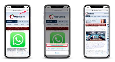
Note that you can also access this option by tapping the Share button (the square with an arrow pointing out) and selecting Request Desktop Site from the third row of the Share Sheet.
With that done, Safari should remember your preference for that particular website and load the desktop version the next time you visit it.


Top Rated Comments
Although, my preference is usually using the mobile site on my iPad or iPhone to be more streamlined and condensed.