Skip to Content

Apple Explored These Notch and Dynamic Island Designs for iPhones

With the iPhone 14 Pro models in 2022, Apple introduced the Dynamic Island, which can morph and expand to display system alerts, sports scores, and a variety of other information. The feature makes the space surrounding the front camera and Face ID sensors useful compared to the notch on older iPhone models.

iPhone Notch
Apple explored a variety of ideas for the iPhone's notch area over the years before arriving at the current Dynamic Island design, according to information obtained by MacRumors. We recreated the images below based on our source material to provide a never-before-seen look at some of the concepts that Apple considered.

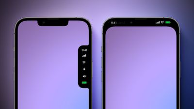
Before the Dynamic Island, Apple explored a popover menu on the right side of the screen that would have provided users with quick access to the time, cellular signal and Wi-Fi strength, display brightness, volume, and battery charge level. The menu essentially looks like a second notch, and it would disappear when not in use.

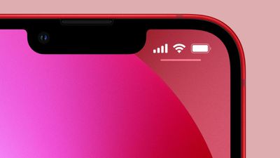
Another idea that Apple considered was hiding the notch with an all-black status bar area at the top of the screen. OLED displays show the color black by turning off individual pixels, so this design would have contributed to battery life savings.

Alternate Notch Design Mock Feature
Apple later came up with the idea of the Dynamic Island, and it explored a variety of different designs for this, as pictured below.

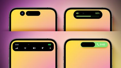
Apple initially made the Dynamic Island permanently elongated across the top of the screen, before deciding that it would be less intrusive if it changed size as necessary. Apple also considered showing volume and a full row of system shortcuts in the Dynamic Island, tested a never-used layout for ongoing phone calls, and more.

Alternate Dynamic Island Design Mock Feature
Apple has since expanded the Dynamic Island to all iPhone 15 models, while it continues to sell the iPhone 13, iPhone 14, and iPhone 14 Plus with a notch. Rumors suggest that Apple eventually plans to move the iPhone's front camera and Face ID sensors under the display, but this transition is not expected to begin until next year at the earliest.

Popular Stories

Apple Event Logo

Apple Released Seven New Products Today

Wednesday March 11, 2026 7:05 am PDT by
Starting today, the seven new Apple products that were announced last week are available at Apple Stores and beginning to arrive to customers. The colorful MacBook Neo and all of the other new products are on display at most Apple Store locations around the world starting today. Apple Stores have inventory of the new products for both walk-in customers and Apple Store pickup, but...
iOS 27 Mock Quick

10+ New Features Coming in iOS 27

Friday March 13, 2026 2:13 pm PDT by
We're only three months away from Apple's WWDC 2026 event, which will see the company unveil iOS 27. With the fully revamped version of Siri possibly delayed until September, iOS 27 is shaping up to be the update we wanted iOS 26 to be. There will be new Apple Intelligence features, updates for the iPhone Fold, and more, with the latest rumors summarized below. Foldable iPhone Features...
Apple 50 Years of Thinking Different

Apple Announces 50th Anniversary Plans

Thursday March 12, 2026 6:10 am PDT by
Apple today announced that it will celebrate the company's 50th anniversary over the coming weeks, but it has yet to reveal any specific plans. Apple was founded on April 1, 1976, so the company will turn 50 on April 1, 2026. "While Apple is known for looking forward, this milestone offers a special moment to reflect on the journey that has brought the company here, to celebrate the...

Top Rated Comments

27 months ago

Who ever does Apple‘s software design esthetic needs to be fired for coming up with those option…🤮
I don't think you have any idea how prototyping software and hardware works. It's those options that make you come up with the final, perfect design.
Score: 53 Votes (Like | Disagree)
erikkfi Avatar
27 months ago
I know it means less screen real estate, but I much prefer the right-side purple one. Yes, I've "gotten used to it," but the notch is still a design crime.
Score: 35 Votes (Like | Disagree)
Mescagnus Avatar
27 months ago

Man hiding the notch with an all-black status bar area at the top of the screen was the best option.
I thought that looked like the display of a cheap android phone...
Score: 30 Votes (Like | Disagree)
Mescagnus Avatar
27 months ago
Apple definitely decided on the best implementation: a Dynamic Island that resizes to its content.
Score: 25 Votes (Like | Disagree)
dmk1974 Avatar
27 months ago
Personally, I think expanding the notch would have been the winner (without the radii). Close to the rounded one near the top of the original post.


Attachment Image
Score: 22 Votes (Like | Disagree)
Iconoclysm Avatar
27 months ago

I think in 10 years we will look back at the notch and really say WTF..

It's truly ugly but we just dealt with it because Apple can do no wrong.
How about we dealt with it because of function over form?
Score: 22 Votes (Like | Disagree)