Apple today announced that macOS Ventura will be available on Monday, October 24, the same day that iPadOS 16.1 will be available to iPad customers.
macOS Ventura is a notable update for the Mac, bringing new features such as Stage Manager, a new Clock and Weather app, and updates to core system apps like Messages and Safari. System Settings, previously known as System Preferences, has also been completely redesigned to make it more in line with the design on iOS and iPadOS. For a full breakdown of everything new in macOS Ventura, see our roundup.
Apple today released a new Pride Edition Sport Loop for the Apple Watch. The band features a rainbow design with 11 colors of woven nylon yarns.
The new Pride Edition Sport Loop is available to order now on Apple.com and in the Apple Store app in 40mm, 42mm, and 46mm sizes, and it will be available at Apple Store locations starting later this week. In the U.S., the band costs $49.
There...
Instagram will remove end-to-end encryption for direct messages between users from May 8, 2026. When the date comes around, Meta will potentially be able to see the contents of all messages between users on the social media platform.
Encrypting messages has been an optional feature in Instagram since 2023, but in March of this year the social media platform quietly updated a help page to say ...
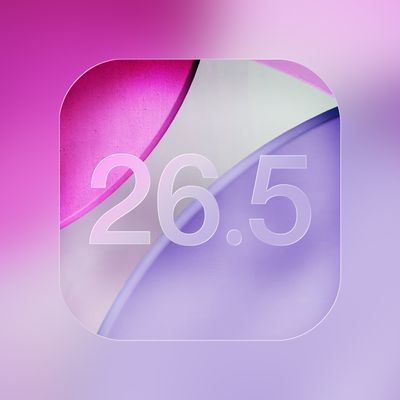
iOS 26.5 includes three new features for iPhones, according to Apple's release notes for the update, which is expected to be released next week.
As discovered during beta testing, iOS 26.5 enables end-to-end encryption for RCS messaging between iOS and Android devices. Apple says this security upgrade is limited to supported carriers around the world and will continue to roll out....
I wish they would add *BACK* a freaking hint of contrast in apps like Mail so the folders bar, commands up top, emails/folder summary, and email preview didn’t all blend together in a complete white-out!
Edit: I added *BACK* because the OS interface for Mail (and other native apps) used to be quite attractive *and* intuitive with how it was laid out before Mac OS was “improved” to the minimalist white-out it is today.
Edit #2: I’ve been experimenting since day 1 with increase contrast and other adjustments Apple condescendingly and dismissively hides under “Accessibility.” Not enough improvement/change back to similar to how it was before. Those settings belong under a section titled “Common Sense and Intuitive User Interface Element Options” and not “Accessibility.”
I wish they would add a freaking hint of contrast in apps like Mail so the folders bar, commands up top, emails/folder summary, and email preview didn’t all blend together in a complete white-out!