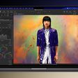
Following today's release of macOS Big Sur, Apple has updated a number of its apps to support the new operating system version and upcoming Apple Silicon Macs.
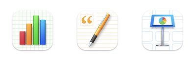
Apple's suite of iWork apps is among the updates, with Pages, Numbers, and Keynotes all sporting refreshed icons and a "refined new design on macOS Big Sur." Stability and performance improvements are also included. Alongside the updates on the Mac side, the iWork apps for iOS have seen minor updates for stability and performance improvements.
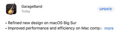
GarageBand for Mac has also been updated with a new icon and refreshed macOS Big Sur design, among other improvements and additions.
- Refined new design on macOS Big Sur - Improved performance and efficiency on Mac computers with Apple silicon - Allows customisation of region colours in your tracks - Adds 1,800 Apple Loops in a variety of genres including Hip-Hop, Chill Rap, Future Bass, New Disco, Bass House and more - Adds over 190 instrument patches and 50 vintage and modern drum kits
Alongside GarageBand and the iWork apps, Apple updated its iMovie app for Mac with Apple Silicon support. No other new features are included.
Monday October 19, 2026 9:37 am PDT by Joe Rossignol
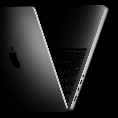
Apple today sent out invites for an experience in Los Angeles on Wednesday, October 28, and the "Pro and tell" tagline on the invitation likely means that the rumored MacBook models with touch-enabled OLED displays will stick with MacBook Pro branding instead of the once-rumored "MacBook Ultra" name.
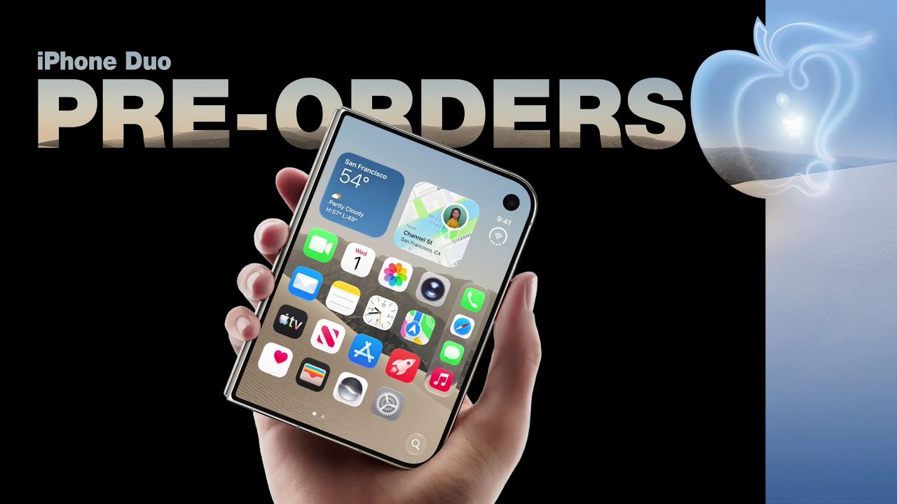
The long-rumored "iPhone Ultra" ended up being named iPhone Duo, so speculation that Apple...
Tuesday October 20, 2026 11:12 am PDT by Juli Clover
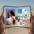
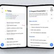
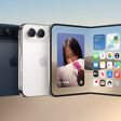
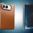
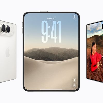
With just three days to go until the iPhone Duo is released, Apple is getting ready for the launch. Behind the scenes, the App Store now has screenshots of Apple's built-in apps running on the Duo. We've seen some apps in marketing materials, but images of the ones we haven't seen give us an idea of what it will be like using the iPhone Duo day to day.
Many apps are shown in landscape...
Monday October 19, 2026 9:05 am PDT by Juli Clover
Apple's Greg Joswiak today hinted at new product announcements coming next week, sharing a social media post that says "Can't wait to pro and tell next week."
Rumors suggest Apple is planning to debut the new MacBook Pro with an OLED touchscreen display, an M6 entry-level MacBook Pro, an M6 iMac, an iPad mini with an OLED display.
Can't wait to pro and tell next week....
There is nothing wrong with the icons. In fact, they are the same icons, just morphed into looking like iOS icons. That’s the part I don’t like, the uniqueness of macOS has been reduced and consumed into the universe of its mobile offspring. I missed the stand out uniqueness of photo realistic icons. It’s really what made OS X attractive. Seeing a representation of true life on screen.
Apple now considers that redundant and I believe it was Jony Ive who promoted this when explaining the abstract look of icons iOS 7 such as Game Center. Icons should hint what they do and at least with these three, you have an idea,
- the charts and cells in the background suggest this has something to do with numbers.
- the pen, quotation symbol and lines suggest this is a tool for writing.
- the podium and what looks like screens it slides is a program for preparing presentations.
I still do miss the unique icons from the old days though. The Adobe Photoshop 7 eye, the Quark Xpress lotus flower, the picture of the child at the beach in preview.
Apple do this in sake of Big Sur and all iOS interface unification. Previously I can easily recognize software icon because of distinctive shape, but with all boxy icon it takes more times for my eyes scanning what picture inside that box.
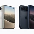
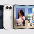
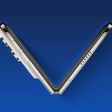
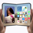
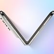
Apple's first foldable iPhone, with a book-style design featuring a 5.4-inch outer display and a 7.6-inch inner display with a minimal crease down the middle.




/https://forums.macrumors.com/attachments/1662674/)
/https://forums.macrumors.com/attachments/1662675/)


/https://forums.macrumors.com/attachments/1663179/)