'iPhone X' Split Status Bar Leak Shows Off Animated Battery Icon and Screen Recording Indicator

Amid the leaked release of the golden master of iOS 11 last night, developers Steve Troughton-Smith and Guilherme Rambo shared a few interesting tidbits about how the split status bar on the OLED "iPhone X" will work (via 9to5Mac). Falling in line with previous rumors, the iPhone X's status bar will show the time of day on the left of the "notch" and cellular signal strength, Wi-Fi, and battery will be located on the right.

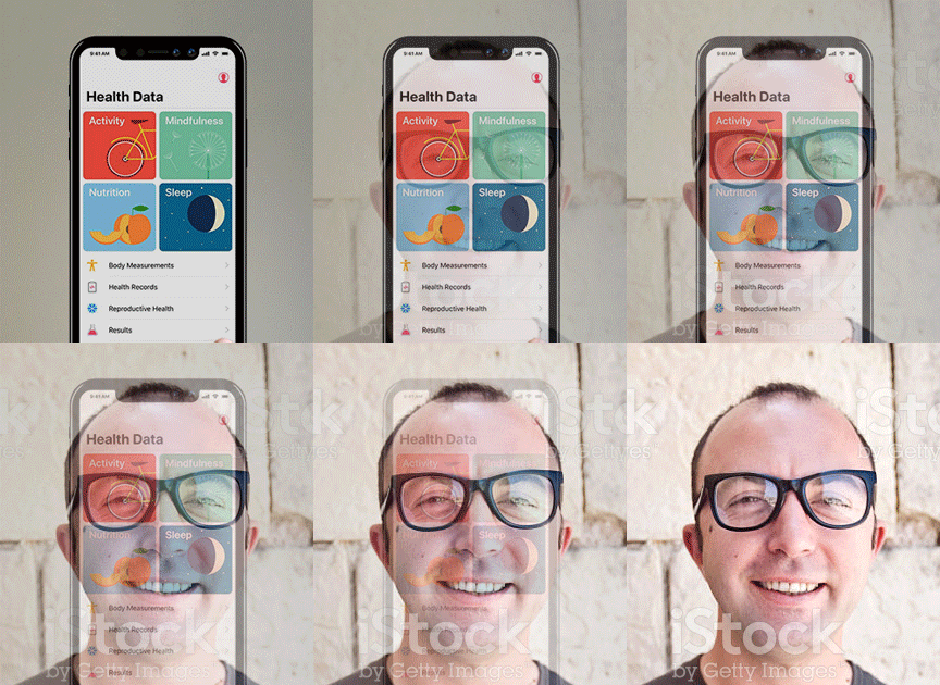
These "ears" of the iPhone X will also be animated in a few ways -- when you plug the device into a power source to charge it, the battery icon grows slightly larger (lower right image) to indicate a successful connection and then minimizes back to its original size. Rambo shared a video of this animated icon in action on his Twitter account.

iphone x status bar 2


There's also a new method to indicate when screen recording is on or when you're taking a phone call. On the iPhone X, the time on the left side of the notch will be highlighted in red for when screen recording is on, or green to indicate that you're in a call but outside of the Phone app. This will replace the current "double height" indicator bar on iOS 10 that pushes down the status bar and displays messages to remind you about apps running in the background.

iPhone X status bar
The breadcrumb trail icon is also staying on the iPhone X, but now it'll reside just below the time, linking you back to the most recently used app with one tap.

iphone x status bar 3
Troughton-Smith theorized that the small dot on the right side of the status bar might indicate "pages" for the right ear that you could tab through by tapping that area of the iPhone X. Further digging led the developer to change his theory to describe the dot as some kind of "network activity indicator," because it pulsates from time to time and vanishes in Airplane Mode.

This theory was further corroborated in a separate video shared by Guilherme Rambo, where the dot in this area of the status bar moved back and forth whenever a piece of media began loading on the smartphone. It's also worth noting that the location services indicator arrow is now sitting to the right of the time.

The iOS 11 GM has leaked just three days ahead of Apple's September 12 media event, where the company will officially announce what is now expected to be called the iPhone X, iPhone 8, iPhone 8 Plus, third-generation Apple Watch, and more.

Related Forums: iOS 11, iPhone

Top Rated Comments

WilliamG Avatar
75 months ago
I love these changes, and embrace the notch. It’s brilliant, really. It gives you the ability to have those notifications and clock etc while simultaneously not eating into the full horizontal screen-only real estate below.

This is such a smart choice I can’t see how anyone is annoyed by it. You lose so much space on the Galaxy S8 etc because Samsung didn’t design theirs as well as Apple.

It seems like the haters here would prefer to have less screen size and have no notch, but the status bar below the sensors. Madness.
Score: 59 Votes (Like | Disagree)
foobarbaz Avatar
75 months ago
Goodbye carrier name! Finally. As if I constantly need to be told what network I’m on… What a waste of space.
Score: 34 Votes (Like | Disagree)
AngerDanger Avatar
75 months ago
So it's official: iOS 11 will embrace the iPhone X's receding hairline.


It seems like the haters here would prefer to have less screen size and have no notch, but the status bar below the sensors. Madness.
Actually, we'd prefer it if the software made this nice hardware more seamless by putting a black bar beneath the status bar icons. It's quite simple and in no way mad.
Score: 32 Votes (Like | Disagree)
shplock Avatar
75 months ago
This is absolutely terrible design. Let's hope it isn't the real deal..
This is absolutely brilliant design, so let's hope it is the real thing
Score: 28 Votes (Like | Disagree)
Hustler1337 Avatar
75 months ago
This has confirmed that I don't want the iPhone 8, I can't ignore the notch. The UI elements look so out of place :eek:
I have a hard time believing Jony Ive could have thought that the notch looks beautiful, especially for an anniversary edition iPhone and how Federighi could have thought it looks great in terms of the UI side.

Edit: If I see Ive explaining his notch inspiration at the keynote, I think I might actually puke.

Score: 23 Votes (Like | Disagree)
iapplelove Avatar
75 months ago
I love that everyone hates it..

More for meee!!!
Score: 23 Votes (Like | Disagree)

Popular Stories

Google Assistant

Google I/O 2016: Assistant, Home, Allo, Duo, Android N, and More

Wednesday May 18, 2016 11:51 am PDT by
Google hosted its annual I/O developers keynote at the Shoreline Amphitheatre in Mountain View, California today, announcing multiple new products and services related to Android, search, messaging, home automation, and more. Google Assistant Google Assistant is described as a "conversational assistant" that builds upon Google Now based on two-way dialog. The tool can be used, for example,...