Apple Releases macOS Big Sur Safari 15.1 Beta With Relocated Favorites Bar
Apple today seeded a new beta of Safari 15.1 for macOS Big Sur and macOS Catalina, allowing developers to test the new Safari update ahead of its launch. Safari 15.1 is also the version of Safari that's available in the macOS Monterey beta.
In yesterday's macOS Monterey release, Apple tweaked the design of the Favorites bar, moving it back up above the Tab bar where it was before Safari changes were implemented with the macOS Monterey update and the Safari 15 release. Safari 15.1 includes the same tweak to the Favorites bar.
Apple in macOS Monterey overhauled the look of Safari, debuting a new tab design that has proven to be unpopular with users. Apple has been refining the Safari design since then, and the changes coming in Monterey were made available to macOS Big Sur and macOS Catalina users with the launch of Safari 15.
Registered developers can download the Safari 15.1 beta by logging in and then navigating to the More Downloads section. The latest versions of macOS Big Sur or macOS Catalina are required to install the beta.
Popular Stories
macOS 27 will have a "slight redesign" compared to macOS Tahoe, according to the latest word from Bloomberg's Mark Gurman.
In his Power On newsletter today, Gurman said the design changes will help to improve the readability of macOS Tahoe's Liquid Glass interface:If you've used Tahoe, you're likely familiar with some of the quirks — particularly the transparency effects and shadows that...
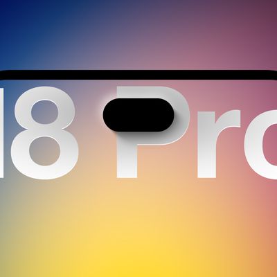
We're only four months out from the launch of Apple's premium next-generation smartphone lineup, and while we're not expecting a sea change in terms of functionality, there are still several enhancements rumored to be coming to the iPhone 18 Pro and iPhone 18 Pro Max.
One thing worth noting is that Apple is reportedly planning a major change to its iPhone release cycle this year, adopting a...
Apple released iOS 26.5 after a few months of beta testing, and while it doesn't have the Siri features we were hoping for since those are being held until iOS 27, there are a handful of useful changes worth knowing about.
Subscribe to the MacRumors YouTube channel for more videos.
End-to-End Encryption for RCS
Support for end-to-end encryption (E2EE) for RCS messages between iPhone and...