Apple Reverses iOS 15 Safari Changes With New Toggle for Top Address Bar

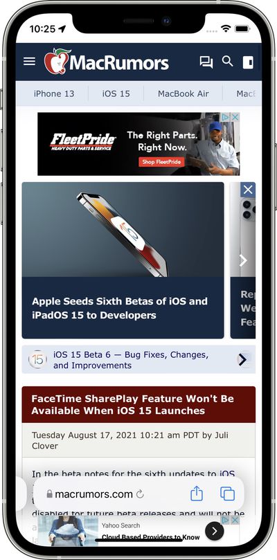
Apple in iOS 15 introduced a new Safari experience that moves the URL bar and tab interface to the bottom of the iPhone, a decision that has been controversial with ‌iPhone‌ users.

iOS 15 Beta 6 Safari Address Bar Feature 2

Safari options in iOS 15 beta 6

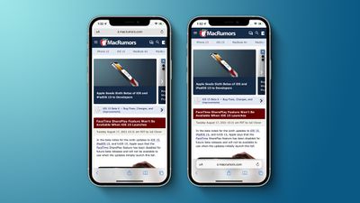
Throughout the beta testing period, Apple has been tweaking the design of the Safari browser on the ‌iPhone‌ and in beta 6, there are further refinements. The bottom tab bar has been redesigned to appear below page content, and Apple has also added a toggle to show the address bar at the top of the ‌iPhone‌ rather than the bottom.

original safari design ios 15

The original design in iOS 15 beta 5

The addition of a toggle to show the address bar at the top of the Safari interface returns Safari to a more iOS 14-like experience, walking back many of the iOS 15 changes.

full safari changes ios 15 b 6
With the bottom view option toggled on, Safari offers a dedicated toolbar with buttons at the bottom of the interface, which is also an improvement over the prior floating design.

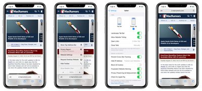
Apple has also introduced new setting options to remove the website tinting and to enable a Tab Bar while in landscape mode. There was previously a "Show Color in Tab Bar" accessibility setting, which appears to be the same as the new "Allow Website Tinting" toggle.

Apple previously added similar toggles in iPadOS 15 and macOS Monterey to offer either a separate tab bar (which was the original default when the betas launched) or a merged tab bar, which is more similar to the previous design.

Related Forum: iOS 15

Top Rated Comments

zv470 Avatar
24 months ago
It took me a while to reprogram 11 years of muscle memory... but now I actually prefer the bottom address bar.
Score: 46 Votes (Like | Disagree)
kuwxman Avatar
24 months ago
Thank goodness.
Score: 35 Votes (Like | Disagree)
MacDevil7334 Avatar
24 months ago
* Moving the address bar to the bottom: smart
* Offering people a choice of top or bottom: smarter
* Trying to cram every control into a single address bar with tiny touch targets: really dumb


Glad to see Apple reverse course on that last design blunder.
Score: 27 Votes (Like | Disagree)
Villarrealadrian Avatar
24 months ago
Thank You! You are starting to listen!
Score: 26 Votes (Like | Disagree)
midkay Avatar
24 months ago
Oh dang, that might be the best possible outcome. They just fixed a lot of issues with that new design of the bottom UI, plus made it optional.
Score: 25 Votes (Like | Disagree)
jk1221 Avatar
24 months ago
Wow, shocker. Easy solution: give the user the choice. Who woulda thunk it!

And fixed the stupid floating bar issue lacking buttons.
Score: 18 Votes (Like | Disagree)

Popular Stories

gradiente iphone white

Brazilian Electronics Company Revives Long-Running iPhone Trademark Dispute

Tuesday May 19, 2020 1:06 pm PDT by
Apple has been involved in a long-running iPhone trademark dispute in Brazil, which was revived today by IGB Electronica, a Brazilian consumer electronics company that originally registered the "iPhone" name in 2000. IGB Electronica fought a multi-year battle with Apple in an attempt to get exclusive rights to the "iPhone" trademark, but ultimately lost, and now the case has been brought to...