Facebook to Remove 'Classic' Web Design Option Next Month
Facebook's "classic" web interface is set to become obsolete in September, according to a Facebook support page spotted by Engadget.
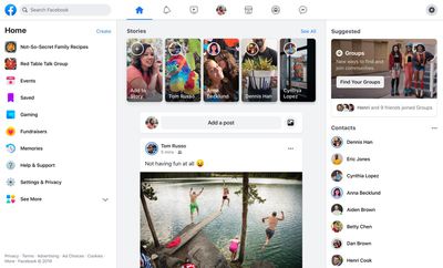
Mark Zuckerberg unveiled the refreshed design over a year ago at Facebook's "F8" developer conference. It has been the default since May, with the option to voluntarily return to the previous design. From next month, there will be no facility to access the old design and all users will have the updated look.
The new design is a significant change from how Facebook has looked for most of its life. It places more emphasis on groups, switching between public and private spaces, and displays more pronounced links to Facebook's updated Watch, Marketplace, and Gaming sections. The motivation behind the redesign was to bring the experience of the Facebook mobile app and the Facebook website to parity, and refresh the overall look of the social media platform.
Popular Stories
Meta has been warned by the European Commission that its endlessly scrolling Facebook and Instagram feeds may violate the EU's new Digital Services Act rules.
In preliminary findings published on Friday, the Commission said that its investigation into features such as infinite scroll, autoplay, push notifications, and highly personalized recommender systems, found that Meta "did not...
In May, Apple agreed to pay $250 million to settle a U.S. class action lawsuit over Siri AI's delayed launch, and eligible iPhone users could receive up to a $95 payout.
This week, the California court overseeing the case held a hearing regarding preliminary approval of the settlement, but the judge has not yet issued a ruling. It will likely be at least a few more months before eligible...
The Apple TV 4K hasn't been updated since 2022, and it's due for a refresh. An update is planned for 2026, but Apple is likely going to wait to launch it after Siri AI launches in iOS 27.
Design
Apple TV design updates don't happen often, and that's not changing. The next Apple TV is going to have the same squircle shape as the current model, and it'll continue to be made from a black...