We're a little over one month out from the expected September unveiling of the ten year anniversary iPhone, which has come to be known as the "iPhone 8" ahead of release. While recent HomePod firmware discoveries have essentially confirmed the iPhone 8's edge-to-edge design and front-facing sensor bar notch, it's still unclear how iOS 11 will be incorporated into all of these drastically redesigned hardware upgrades.
New mockups shared by Allen Pike and Max Rudberg this week have taken a look at how these changes might be realized in an iPhone 8 running iOS 11. Particularly, the mockups address one of the more curious additions in the iOS 11 beta: large, banner pieces of text that sit atop apps like Messages, Mail, and the App Store. Pike pointed out that these "Large Title" banners sit below navigation buttons in many of the apps, with plenty of "weirdly empty" white space on current model iPhones.
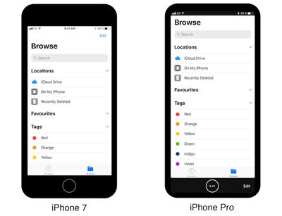
Pike's theory, further polished in enhanced mockups by Rudberg, is that iOS 11 will shift the topmost navigation buttons within these apps to a bottom bar -- perhaps a "function area" -- where users will easily be able to tap UI inputs to jump around within the apps.
In total, Rudberg realized three possible outcomes that Apple could create with regards to the sensor bar notch and bottom navigation inputs. In the first mockup, the entirety of the iPhone 8's 5.8-inch display is used by the status bar and navigation buttons at the bottom near the virtual home button.
The next two designs include a variety of combinations: the sensor bar using an all-black UI to hide the hardware notch, and the same effect "blending" the bottom navigation bar. As for Rudberg himself, at first he was more favorable of the UI blending the notch into the software of the iPhone, but due to what would result in a visually smaller display, he's now hoping that Apple will "embrace the notch."
Beforehand I was fond of the idea of blending the statusbar with the hardware, but seeing the mockups like this, I’m not so sure. Blending the statusbar with the hardware makes the screen seem smaller than it is and the result is less striking. I’m now leaning towards that Apple will embrace the notch.
This week, HomePod firmware data also revealed that the notch will sit between a "split" status bar, where iOS 11 will showcase data like connection, battery, Bluetooth, and more on each side of the notch. One question mark that remains in Rudberg's mockups is where the time will be located in iOS 11 on an iPhone 8, although there appears to be some room on the left or right side of the front-facing hardware for it to be located.
The front-facing sensor bar on the iPhone 8 has been a point of contention for device concept and mockups over the past few months. It's expected that this bar will hold the earpiece, front-facing camera, and new 3D sensors for advanced facial recognition. Recent rumors have suggested that the iPhone 8 will do away with Touch ID completely, and rely on facial recognition abilities to authenticate purchases and other iOS elements that the fingerprint sensor previously guarded.
To see all of the iPhone 8 mockups shared this week, check out Pike's blog post here and Rudberg's here.