Visual Design Student Reimagines Apple Music With Unified Artwork, Better Discovery, and More

When Apple Music launched in 2015, one of the biggest complaints from users and critics centered on the somewhat confusing user interface of Apple's first foray into music streaming. Although the app was redesigned last year in iOS 10, concerns were then raised around the oversized nature of Apple Music's new typography and artwork.

This week visual design student Jason Yuan, who studies at Northwestern University, has shared a new project that he's been working on the past few months, which was sparked when Apple rejected him for a graphic design internship at Apple Music. Yuan decided to take Apple's rejection, which referenced wanting to see "more growth and training," and turn it into a new passion project focused on a visual overhaul of Apple Music (via The Next Web).

apple music redesign 2
He said his redesign provides a few "potential solutions" to the service's problems.

At first, I was frustrated — Northwestern University doesn’t offer any sort of undergraduate graphic design program, so whatever growth they were looking for would have to be self taught … but as soon as I came to this realization, I became inspired to embark on what became a a three-month long journey to the holy grail — the iOS app that Apple Music deserves.

For me, this was an opportunity to really dig my teeth into UX research and design, an excuse to spend way too much time on Sketch and Principle, a reason to bore everyone around me with my notebook of crudely drawn wireframes … My process was guided by qualitative user research, Apple’s official Design Principles, and my own designer intuition.

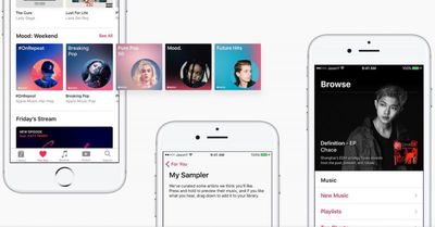
One of Yuan's first ideas is called "The Sampler," which he pitches as a replacement to "My New Music Mix." The Sampler would be for users "reluctant to sit through an entire playlist full of new music," and would present Apple Music subscribers with samples of songs in a Tinder-like UI that they could swipe up to reject or swipe down to add to their library. These samples would last around 15 seconds and present highlights from the songs in question so users would immediately know if they like the music or not.

apple music redesign 3
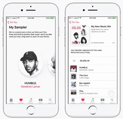
Any music that is swiped down upon is then saved to Yuan's equivalent of the My New Music Mix, taking out the automatic curation of content currently in place and making it more personalized in Yuan's design. Yuan said that The Sampler was inspired by the idea of gamification, which he argued would allow the user to create "an immediate connection to the music they discover," instead of just taking a shot at what Apple Music serves up to them now.

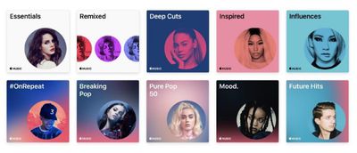
The visual designer also came up with more cohesive branding in Apple Music's album and playlist artwork, which he argued is currently "kind of all over the place," with a mix of collages, 3D typography, and more for various radio stations and activity playlists. To fix this, Yuan focused on the circular bubble art that Apple Music subscribers encounter when signing up for the service -- which also references the iPod click wheel and iPhone contacts -- while subtly altering colors and profile shots for the artist and playlist in question.

apple music redesign 1
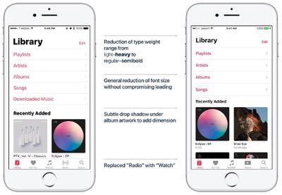
Yuan went on to address the basic UI complaints currently leveled at Apple Music, reducing the font size and white space of the app's launch tab while also introducing a new "Watch" tab for the service's upcoming slate of TV shows. He eliminated what he argued as extraneous UI additions, like the "Downloaded Music" front page menu option, and personalized For You so it introduces music based on location, time, and even recent social media activity.

apple music redesign 4

The current Apple Music (left) compared with Yuan's redesign (right)

Connect is gone for good in Yuan's design as well.

Truth is, I didn’t see any data from my research that would justify keeping the Connect feed in the app as is. Users were more interested in connecting with friends and family through music (a la Spotify) instead of with artists through a watered-down Twitter.

I think Apple should focus on integrating existing social media with Apple Music instead of trying to push yet another one on its already overburdened consumers.

There are plenty of other highlights from Yuan's list of redesign ideas, including tweaks to Now Playing, Browse, Search, and how users love or dislike a song. Yuan ended his article saying he's happy with the knowledge he gained and progress he made redesigning Apple Music as a personal project, but never intended the tweaks to be taken seriously by Apple.

"I don’t expect the good folks at Apple Music to take anything from this case study," Yuan mentioned. "In fact, I might actually have a heart attack if anyone working on Apple Music stumbles upon this article… but if you’re out there, I hope my work was able to give you some ideas and spark some conversations!"

Check out the rest of Yuan's Apple Music changes in his Medium post right here.

Popular Stories

2024 iPhone Boxes Feature

Apple Adjusts Trade-In Values for iPhones, iPads, Macs, and More

Thursday November 6, 2025 11:12 am PST by
Apple today updated its trade-in values for select iPhone, iPad, Mac, and Apple Watch models. Trade-ins can be completed on Apple's website, or at an Apple Store. The charts below provide an overview of Apple's current and previous trade-in values in the U.S., according to its website. Maximum values for most devices either decreased or saw no change, but the iPad Air received a slight bump. ...
Liquid Glass General Feature

Apple Shares Liquid Glass Design Gallery

Thursday November 6, 2025 2:45 pm PST by
Apple is promoting the new Liquid Glass design in iOS 26, showing off the ways that third-party developers are embracing the aesthetic in their apps. On its developer website, Apple is featuring a visual gallery that demonstrates how "teams of all sizes" are creating Liquid Glass experiences. The gallery features examples of Liquid Glass in apps for iPhone, iPad, Apple Watch, and Mac. Apple...
iOS 26

iOS 26.1 Available Now With These 8 New Features

Monday November 3, 2025 5:54 am PST by
Following more than a month of beta testing, Apple released iOS 26.1 on Monday, November 3. The update includes a handful of new features and changes, including the ability to adjust the look of Liquid Glass and more. Below, we outline iOS 26.1's key new features. Liquid Glass Toggle iOS 26.1 lets you choose your preferred look for Liquid Glass. In the Settings app, under Display...
airtag purple

Apple's Website Lists AirTag 4-Pack at Shockingly Low Price [Updated]

Friday November 7, 2025 6:40 am PST by
Apple's online store in the U.S. is suddenly offering a pack of four AirTags for just $29, which is the same price as a single AirTag. This is likely a pricing error, and it is unclear if orders will be fulfilled. Apple has not discounted the AirTag four-pack in any other countries that we checked. Delivery estimates are already pushing into late November to early December, suggesting...
Finder Siri Feature

Apple's New Siri Will Be Powered By Google Gemini

Wednesday November 5, 2025 11:57 am PST by
The smarter, more capable version of Siri that Apple is developing will be powered by Google Gemini, reports Bloomberg. Apple will pay Google approximately $1 billion per year for a 1.2 trillion parameter artificial intelligence model that was developed by Google. For context, parameters are a measure of how a model understands and responds to queries. More parameters generally means more...
apple watch se 3 always on

Apple to Remove iPhone-Apple Watch Wi-Fi Sync in EU With iOS 26.2

Thursday November 6, 2025 4:37 am PST by
Apple in iOS 26.2 will disable automatic Wi-Fi network syncing between iPhone and Apple Watch in the European Union to comply with the bloc's regulations, suggests a new report. Normally, when an iPhone connects to a new Wi-Fi network, it automatically shares the network credentials with the paired Apple Watch. This allows the watch to connect to the same network independently – for...
ikea smart home devices

IKEA Debuts 21 HomeKit-Compatible Smart Bulbs, Sensors, and Controls

Thursday November 6, 2025 4:08 pm PST by
IKEA today announced the upcoming launch of 21 new Matter-compatible smart home products that will be able to interface with HomeKit and the Apple Home app. There are sensors, lights, and control options, all of which will be reasonably priced. Some of the products are new, while some are updates to existing lines that IKEA previously offered. There are a series of new smart bulbs that are...
Home Hub Command Center with Dome Base Feature

Apple's 2026 Smart Home Revamp: All the Rumors

Wednesday November 5, 2025 3:54 pm PST by
It's been over a decade since Apple's HomeKit smart home platform launched, and it is overdue for an update. HomeKit and the Home app can no longer keep up with AI-powered solutions from other companies like Google and Amazon, but that's set to change with a smart home revamp that Apple has planned for 2026. Home Hub Apple is working on a home hub or "command center" that will serve as a...
apple tv logo physical

New Apple TV Intro Was Made With Practical Effects

Thursday November 6, 2025 7:02 am PST by
The all-new intro sequence for Apple TV was made with practical effects and shot in-camera, Ad Age reports. Rather than using digital techniques, the new sequence was made by shooting large glass versions of the Apple TV logo, with physical motion and changing lighting used to create effects. Apple partnered with TBWA\Media Arts Lab to create the intro. Ad Age released an exclusive look...

Top Rated Comments

Abazigal Avatar
111 months ago
While I am all for good ideas, how is this news? Are we going to start covering everyone who re-imagines Apple's products and / or UI?
Score: 35 Votes (Like | Disagree)
TwoBytes Avatar
111 months ago
Apple need to hire this guy. Why they passed him up is beyond me. It's not a perfect re-design but better than the convoluted mess we have.
Score: 29 Votes (Like | Disagree)
Dilster3k Avatar
111 months ago
iTunes in general has been a mess for a long time.
Score: 23 Votes (Like | Disagree)
69Mustang Avatar
111 months ago
Reading some of the comments makes me think a few people just looked at the image and started typing instead of reading the actual article. The kid made some decent changes that make sense. To focus on reduced font sizes sort of devalues the effort and time put in and ignores the difficulty in getting UI/UX right.
Score: 20 Votes (Like | Disagree)
andy.ringwood Avatar
111 months ago
He's literally changed the font size and changed the artwork. Nothing special. I'm sure Apple will change some UI elements in iOS 11 anyway.
Score: 19 Votes (Like | Disagree)
bLackjackj Avatar
111 months ago
Bring back CoverFlow,..oh how I miss you!
Score: 14 Votes (Like | Disagree)