Apple Adopts San Francisco Typeface for Apple.com Website - MacRumors
Skip to Content

Apple Adopts San Francisco Typeface for Apple.com Website

by

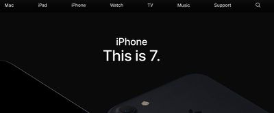
As of today, Apple has started changing the typeface on its Apple.com website to San Francisco, the font it first debuted alongside the Apple Watch in 2015.

On Apple's homepage and other web pages on the site, the San Francisco typeface is being used in many places where text is displayed, replacing the previous Myriad typeface. Bolder and easier to read, San Francisco has been used on iOS devices and Macs since iOS 9 and OS X 10.11 were introduced in 2015.
applesanfrancisco
San Francisco is a condensed sans-serif that's similar to Helvetica. It was created specifically for small displays like the Apple Watch, with extra spacing between letters to increase legibility. It also works well on larger Retina displays because of its clean design.

sanfrancisco2

Apple's website with old Myriad typeface on left, new San Francisco typeface on right

San Francisco is the first font Apple has designed in-house in many years. In the 80s and 90s, Apple used several fonts that were created in-house, but the company largely stopped making its own fonts in the early 1990s.

Apple isn't yet using the San Francisco typeface for its entire website, but may continue the transition over the coming days.

(Thanks, Nick!)
Top Rated Comments

Kabeyun Avatar
124 months ago
Theyve rolled the San Francisco website before its ready, similar to a lot of their products recently.
Now we're innovating! :cool: :apple:
They can make a font, but they cannot update their mac line up regularly? Guess they are too busy doing more important things
Changing the font on Apple's website will be the best thing Apple does this year. Thanks Tim Cook.

Mark my words, 2017 will be another dull year for Apple.
What a waste of resources. They should had been working on more emojis and watch bands.
Congratulations, MR. You managed to go negative over a fri**in' font story. A font story! Ooh, let me have a go:

Almost as much spacing between those ugly letters as there is between Mac Mini updates!

Was that good?

Next up: Tim Cook saves a baby from a burning building. MR forums: Cook can take the time to save a baby but he can't even make a battery last all day. Wah!
Score: 24 Votes (Like | Disagree)
ErikGrim Avatar
124 months ago
Allow me to have a rare moment of negativity here, as a sometime typographer. San Francisco is a lovely UI typeface, but it does not work at all in large headlines. It lacks proper differentiating weights and looks especially bad on the Mac Book Pro headline.

There was a reason why up until now Apple had separate typefaces for user interface and other media. You never saw a print ad set in Chicago or Charcoal. You never had UI elements set in Apple Garamond. Yes, those were specifically design and set for low vs high resolutions, but even with retina screens today typefaces made for user interfaces still look awkward and "cheap" when displayed at headline sizes.
Score: 17 Votes (Like | Disagree)
Peel Avatar
124 months ago
I'm used to San Francisco's light weight in iOS. The heavier weight they've chosen for the website titles makes it look less graceful.
Score: 14 Votes (Like | Disagree)
radiology Avatar
124 months ago
What a waste of resources. They should had been working on more emojis and watch bands.
Score: 14 Votes (Like | Disagree)
asleep Avatar
124 months ago
Now we're innovating! :cool: :apple:
Score: 11 Votes (Like | Disagree)
btrach144 Avatar
124 months ago
Changing the font on Apple's website will be the best thing Apple does this year. Thanks Tim Cook.

Mark my words, 2017 will be another dull year for Apple.
Score: 10 Votes (Like | Disagree)

Popular Stories

iPhone 18 Pro Deep Red Feature

iPhone 18 Pro Launching Next Month With These 12 New Features

Sunday August 2, 2026 7:21 pm PDT by
It is now August, and that means the iPhone 18 Pro and iPhone 18 Pro Max should be launching next month. The devices are expected to look similar to the iPhone 17 Pro and iPhone 17 Pro Max, but there will still be many year-over-year changes, with rumored features including a smaller Dynamic Island, 5G via satellite, and more. Apple is expected to unveil the iPhone 18 Pro, iPhone 18 Pro Max, ...
Four iPhone 18 Pro Colors Mock Feature

iPhone 18 Pro and iPhone Ultra: Pre-Orders and Release Date

Thursday July 30, 2026 6:12 am PDT by
Apple has yet to reveal when the iPhone 18 Pro and iPhone Ultra will be announced and released, but the dates usually follow a familiar pattern. Labor Day is September 7 this year. The last time the holiday fell on that day was in 2020, but the iPhone event that year was delayed until October due to the COVID-19 pandemic. So, the last time Labor Day was on September 7 in a normal year was in ...
Four iPhone 18 Pro Colors Mock Feature

iPhone 18 Pro and iPhone Ultra: Pre-Orders and Release Date

Sunday August 2, 2026 7:32 pm PDT by
Apple has yet to reveal when the iPhone 18 Pro and iPhone Ultra will be announced and released, but the dates usually follow a familiar pattern. Labor Day is September 7 this year. The last time the holiday fell on that day was in 2020, but the iPhone event that year was delayed until October due to the COVID-19 pandemic. So, the last time Labor Day was on September 7 in a normal year was in ...