Office for iPad Design Manager Talks About Design Process

Office for iPadMicrosoft's design manager for Office for iPad has posted an interesting piece discussing the company's design philosophy behind the software.

The software, released back in March, has been well received by both users and critics. It's seen more than 27 million downloads and has already seen a significant update to add features that weren't ready for launch.

Han-Yi Shaw writes about the scenarios that the team imagined Office for iPad users would find themselves in, as well as the user experience goals they had:

- Familiar Office experience, with no learning curve
- Unmistakably Office, optimized for iPad
- Immersive and removes distractions
- Document content, not UI, takes center stage
- Experience is always beautiful, fast, and fluid

The purpose of a familiar Office experience is simple: a low learning curve and high user confidence. However, it’s just as important to strike a balance between “unmistakably Office” and “platform optimization,” which means optimizing for iOS platform conventions and touch-first user expectations. The most important, yet challenging, goal was finding the sweet spot between the essence of Office and iOS. Fortunately, since the Office for iPad and Mac team (formally known as the Macintosh Business Unit) is made up of Apple platform specialists, we were able to apply our deep knowledge of Apple platforms to the task.

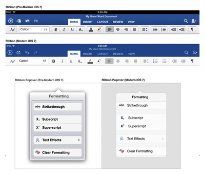
The piece talks about how Microsoft redesigned The Ribbon -- the control strip at the top of all Office programs -- to mesh with Apple's design philosophies following the release of iOS 7. "That meant stripping out extraneous detail," said Shaw. "If there was a visual treatment or text label that wasn't absolutely necessary, we stripped it away."

Old and New Office
The full piece is an interesting peek behind the curtain for designers and anyone interested in how software used by millions of people gets built.

Office for iPad is available from the App Store. [Direct Link: Word, Excel, PowerPoint]

Popular Stories

iOS 26 on Three iPhones

iOS 26's Liquid Glass Design Draws Criticism From Users

Wednesday September 17, 2025 2:56 pm PDT by
It's been two days since iOS 26 was released, and Apple's new Liquid Glass design is even more divisive than expected. Any major design change can create controversy as people get used to the new look, but the MacRumors forums, Reddit, Apple Support Communities, and social media sites seem to feature more criticism than praise as people discuss the update. Complaints There are a long...
iOS 26

iOS 26.1 to iOS 26.4: Here Are 5 New Features to Expect on Your iPhone

Tuesday September 16, 2025 11:17 am PDT by
iOS 26 was finally released on Monday, but the software train never stops, and the first developer beta of iOS 26.1 will likely be released soon. iOS 18.1 was an anomaly, as the first developer beta of that version was released in late July last year, to allow for early testing of Apple Intelligence features. The first betas of iOS 15.1, iOS 16.1, and iOS 17.1 were all released in the second ...
M6 MacBook Pro Feature 1

Apple's Rumored MacBook Pro Redesign: 6 New Features Anticipated

Wednesday September 17, 2025 4:26 am PDT by
Apple in October 2024 overhauled its 14-inch and 16-inch MacBook Pro models, adding M4, M4 Pro, and M4 Max chips, Thunderbolt 5 ports on higher-end models, display changes, and more. That's quite a lot of updates in one go, but if you think this means a further major refresh for the ‌MacBook Pro‌ is now several years away, think again. Bloomberg's Mark Gurman has said he expects only a small ...
iOS 26 Glass Feature

iOS 26: The Top 100 New Features and Changes

Tuesday September 16, 2025 12:26 pm PDT by
Apple released iOS 26 on September 15, and it's now available for all iPhone users with a compatible device. There are a lot of changes and features to learn about, so if you want a quick, easy-to-read list that outlines what's new, we've got you covered. Design Liquid Glass design that reflects light and refracts what's underneath. It's system wide, with dynamic tab bars and toolbars...
ios 26 liquid glass dark mode

iOS 26 Liquid Glass Design Makes App Icons Look Crooked, Report Users

Wednesday September 17, 2025 4:55 am PDT by
iOS 26's new Liquid Glass interface has been criticized for making some content illegible in certain circumstances, and now the UI design is reportedly causing another unusual visual problem for some users. Liquid Glass adds subtle glowing effects to the corners of app icons, creating a dynamic glass-like appearance with depth and parallax effects. However, as noted by Gizmodo, this design...
AirPods Pro Firmware Feature

AirPods Pro 2 and AirPods 4 Get iOS 26 Features With New Firmware Update

Monday September 15, 2025 10:50 am PDT by
Apple today released updated firmware for the AirPods Pro 2 and the AirPods 4, introducing support for the new AirPods features that are included in iOS 26, iPadOS 26, and macOS Tahoe. The firmware has a build number of 8A356, and it replaces the current 7E93 firmware. With Apple's new software updates, the AirPods Pro 2 and the AirPods 4 support better audio quality for phone calls and...
iOS 26

iOS 26.0.1 Coming Soon, Likely With iPhone Air and iPhone 17 Pro Fix

Thursday September 18, 2025 9:17 am PDT by
Apple is preparing to release iOS 26.0.1, according to a private account on X with a proven track record of sharing information about future iOS versions. The update will have a build number of 23A350, or similar, the account said. It is likely that iOS 26.0.1 will fix a camera-related bug on the new iPhone Air and iPhone 17 Pro models. In his iPhone Air review, CNN Underscored's Henry T. ...

Top Rated Comments

AngerDanger Avatar
148 months ago
Based on the screenshots, it made "designing" the UI a lot easier.

"Should we add some borders or shadows to distinguish between various tappable areas?"
"What, no! Next thing you know, people will want graphics or something to go along with them!"

I personally cannot wait until design becomes so simple, intuitive, refined, beautiful, gorgeous, (insert denigrated aesthetic term) that our homescreens are white backgrounds with a list of unformatted text. Ahhh, that'll be something…

(http://i.imgur.com/VpYGPUS.png)

</misplaced anger>
Score: 38 Votes (Like | Disagree)
surfingarbo Avatar
148 months ago
I really like the green, blue, and orange colours Microsoft use for each app. Both classic and modern at the same time. Great design work.
Score: 18 Votes (Like | Disagree)
maflynn Avatar
148 months ago
I will say I like the pre iOS 7 ribbon better but nonetheless word and excel are great apps on the iPad.
Score: 14 Votes (Like | Disagree)
Sky Blue Avatar
148 months ago
The new iOS 7 version looks ssoooo much better

new Office for Mac please :)
Score: 12 Votes (Like | Disagree)
deluxeshredder Avatar
148 months ago
Note how the pre-iOS 7 ribbon defers to content much better than the "modern" one.
Score: 9 Votes (Like | Disagree)
nep61 Avatar
148 months ago
Its just to bad you have to pay a subscription to use Office on the iPad :( Because of that I won't touch it.

I think we're all going to find a LOT of software for Mac / PC / iPad etc. going the way of subscription.

Remember the days of buying a program on disk... using it for a long while and eventually deciding to get the next updated version-- (2 years later !)

Now, Adobe CS is Subscription based, AVID MC is going that way it seems, MS Office is that way now... It's the ONLY way to have a continuous revenue stream for these companies.

It's Sad, but soon, with the cost of the hardware, the cost of monthly data and the cost of subscription based software... who will be able to afford today's technology ?!?!
Score: 8 Votes (Like | Disagree)