Exactly two weeks after releasing the second beta of iOS 7 to developers, Apple has just pushed out a third beta version for testing. The update is arriving as both an over-the-air update to existing beta testers and through the iOS Dev Center.
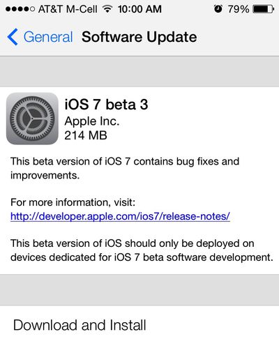
The new beta arrives as build 11A4414e, up from the second beta at build 11A4400f. Apple has also released a third developer preview of Xcode 5.
A report from late last month had indicated that the third beta was scheduled to arrive today, although many have regarded the two-week interval as an obvious prediction given Apple's past release history. Apple typically runs on 2-3 week intervals for releasing developer builds of its major iOS operating system versions.
iOS 7 is scheduled for release in the fall of this year, with updates to Apple's iPhone, iPad, and iPad mini all expected around the same time. If past history is any indication, iOS 7 should be made available to the public just a few days before the launch of the next-generation iPhone.
Direct links for paid members of Apple's iOS developer program:
- iPad (4th generation Model A1458)
- iPad (4th generation Model A1459)
- iPad (4th generation Model A1460)
- iPad mini (Model A1432)
- iPad mini (Model A1454)
- iPad mini (Model A1455)
- iPad Wi-Fi (3rd generation)
- iPad Wi-Fi + Cellular (model for ATT)
- iPad Wi-Fi + Cellular (model for Verizon)
- iPad 2 Wi-Fi (Rev A)
- iPad 2 Wi-Fi
- iPad 2 Wi-Fi + 3G (GSM)
- iPad 2 Wi-Fi + 3G (CDMA)
- iPhone 5 (Model A1428)
- iPhone 5 (Model A1429)
- iPhone 4S
- iPhone 4 (GSM Rev A)
- iPhone 4 (GSM)
- iPhone 4 (CDMA)
- iPod touch (5th generation)
Top Rated Comments
I'm sure apples infrastructure can support us.
They never will......Whats done is done. Live with it
I hate the icons. They look like something out of an unpopular jailbreak theme. No class at all. Jony Ive needs to go back to working on hardware and then need to hire someone who understand software usability.
I really don't care if you guys think that skeuomorphism is not chic or hip anymore. It lends itself toward usability because user interfaces are for the "user", not the hipster wannabe designer. Usability sometimes requires a few compromises for a designers "vision".
Even these icons use skeuomorphism because without it, you would not recognize which is the phone icon.
See this article on what it is any why it can be useful.
http://en.wikipedia.org/wiki/Skeuomorph#Arguments_for_skeuomorphism_in_digital_design
That design philosophy is context sensitive where the look and feel is suited to the context. The current design language in iOS 7 is not context sensitive. It is harder to use for new users and is really boring visually IMHO.
1. Weather doesn't crash when you delete a location from the "world" view
2. Weather: Fonts are thicker
3. Settings: Fonts are thicker
4. Control Center: Music scrubber bar is thicker
5. Calendar: Mini dots in month view for events on each day!!!
6. Camera: Much more stable, seems quicker, though not quantifiably verified yet.
7. Messages: Thicker font (seems like the font style "normal" has replaced "light" in many places throughout the system...)
8: Messages: Previously, names on the top of a message thread were pushed off center to fit the words "Messages" and "Contact". Now the name and surrounding words truncate to keep the contact name centered no matter what. "Messa... Person's nam... Contact"
9: Lock: Time keeps correct Y-axis position when waking up phone instead of shifting to the middle arbitrarily (and thicker font for "slide to unlock")
10: No evidence of overlapping objects in titles (or % charged)
11: Unlock icon animation seems 20% quicker or so.
Get over it already
new symbols in music app
clock displays in lock screen when playing music