Apple to Use 'San Francisco' Apple Watch Font in iOS 9 and OS X 10.11 - MacRumors
Skip to Content

Apple to Use 'San Francisco' Apple Watch Font in iOS 9 and OS X 10.11

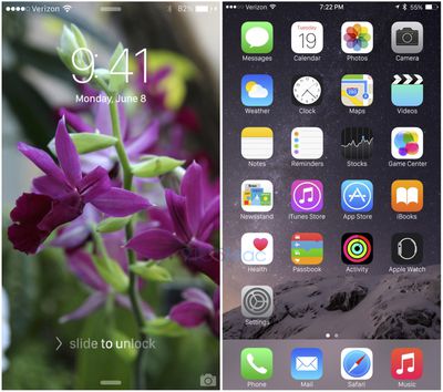
Though iOS 9 and OS X 10.11 are set to debut in three weeks at Apple's Worldwide Developers Conference, we've heard little detail on the content Apple might include in the new operating system updates. Neither operating system is expected to get a major visual overhaul, but there may be one significant design change for both iOS and OS X -- a new system font.

Apple has plans to use the new San Francisco font that was introduced with the Apple Watch to replace the Helvetica Neue font used in iOS 7/iOS 8 and OS X Yosemite, according to a report from 9to5Mac. The font will be used for menu items, app names, and more, throughout the operating systems.

sanfranciscomockup

Ever since switching to particularly thin weights of Helvetica Neue in iOS 7, Apple has been chastised for using a font that emphasizes clean lines over readability, and San Francisco is intended to solve this. According to the sources familiar with the decision to move to the San Francisco type face on iOS and OS X, Apple higher-ups also believe that the new look will serve to refresh its familiar operating systems, helping iOS and OS X to avoid becoming stale. However, some Apple engineers have told us that they are not fans of the new font, which may look particularly rough on non-Retina screens.

A condensed sans-serif that's not unlike Helvetica, San Francisco is the first new font Apple has designed in-house in many years. In the 80s and 90s, Apple used several fonts that were created in-house, but the company largely ceased making its own fonts in the early 1990s. Apple's early fonts were also named after major cities, so San Francisco pays homage to those first fonts.

Chicago, New York, Geneva, Monaco, and Cairo are all fonts that were designed by early Apple graphic artist Susan Kare. Kare even designed her own font called San Francisco in 1984, but that now-obsolete typeface looked quite different than the San Francisco Apple introduced in 2014.

San Francisco was created specifically for small displays like the Apple Watch, with extra spacing between each letter to increase legibility on the wrist. Since its debut, there has been speculation that it could be brought to iPhones and Macs in the future, due to its clean look on larger Retina displays in addition to the small display of the Apple Watch. That idea was further reinforced with the introduction of the Retina MacBook, which uses the San Francisco font for the lettering on the keyboard.

We may get our first official glimpse of San Francisco as a system-wide iOS and OS X font on June 8, when Apple is expected to show off iOS 9 and OS X 10.11 for the first time. Not much else is known about the two operating systems, but Apple may be opting to focus more on internal upgrades, improvements, and bug fixes over external changes to further polish features introduced with iOS 8 and OS X Yosemite.

Related Forums: iOS 9, OS X El Capitan

Popular Stories

HomePod mini and Apple TV Sage

New Apple TV and HomePod Mini Are 'Nearly Ready' to Launch, New Siri Remote Also Rumored

Sunday May 31, 2026 8:47 am PDT by
New models of the Apple TV 4K and HomePod mini are "nearly ready to go," according to the latest word from Bloomberg's Mark Gurman. Subscribe to the MacRumors YouTube channel for more videos. Both devices have been ready "for months," but Apple is holding off on launching them until the more personalized version of Siri is available, he said. "I am told the hardware for the next Apple TV...
iphone 17 pro black feature

iPhone 18 Pro's Camera Upgrade Will Cost Apple 50% More

Friday May 29, 2026 3:44 am PDT by
The iPhone 18 Pro and iPhone 18 Pro Max's all-new variable aperture lens will cost Apple 50% more than the camera unit used in current models, according to supply chain analyst Ming-Chi Kuo. Variable aperture has been one of the most persistent iPhone camera rumors of the past few years. Kuo first flagged the feature in late 2024, and it has since been corroborated by multiple reports and...
iphone 18 pro color dummies

First Look at iPhone 18 Pro Color Options Revealed by Dummy Models

Friday May 29, 2026 4:50 am PDT by
Leaker Sonny Dickson today shared images of iPhone 18 Pro dummy models in the device's four rumored colors, offering the first real-world look at what to expect from the lineup visually. Corroborating previous rumors, the dummies show the iPhone 18 Pro Max in Light Blue, Black, Silver, and Dark Cherry. Dickson said "Cherry will probably be the next hit, orange did very well." Cosmic Orange...

Top Rated Comments

144 months ago
One thing I love on MacRumors is font debates and font rants by font-o-philes. Some of my favourite comments in the last 12 months were on helvetica neuve vs lucida grande. This is going to be an entertaining thread, cant wait.
Score: 33 Votes (Like | Disagree)
144 months ago
Here's what it looks like in action.
Warning: If for any reason you decide that you want to replace the OS X System Font on your own please use caution to remove it before upgrading to OS X 10.11. Apple was quick to DMCA the Github repository that had the font because if the new font isn't removed as a system font when the user upgrades to 10.11, Apple's replacement font will not show up. Messing with system fonts is really nasty and can ruin your experience.

Score: 31 Votes (Like | Disagree)
144 months ago
I wish Apple were less patriotic about their home state.
Score: 28 Votes (Like | Disagree)
144 months ago
No!!!

Shoot me now. I hate that font. :mad: It looks to much like Android. What is happening to my Apple, that I love.
Score: 26 Votes (Like | Disagree)
144 months ago
tbh, I like the look of it on iOS and OS X. Makes sense to have a consistent UI across all devices.
Score: 25 Votes (Like | Disagree)
144 months ago
Please no. That font would look terrible on iOS. If anything, give us a choice!
Score: 24 Votes (Like | Disagree)