iOS 7 Beta 5 Tidbits: Icon Settings Redesign, New Control Center Options

Apple today released the fifth beta of iOS 7, which brings a number of improvements, changes, and bug fixes to the operating system, including newly redesigned Settings icons and a Control Center option that allows the feature to be disabled within apps.

iOS 7 beta 5 also offers a slew of minor interface tweaks and improvements that continue to make iOS 7 feel both faster and more polished. Our forum members have noted multiple enhancements that have been bundled into the release:

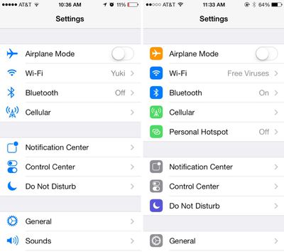
Settings - The icons in the Settings menu have seen a complete design, going from standard blue icons to a variety of square icons in various colors.

settings
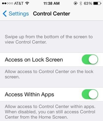
Control Center - Control Center’s settings now allow the function to be turned off while in apps, preventing Control Center from being accessed from the bottom of the screen while playing games or otherwise using apps.

controlcenteroptions
Power Off - The slider bar that displays when the iPhone is being powered off has been slightly altered.

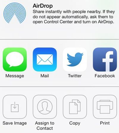
Twitter - The Twitter icon has been redesigned. Rather than a white bird on a blue background, it now depicts a blue bird on a white background.

twitternew
Notifications - Banner notifications can now be pulled down to access additional information.

Phone - The icons that are displayed while a user is in a call have been slightly altered with the addition of circles around the icons. They also appear to be larger.

phone
Accessibility Options - There are now On/Off toggle options under the Accessibility menu.

Boot Screen - When installing iOS 7 beta 5, many iPhone 5 users noted that the color of the boot screen matched their devices, with a white screen used for white phones and a black screen used for black phones. This differentiation appears to be limited to the iPhone 5 at this point in time as iPad owners and older iPhone users have not noticed the change.

Messages - In iOS 7 beta 4, Apple changed Messages to default to displaying the first name and last initial of a contact in a conversation. With beta 5, only the first name is displayed by default, though other options can be selected in the Mail settings menu (which is linked to Messages). To access the feature, go to Settings / Mail Contacts and Calendars / Short Name (under Contacts).

Additional features in iOS 7 beta 5 will be added here as they are discovered. Apple is likely to continue pushing regular updates for iOS 7, bringing minor performance boosts and changes ahead of the operating system’s public release, which is expected to come in the fall.

Related Forum: iOS 7

Popular Stories

iPadOS 26 App Windowing

Apple Explains Why iPads Don't Just Run macOS

Friday June 13, 2025 7:46 am PDT by
iPadOS 26 allows iPads to function much more like Macs, with a new app windowing system, a swipe-down menu bar at the top of the screen, and more. However, Apple has stopped short of allowing iPads to run macOS, and it has now explained why. In an interview this week with Swiss tech journalist Rafael Zeier, Apple's software engineering chief Craig Federighi said that iPadOS 26's new Mac-like ...
iphone 16 pro models 1

17 Reasons to Wait for the iPhone 17

Thursday June 12, 2025 8:58 am PDT by
Apple's iPhone development roadmap runs several years into the future and the company is continually working with suppliers on several successive iPhone models simultaneously, which is why we often get rumored features months ahead of launch. The iPhone 17 series is no different, and we already have a good idea of what to expect from Apple's 2025 smartphone lineup. If you skipped the iPhone...
Logitech Logo Feature

Logitech Announces Two New Accessories for WWDC

Friday June 13, 2025 7:22 am PDT by
Alongside WWDC this week, Logitech announced notable new accessories for the iPad and Apple Vision Pro. The Logitech Muse is a spatially-tracked stylus developed for use with the Apple Vision Pro. Introduced during the WWDC 2025 keynote address, Muse is intended to support the next generation of spatial computing workflows enabled by visionOS 26. The device incorporates six degrees of...
iPhone 17 Pro Blue Feature Tighter Crop

iPhone 17 Pro Launching in Three Months With These 12 New Features

Saturday June 14, 2025 5:45 pm PDT by
The iPhone 17 Pro and iPhone 17 Pro Max are three months away, and there are plenty of rumors about the devices. Below, we recap key changes rumored for the iPhone 17 Pro models as of June 2025:Aluminum frame: iPhone 17 Pro models are rumored to have an aluminum frame, whereas the iPhone 15 Pro and iPhone 16 Pro models have a titanium frame, and the iPhone X through iPhone 14 Pro have a...
iOS 26 Screens

Here Are All the iOS 26 Features That Require iPhone 15 Pro or Newer

Thursday June 12, 2025 4:53 am PDT by
With iOS 26, Apple has introduced some major changes to the iPhone experience, headlined by the new Liquid Glass redesign that's available across all compatible devices. However, several of the update's features are exclusive to iPhone 15 Pro and iPhone 16 models, since they rely on Apple Intelligence. The following features are powered by on-device large language models and machine...
CarPlay Liquid Glass Dark

Apple to Let iPhone Users Watch Videos on CarPlay Screen While Parked

Thursday June 12, 2025 6:16 am PDT by
Apple this week announced that iPhone users will soon be able to watch videos right on the CarPlay screen in supported vehicles. iPhone users will be able to wirelessly stream videos to the CarPlay screen using AirPlay, according to Apple. For safety reasons, video playback will only be available when the vehicle is parked, to prevent distracted driving. The connected iPhone will be able to...
iOS 26 on Three iPhones

Hate iOS 26's Liquid Glass Design? Here's How to Tone It Down

Wednesday June 11, 2025 4:22 pm PDT by
iOS 26 features a whole new design material that Apple calls Liquid Glass, with a focus on transparency that lets the content on your display shine through the controls. If you're not a fan of the look, or are having trouble with readability, there is a step that you can take to make things more opaque without entirely losing out on the new look. Apple has multiple Accessibility options that ...
Mac Studio Feature

Apple Begins Selling Refurbished Mac Studio With M4 Max and M3 Ultra Chips at a Discount

Thursday June 12, 2025 10:14 am PDT by
Apple today added Mac Studio models with M4 Max and M3 Ultra chips to its online certified refurbished store in the United States, Canada, Japan, Singapore, and many European countries, for the first time since they were released in March. As usual for refurbished Macs, prices are discounted by approximately 15% compared to the equivalent new models on Apple's online store. Note that Apple's ...
iOS 26 Feature

Apple Seeds Revised iOS 26 Developer Beta to Fix Battery Issue

Friday June 13, 2025 10:15 am PDT by
Apple today provided developers with a revised version of the first iOS 26 beta for testing purposes. The update is only available for the iPhone 15 and iPhone 16 models, so if you're running iOS 26 on an iPhone 14 or earlier, you won't see the revised beta. Registered developers can download the new beta software through the Settings app on each device. The revised beta addresses an...

Top Rated Comments

ryansimmons323 Avatar
155 months ago
Nice WiFi name on the right.
Score: 67 Votes (Like | Disagree)
JoshBoy Avatar
155 months ago
Much prefer the minimal look icons
Score: 42 Votes (Like | Disagree)
fsboy0 Avatar
155 months ago
I'm not sure how, but Apple took the iOS personality and snuffed it. The UI is ultra-boring, just like bauhaus architecture: it looks great, but you wouldn't want to live in it.

Um, many people, including myself, would LOVE to live in a Bauhaus style home.

Score: 39 Votes (Like | Disagree)
ZacNicholson Avatar
155 months ago
I'm glad they are slowing adding color back into iOS 7. it has too much white
Score: 36 Votes (Like | Disagree)
usarioclave Avatar
155 months ago
boring

I'm not sure how, but Apple took the iOS personality and snuffed it. The UI is ultra-boring, just like bauhaus architecture: it looks great, but you wouldn't want to live in it.

The UI has moved from delightful to cool. Using it makes me want to throw my phone away. It's like Apple has sucked all the joy out of the UI and replaced it with futura.
Score: 34 Votes (Like | Disagree)
Techtimate Avatar
155 months ago
The settings icons are much better now. Having them all blue made it to hard to easily distinguish which was which. They almost melded into each other. This is a great change!
Score: 31 Votes (Like | Disagree)