Here's the New iOS 13 Volume Indicator
As rumored, the new iOS 13 update (and the new iPadOS update) feature an updated volume HUD, which is less obtrusive than the previous volume control option that's been in iOS forever.
The new volume interface takes up much less room on the display, expanding from a small bar at the side of the display when you first press the volume up or down buttons into an even thinner bar as you keep adjusting the volume.

In portrait mode, this new volume HUD is located at the left side of the iOS device, both on the Home screen and within apps.
When you're adjusting the volume with the iPhone held in landscape mode with a landscape mode app, the volume interface appears at the top of the display.
An updated volume interface is a feature that iOS users have been wanting for years, and iOS 13 definitely delivers a more streamlined volume experience that should be a relief for those tired of seeing a giant volume indicator in the middle of the display.
Popular Stories
Apple's next-generation iPhone 17 Pro and iPhone 17 Pro Max are less than three months away, and there are plenty of rumors about the devices.
Apple is expected to launch the iPhone 17, iPhone 17 Air, iPhone 17 Pro, and iPhone 17 Pro Max in September this year.
Below, we recap key changes rumored for the iPhone 17 Pro models:Aluminum frame: iPhone 17 Pro models are rumored to have an...
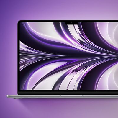
Apple is developing a MacBook with the A18 Pro chip, according to findings in backend code uncovered by MacRumors.
Earlier today, Apple analyst Ming-Chi Kuo reported that Apple is planning to launch a low-cost MacBook powered by an iPhone chip. The machine is expected to feature a 13-inch display, the A18 Pro chip, and color options that include silver, blue, pink, and yellow.
MacRumors...
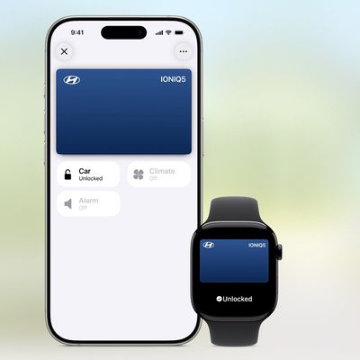
In 2020, Apple added a digital car key feature to its Wallet app, allowing users to lock, unlock, and start a compatible vehicle with an iPhone or Apple Watch. The feature is currently offered by select automakers, including Audi, BMW, Hyundai, Kia, Genesis, Mercedes-Benz, Volvo, and a handful of others, and it is set to expand further.
During its WWDC 2025 keynote, Apple said that 13...
Apple hasn't updated the AirPods Pro since 2022, and the earbuds are due for a refresh. We're counting on a new model this year, and we've seen several hints of new AirPods tucked away in Apple's code. Rumors suggest that Apple has some exciting new features planned that will make it worthwhile to upgrade to the latest model.
Subscribe to the MacRumors YouTube channel for more videos.
Heal...
Apple is planning to launch a low-cost MacBook powered by an iPhone chip, according to Apple analyst Ming-Chi Kuo.
In an article published on X, Kuo explained that the device will feature a 13-inch display and the A18 Pro chip, making it the first Mac powered by an iPhone chip. The A18 Pro chip debuted in the iPhone 16 Pro last year. To date, all Apple silicon Macs have contained M-series...
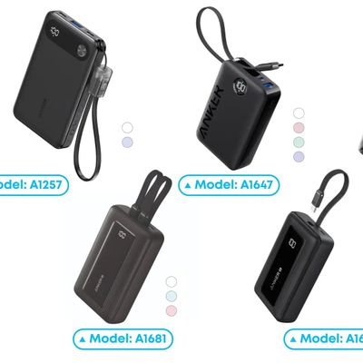
Popular accessory maker Anker this month launched two separate recalls for its power banks, some of which may be a fire risk.
The first recall affects Anker PowerCore 10000 Power Banks sold between June 1, 2016 and December 31, 2022 in the United States. Anker says that these power banks have a "potential issue" with the battery inside, which can lead to overheating, melting of plastic...
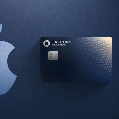
Chase this week announced a series of new perks for its premium Sapphire Reserve credit card, and one of them is for a pair of Apple services.
Specifically, the credit card now offers complimentary annual subscriptions to Apple TV+ and Apple Music, a value of up to $250 per year.
If you are already paying for Apple TV+ and/or Apple Music directly through Apple, those subscriptions will...
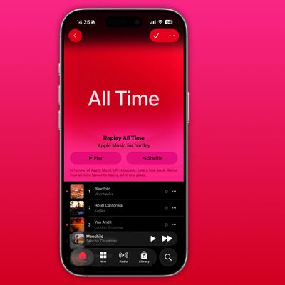
As part of its 10-year celebrations of Apple Music, Apple today released an all-new personalized playlist that collates your entire listening history.
The playlist, called "Replay All Time," expands on Apple Music's existing Replay features. Previously, users could only see their top songs for each individual calendar year that they've been subscribed to Apple Music, but now, Replay All...