Microsoft today launched a much-requested dark mode for its Outlook.com web mail service. The company teased the new mode earlier this month, suggesting it would be reminiscent of last year's Halloween theme for Outlook.
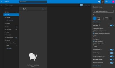
The new dark mode actually adopts shades of grey to generate panel contrast, providing a more polished look as a result. You can enable it from the Quick settings menu (the cog wheel icon in the upper right). Currently it only works with the default blue theme.
The dark mode for Outlook.com is one of the most highly requested features for Microsoft's web mail service, according to listings on the Outlook.com feedback site, although there's still no word on whether a similar mode is coming to the mobile Outlook app.
Last month, Microsoft launched a rebranded version of its Microsoft News app for iOS with a dark mode. Several other iOS apps have similar modes, including Twitter, YouTube, Reddit, and Twitch, while Apple's upcoming macOS Mojave also includes dark mode support.


Top Rated Comments
But choice is good and as long as everybody can pick their favorite, everybody should be happy.
I agree! As a person with poor eyes, this is awesome! I really hate Apple for taking so long to implement a good, simple and consistent OS wide Dark mode. I hate Microsoft for implementing it half-a**ed as well.
On my iOS devices I have my home button triple click set on invert screen. Unfortunately Apple's 'Smart Invert' is ok once On, but awful to use due to the long time it takes to swap between normal and Smart Invert (on iphone 6, anyways). Then, just like Microsoft (half a**), the alarm clock is in Dark Mode by default, so if I'm reading and I'm in invert colors mode, and before sleep I need to check my Alarms, I open a bright white app that burns my eyes. This is so simple to properly fix or introduce into iOS and yet it takes years before they do it. If ever.
On PC, my tool of choice is a little program called Negative Screen that has smart invert features. I have it an all my computers and it help a lot. I do photography. Photoshop had a darkish' gray background since version 3! Now it's even darker. I always had all my photo viewers set with dark (er) background for thumbnail view. It just helps to see the colors so much better because your eyes don't fight the all the white space around them. I'm an engineer. All my CAD stuff is on black. I've tried once to swap the colors just for fun...you get headache after half an hour of work.
And for all the people out there that think Dark Mode is just a fad or completely useless, please understand that taking the brightness down all the way at night is NOT what you need in order to comfortably read stuff on your phone or tablet. And no, don't compare it with the 'books' either please. You never ever read books in the dark. You always have a light above or nearby that lights up more than just your book. There is no strain because your eyes don't have to adjust to anything as the light reflected off of your book is just about at the same intensity as the light reflected off of your walls or ceiling, or night stand. Reading on a backlit screen is NOT like reading in a book. It's like someone points a flashlight in your eyes. At night, in a dark room, with dark mode on, your eyes don't fight lights of 0 intensity (your room) and bright intensity (your screen). You can keep your brightness quite high for pictures and such, and still read comfortably.
Sorry, but yeah...the more Dark Mode, the better.