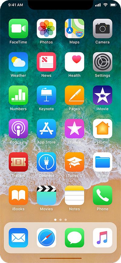
Earlier today, well-connected Apple reporter Mark Gurman said the so-called "iPhone 8" will have a thin software-based bar along the bottom of the home screen, controlled by gestures, in lieu of a physical home button.
Gurman also said the Dock, which houses up to four commonly used apps, will be redesigned with a new interface similar to the one on the iPad version of iOS 11. Above it, there will still be six rows of apps, with up to 24 apps per page.
The status bar is said to be split into left and right sides, which some Apple employees supposedly call "ears" internally. By default, the left side shows the time, while the right side displays Wi-Fi, signal bars, and battery life.
With those details in mind, graphic designer Olivier Charavel created a mockup of what the Home screen could look like on the iPhone 8.
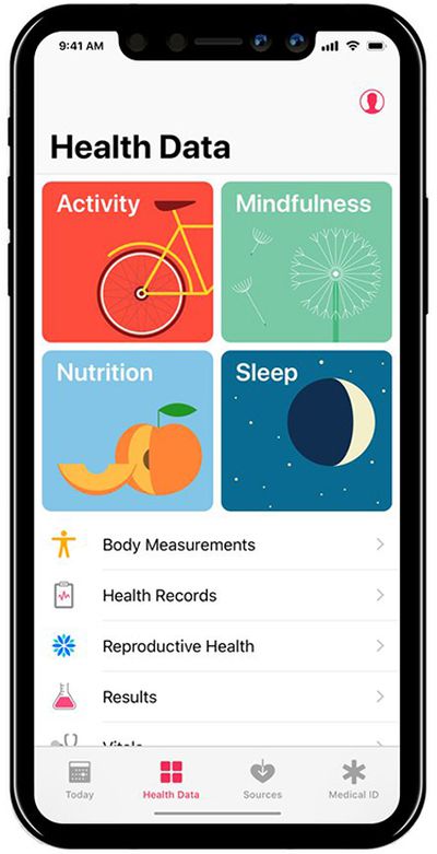
Charavel also shared a mockup of Apple's Health app as an example of what apps could look like on the iPhone 8 accordingly.
Gurman said users can drag the gesture bar up to the middle of the screen to unlock the device. When inside an app, a similar gesture starts multitasking, and users can continue to flick upwards to close the app and go back to the home screen.
Guilherme Rambo shared a video that demonstrates how it could look once the Dock has been summoned, based on Apple's iOS simulator for developers.
Apple's next-generation iPhone 17 Pro and iPhone 17 Pro Max are just over two months away, and there are plenty of rumors about the devices.
Below, we recap key changes rumored for the iPhone 17 Pro models.
Latest Rumors
These rumors surfaced in June and July:Apple logo repositioned: Apple's logo may have a lower position on the back of the iPhone 17 Pro models, compared to previous...
Apple should unveil the iPhone 17 series in September, and there might be one bigger difference between the Pro and Pro Max models this year.
As always, the Pro Max model will be larger than the Pro model:iPhone 17 Pro: 6.3-inch display
iPhone 17 Pro Max: 6.9-inch displayGiven the Pro Max is physically larger than the Pro, it has more internal space, allowing for a larger battery and...
The calendar has turned to July, meaning that 2025 is now more than half over. And while the summer months are often quiet for Apple, the company still has more than a dozen products coming later this year, according to rumors.
Below, we have outlined at least 15 new Apple products that are expected to launch later this year, along with key rumored features for each.
iPhone 17 Series
iPho...
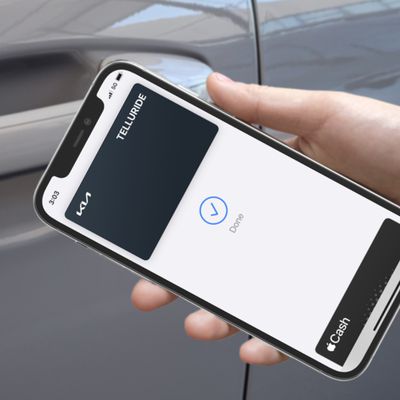
In 2020, Apple added a digital car key feature to its Wallet app, allowing users to lock, unlock, and start a compatible vehicle with an iPhone or Apple Watch. The feature is currently offered by select automakers, including Audi, BMW, Hyundai, Kia, Genesis, Mercedes-Benz, Volvo, and a handful of others, and it is set to expand further.
Apple has a web page with a list of vehicle models that ...
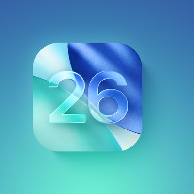
Apple is continuing to refine and update iOS 26, and beta three features smaller changes than we saw in beta 2, plus further tweaks to the Liquid Glass design. Apple is gearing up for the next phase of beta testing, and the company has promised that a public beta is set to come out in July.
Transparency
In some apps like Apple Music, Podcasts, and the App Store, Apple has toned down the...
Since the iPhone X in 2017, all of Apple's highest-end iPhone models have featured either stainless steel or titanium frames, but it has now been rumored that this design decision will be coming to an end with the iPhone 17 Pro models later this year.
In a post on Chinese social media platform Weibo today, the account Instant Digital said that the iPhone 17 Pro models will have an aluminum...
New renders today provide the best look yet relocated Apple logo and redesigned MagSafe magnet array of the iPhone 17 Pro and iPhone 17 Pro Max.
Image via Majin Bu.
Several of the design changes coming to the iPhone 17 Pro model have been rumored for some time, such as the elongated camera bump that spans the full width of the device, with the LiDAR Scanner and flash moving to the right side.
...
Amazon is soon to be back with its annual summertime Prime Day event, lasting for four days from July 8-11, the longest Prime Day yet. As it does every year, Prime Day offers shoppers a huge selection of deals across Amazon's storefront, and there are already many deals you can get on sale ahead of the event.
Note: MacRumors is an affiliate partner with Amazon. When you click a link and make a ...
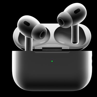
Apple's position as the dominant force in the global true wireless stereo (TWS) earbud market is expected to continue through 2025, according to Counterpoint Research.
The forecast outlines a 3% year-over-year increase in global TWS unit shipments for 2025, signaling a transition from rapid growth to a more mature phase for the category. While Apple is set to remain the leading brand by...
Really hoping there is still some sort of "home button" in software. I can't see any kind of usability at all with some hidden idea of "gestures" to get things done. I just can't see my mother (or any older person) being comfortable with an iPhone that doesn't have an obvious "home" button, even if it's a virtual one drawn in the same place on the screen as the hardware one.
Strongly agree. Apple has been reducing usability steadily ever since they shed skeumohism, which is when a hardware design expert started pretending he was skilled at software user experience design. Getting rid of the home button is that final step in eliminating what made the iPhone so approachable to so many. It's a sad day if true.
Really hoping there is still some sort of "home button" in software. I can't see any kind of usability at all with some hidden idea of "gestures" to get things done. I just can't see my mother (or any older person) being comfortable with an iPhone that doesn't have an obvious "home" button, even if it's a virtual one drawn in the same place on the screen as the hardware one.
My expectation is the virtual home button will automatically appear "on raise", based on the motion and proximity sensors.
Biggest design overhaul since iOS 7 with Liquid Glass, plus new Apple Intelligence features and improvements to Messages, Phone, Safari, Shortcuts, and more. Developer beta available now ahead of public beta in July.