Dropbox for iOS was today updated to version 3.0, adding a complete iOS 7-style redesign. The app features a revamped App Store icon and an overall design that incorporates more white space, a cleaner look, and lighter, less obtrusive navigation bars. Folder and menu icons have also been revamped.
In addition to a new look, the updated version of Dropbox features a streamlined iPad experience plus improved sharing and exporting. It also incorporates AirDrop support, speed improvements, PDF viewing updates, and bug fixes.
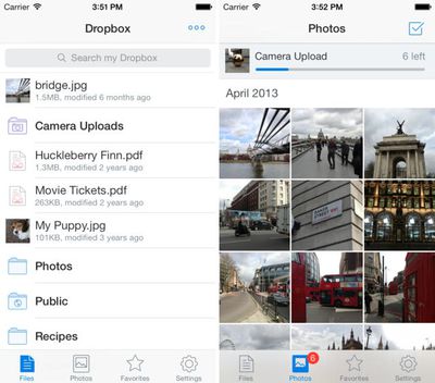
What’s New in Version 3.0
- Beautiful new design for iOS 7
- Streamlined iPad experience: just tap on your files and photos to toggle fullscreen
- Improved sharing and exporting makes it easier than ever to send files to your favorite apps
- AirDrop support lets you send links and files in a snap
- Seamlessly save videos to your library
- Speed! Faster launch, photo loading, and video playback
- Vanquished our most common crashes
- Fixed bug that caused HTML to render as text
- Oodles of PDF viewing updates
Dropbox can be downloaded from the App Store for free. [Direct Link]


Top Rated Comments
I wish developers would be just a touch more creative in matching the feel of iOS 7 without making their app look like all the other updated ones. Zzzzzz.
:D
"Most popular iOS ever designed"
Show your work.
In case you haven't been paying attention, there's an unprecedented amount of controversy over the amount of people incredibly unhappy about getting stuck with the awful aesthetics of this OS.