Apple has released newly updated versions of the iOS iBooks and iTunes U apps, bringing a clean look and feel to the app and getting rid of the wooden bookshelf look that has been a hallmark of the app since it was released.
Other than the new design, the apps do not appear to have gained any new features.
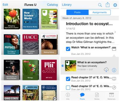
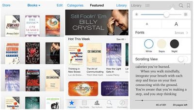
What's New in iBooks Version 3.2
iBooks has been updated with a beautiful new design for iOS 7.
What's New in iTunes U Version 1.4
This version of iTunes U has been updated for iOS 7 with an all-new look and feel.
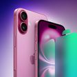
Apple's next-generation iPhone 17 Pro and iPhone 17 Pro Max are less than three months away, and there are plenty of rumors about the devices.
Apple is expected to launch the iPhone 17, iPhone 17 Air, iPhone 17 Pro, and iPhone 17 Pro Max in September this year.
Below, we recap key changes rumored for the iPhone 17 Pro models:Aluminum frame: iPhone 17 Pro models are rumored to have an...
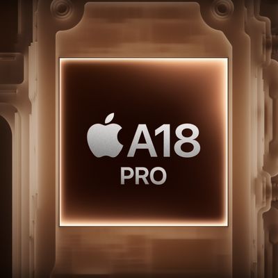
Apple is developing a MacBook with the A18 Pro chip, according to findings in backend code uncovered by MacRumors.
Earlier today, Apple analyst Ming-Chi Kuo reported that Apple is planning to launch a low-cost MacBook powered by an iPhone chip. The machine is expected to feature a 13-inch display, the A18 Pro chip, and color options that include silver, blue, pink, and yellow.
MacRumors...
The upcoming iPhone 17 Pro and iPhone 17 Pro Max are rumored to have a slightly different MagSafe magnet layout compared to existing iPhone models, and a leaked photo has offered a closer look at the supposed new design.
The leaker Majin Bu today shared a photo of alleged MagSafe magnet arrays for third-party iPhone 17 Pro cases. On existing iPhone models with MagSafe, the magnets form a...
Apple is planning to launch a low-cost MacBook powered by an iPhone chip, according to Apple analyst Ming-Chi Kuo.
In an article published on X, Kuo explained that the device will feature a 13-inch display and the A18 Pro chip, making it the first Mac powered by an iPhone chip. The A18 Pro chip debuted in the iPhone 16 Pro last year. To date, all Apple silicon Macs have contained M-series...
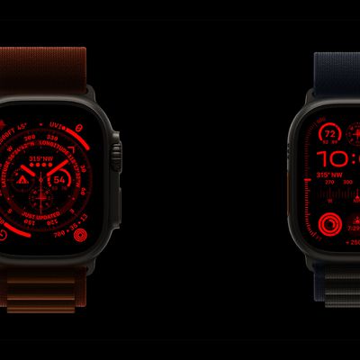
The long wait for an Apple Watch Ultra 3 appears to be nearly over, and it is rumored to feature both satellite connectivity and 5G support.
Apple Watch Ultra's existing Night Mode
In his latest Power On newsletter, Bloomberg's Mark Gurman said that the Apple Watch Ultra 3 is on track to launch this year with "significant" new features, including satellite connectivity, which would let you...
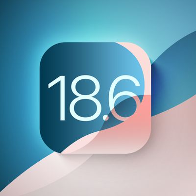
Apple today seeded the second betas of upcoming iOS 18.6 and iPadOS 18.6 updates to public beta testers, with the betas coming just a day after Apple provided the betas to developers. Apple has also released a second beta of macOS Sequoia 15.6.
Testers who have signed up for beta updates through Apple's beta site can download iOS 18.6 and iPadOS 18.6 from the Settings app on a compatible...
iOS 26 and iPadOS 26 add a smaller yet useful Wi-Fi feature to iPhones and iPads.
As spotted by Creative Strategies analyst Max Weinbach, sign-in details for captive Wi-Fi networks are now synced across iPhones and iPads running iOS 26 and iPadOS 26. For example, while Weinbach was staying at a Hilton hotel, his iPhone prompted him to fill in Wi-Fi details from his iPad that was already...
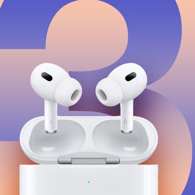
Apple hasn't updated the AirPods Pro since 2022, and the earbuds are due for a refresh. We're counting on a new model this year, and we've seen several hints of new AirPods tucked away in Apple's code. Rumors suggest that Apple has some exciting new features planned that will make it worthwhile to upgrade to the latest model.
Subscribe to the MacRumors YouTube channel for more videos.
Heal...
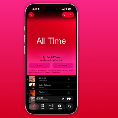
As part of its 10-year celebrations of Apple Music, Apple today released an all-new personalized playlist that collates your entire listening history.
The playlist, called "Replay All Time," expands on Apple Music's existing Replay features. Previously, users could only see their top songs for each individual calendar year that they've been subscribed to Apple Music, but now, Replay All...
So, I've been pretty vocal in my career (I write iOS apps) as to how much I don't like the "deference" argument in iOS 7. I mean, look at how ugly that list view is? That list view in the right image (for the posts/assignments) is just awful. It doesn't look clean, or minimal. It seems cluttered and extremely noisy.
Am I the only one who thinks so? So many blue artifacts makes the use of the color pointless. You can select certain blue things. Certain blue things are just more blue indicating they are selected and some things have such a minimal use of blue that the only think you can do is just try tapping on everything with blue to see if anything happens. It's awful. Again, IMHO. :(
+1 for removing the goofy 2007-era wooden bookshelves
-1 for blinding white background
-1 for thin light blue text on white background
-1000 for replacing clean, instantly recognizable icons with disjointed text that must be read
Biggest design overhaul since iOS 7 with Liquid Glass, plus new Apple Intelligence features and improvements to Messages, Phone, Safari, Shortcuts, and more. Developer beta available now ahead of public beta in July.