Just as Yahoo has announced its acquisition of Tumblr, the Tumblr team has released an update for its iOS app bringing a redesigned user interface that offers up a brand new post type chooser, displaying post options that fan out vertically from the app's redesigned compose button to allow for speedier posting.

The redesigned menu is similar to the radial posting options used by social networking app Path, which displays buttons unobtrusively in the corner of the app. Previously, hitting Tumblr's compose button opened a new window with square-shaped posting icons, which was more obtrusive than the current overlay design.

tumblr

Old Design on Left, New Design on Right

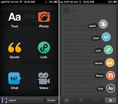
Tumblr's update, which was obviously in the works prior to the Yahoo acquisition, also includes app attribution for posts from iOS devices, a feature that was not previously available for mobile posters.

After multiple weekend reports that Yahoo was planning to buy Tumblr, Yahoo this morning announced that it had indeed purchased the blogging platform for $1.1 billion dollars.

According to the company's press release, Yahoo plans to allow Tumblr to operate independently as a separate business, with current Tumblr CEO David Karp remaining in charge of the company.

Tumblr for iOS can be downloaded for free from the App Store. [Direct Link]

Top Rated Comments

fruitpunch.ben Avatar
131 months ago
The article title is kinda misleading in that it suggests that it was Yahoo behind the UI update. But that's hardly likely, they only announced the purchase a few hours ago
Score: 4 Votes (Like | Disagree)
somethingelsefl Avatar
131 months ago
Even Yahoo knows they have a tendency to destroy everything they touch. The FIRST line in the press release:

"Per the agreement and our promise not to screw it up, Tumblr will be independently operated as a separate business"


I really enjoy Tumblr but I still have a feeling that Yahoo will, in fact, "screw it up".
Score: 2 Votes (Like | Disagree)
nekonari Avatar
131 months ago

The redesigned menu is similar to the radial posting options used by social networking app Path, which displays buttons unobtrusively in the corner of the app.

I'd liken it to OS X's Stacks design, which pops up a list of files quite exactly like Tumblr apps new design:


But I guess Path and this do have similarities.
Score: 1 Votes (Like | Disagree)
shiseiryu1 Avatar
131 months ago
Prepare for news headline in about 5-10 years: "Yahoo Sells Off Tumblr for $250 million"
Score: 1 Votes (Like | Disagree)
tonyr6 Avatar
131 months ago
Never used Tumblr. Yahoo ends up messing up everything it buys anyway.
Score: 1 Votes (Like | Disagree)
Parasprite Avatar
131 months ago
Wow, Tumblr can get worse? I can't wait to see what happens.:D
Score: 1 Votes (Like | Disagree)

Popular Stories

google drive for desktop1

Google to Roll Out New 'Drive for Desktop' App in the Coming Weeks, Replacing Backup & Sync and Drive File Stream Clients

Tuesday July 13, 2021 1:18 am PDT by
Earlier this year, Google announced that it planned to unify its Drive File Stream and Backup and Sync apps into a single Google Drive for desktop app. The company now says the new sync client will roll out "in the coming weeks" and has released additional information about what users can expect from the transition. To recap, there are currently two desktop sync solutions for using Google...