Safari 15 has faced a barrage of complaints about its controversial new design, and while Apple has listened to user feedback and reversed some changes or made them optional, many users still struggle to discern an active tab from a background tab on the Mac browser because of the inverted shading.
Unfortunately for users who do not like the new design, Apple has not made any changes to the shading of tabs in either the Safari 15.1 beta or the latest version of the experimental Safari Technology Preview browser.
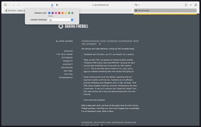
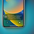
Fortunately however, developer Zhenyi Tan was inspired by John Gruber's Daring Fireballarticle about the issue and has since come up with a simple Safari extension called ActiveTab that provides a solution.
ActiveTab simply makes it easier to spot the active tab in Safari on Mac by drawing a line underneath it. There are eight colors to choose from, and the line below the tab can be customized to be between 1 and 7 pixels wide.
As Zhenyi notes, the extension works best with the "Separate" tab layout selected and "Show color in tab bar" disabled in the Tab section of Safari's Preferences. Zhenyi also cautions that ActiveTab will not work reliably if you have so many tabs in a window that the tab bar becomes scrollable.
ActiveTab is available for $1.99 on the Mac App Store, with no in-app purchases, no ads, and no tracking.
Saturday April 11, 2026 9:14 am PDT by Joe Rossignol
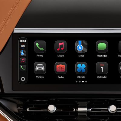
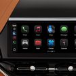
Last year, Apple launched CarPlay Ultra, the long-awaited next-generation version of its CarPlay software system for vehicles. Nearly a year later, CarPlay Ultra is still limited to Aston Martin's latest luxury vehicles, but that should change fairly soon.
In May 2025, Apple said many other vehicle brands planned to offer CarPlay Ultra, including Hyundai, Kia, and Genesis.
CarPlay Ultra...
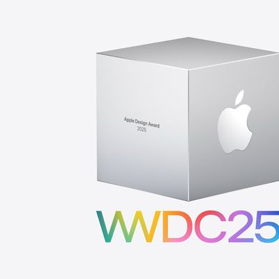
As we wait for WWDC to kick off next Monday, Apple today announced the winners of its annual Apple Design Awards, recognizing apps and games for their innovation, ingenuity, and technical achievement.
The 2025 Apple Design Award winners are listed below, with one app and one game selected per category:
Delight and Fun - CapWords (App) and Balatro (Game)
Innovation - Play (App) and PBJ -...
Saturday April 11, 2026 9:07 am PDT by Joe Rossignol
While the AirPods Max 2 received more attention, Apple also released a second pair of headphones last month: Nike Powerbeats Pro 2.
Nike Powerbeats Pro 2 are the same as the regular Powerbeats Pro 2, except they have a two-tone design consisting of black and Nike's signature Volt neon green-yellow color. The headphones were released on March 20 in the U.S., Canada, Australia, the U.K., and a ...
Saturday April 11, 2026 9:14 am PDT by Joe Rossignol
Last year, Apple launched CarPlay Ultra, the long-awaited next-generation version of its CarPlay software system for vehicles. Nearly a year later, CarPlay Ultra is still limited to Aston Martin's latest luxury vehicles, but that should change fairly soon.
In May 2025, Apple said many other vehicle brands planned to offer CarPlay Ultra, including Hyundai, Kia, and Genesis.
CarPlay Ultra...
As we wait for WWDC to kick off next Monday, Apple today announced the winners of its annual Apple Design Awards, recognizing apps and games for their innovation, ingenuity, and technical achievement.
The 2025 Apple Design Award winners are listed below, with one app and one game selected per category:
Delight and Fun - CapWords (App) and Balatro (Game)
Innovation - Play (App) and PBJ -...
Saturday April 11, 2026 9:07 am PDT by Joe Rossignol
While the AirPods Max 2 received more attention, Apple also released a second pair of headphones last month: Nike Powerbeats Pro 2.
Nike Powerbeats Pro 2 are the same as the regular Powerbeats Pro 2, except they have a two-tone design consisting of black and Nike's signature Volt neon green-yellow color. The headphones were released on March 20 in the U.S., Canada, Australia, the U.K., and a ...
Safari 14 tabs were a better UX design in every way: more attractive, more intuitive, more minimal, a more efficient use of available screen space, more drag-able and tab-like.
Lighter tabs are lighter because they are in the foregrounds - there is more light on them; darker tabs are darker because they are in the background - there is less light on them. It is 101. I can't understand why a designer at Apple would go the opposite way to this. There have been other controls in Mac OS / iOS that have done the same thing, and it is always confusing what the currently selection option is. Design is supposed to get out of the way, it should be 'invisible' so that we can use something without having to think about it.
I use auto dark/light mode: light during the day, dark at night. In dark mode, the lighter tab is active. In light mode, the darker tab is active. When the mouse hovers over a tab, it becomes the same color as the active tab. It's terrible design! Even in DOS things were more visible.
Don't most people run dark mode? Well, I do and my safari looks fine. The active tab is lighter than the inactive ones, just as you'd expect.
It should be the same on light mode but it's not. That's the problem. When I switch to dark mode I'm even more confused. Suddenly active tab is lighter than inactive @@