Safari 15 Users Say New Tab Design is Counterintuitive
Safari 15's controversial new design on the Mac has led to complaints about the way the browser indicates which tab is active.
As illustrated by Daring Fireball's John Gruber, there was never any ambiguity about which tab is active in previous versions of Safari, as an active tab is shown with lighter shading that matches the browser's toolbar.
In Safari 15, however, tabs have a new button-like design with a rounder and more defined appearance. Apple has also inverted its shading of tabs, with an active tab now having darker shading and inactive tabs having lighter shading. The change has annoyed Gruber and other users, as evidenced by this Reddit thread with nearly 1,000 upvotes.
"The design is counterintuitive," wrote Gruber. "What sense does it make that no matter your settings, the active tab is rendered with less contrast between the tab title and the background than background tabs? The active tab should be the one that pops."
In a Safari 15 window with two tabs open, especially from the same website, Gruber said determining which tab is active is basically a guessing game. Gruber acknowledged that it is easier to discern the active tab when more than two tabs are open, but he said the confusion with exactly two tabs should have been reason enough to scrap the design change.
"I can't tell you how many times I closed the tab that I needed because of this," one Reddit user expressed in frustration.
Unfortunately for users who do not like the new design, Apple has not made any changes to the shading of tabs in either the Safari 15.1 beta or the latest version of the experimental Safari Technology Preview browser.
Popular Stories
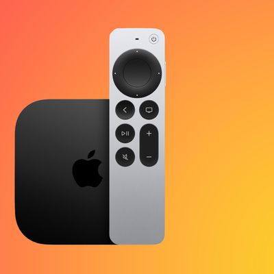
A new Apple TV is expected to be released later this year, and a handful of new features and changes have been rumored for the device.
Below, we recap what to expect from the next Apple TV, according to rumors.
Rumors
Faster Wi-Fi Support
The next Apple TV will be equipped with Apple's own combined Wi-Fi and Bluetooth chip, according to Bloomberg's Mark Gurman. He said the chip supports ...
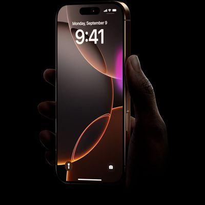
Apple will launch its new iPhone 17 series in two months, and the iPhone 17 Pro models are expected to get a new design for the rear casing and the camera area. But more significant changes to the lineup are not expected until next year, when the iPhone 18 models arrive.
If you're thinking of trading in your iPhone for this year's latest, consider the following features rumored to be coming...
Apple's next-generation iPhone 17 Pro and iPhone 17 Pro Max are only two months away, and there are plenty of rumors about the devices.
Below, we recap key changes rumored for the iPhone 17 Pro models.
Latest Rumors
These rumors surfaced in June and July:A redesigned Dynamic Island: It has been rumored that all iPhone 17 models will have a redesigned Dynamic Island interface — it might ...
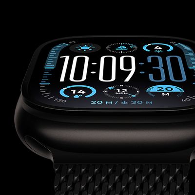
The long wait for an Apple Watch Ultra 3 is nearly over, and a handful of new features and changes have been rumored for the device.
Below, we recap what to expect from the Apple Watch Ultra 3:Satellite connectivity for sending and receiving text messages when Wi-Fi and cellular coverage is unavailable
5G support, up from LTE on the Apple Watch Ultra 2
Likely a wide-angle OLED display that ...
iPhone 17 Pro and iPhone 17 Pro Max models with displays made by BOE will be sold exclusively in China, according to a new report.
Last week, it emerged that Chinese display manufacturer BOE was aggressively ramping up its OLED production capacity for future iPhone models as part of a plan to recapture a major role in Apple's supply chain.
Now, tech news aggregator Jukan Choi reports...
The iOS 26 public beta release is quickly approaching, while developers have recently gotten their hands on a third round of betas that has seen Apple continue to tweak features, design, and functionality.
We're also continuing to hear rumors about the iPhone 17 lineup that is now just about right around the corner, while Apple's latest big-budget film appears to be taking off, so read on...