App Store Connect App for Developers Gets Fresh Icon, New Features - MacRumors
Skip to Content

App Store Connect App for Developers Gets Fresh Icon, New Features

by

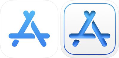
Apple today updated its App Store Connect app designed for developers, introducing a new icon that is a more complex version of the original simple blue and white "A" design.

appstoreconnect

New icon on the right

‌App Store‌ Connect is used by developers for iOS app management. It provides info on app statuses, offers data on app performance and sales, and lets developers access and respond to reviews.

Along with an updated icon, the new version of the app released today introduces an option for setting up internal TestFlight beta testing, with up to 100 members of a developer's team can test beta builds of an app. Full release notes for the update are below:

With this update, you can now:
- Set up internal TestFlight beta testing
- Add up to 100 members of your team to test beta builds of your app
- Edit test details for beta builds, view build activity and status, and expire builds
- Answer required export compliance questions

Developers can download ‌App Store‌ Connect from the ‌App Store‌. [Direct Link]

Top Rated Comments

thatvirtualboy Avatar
71 months ago
Eesh, if I didn't know any better I would think the 'old' icon was the newer one... looks way cleaner.
Score: 29 Votes (Like | Disagree)
skel_73 Avatar
71 months ago
They are legit going backwards with their design language. It looks like circa 2000.

I do branding and design for a living so maybe I've oversensitive to it, but I find the fact that they are doing this worrisome as it feels regressive and 'un-Apple' to me....
Score: 18 Votes (Like | Disagree)
71 months ago
Oh boy ... first we got Aqua look. Then the thin/simple look. Now back 'aqua-a-like' look.

Personally the new icon looks .. well .. ugly.
Score: 13 Votes (Like | Disagree)
71 months ago
That’s one ugly icon. Looks very out of place.
Score: 12 Votes (Like | Disagree)
AngerDanger Avatar
71 months ago
It's like Apple just realized within the last year that icons can have depth.
Score: 10 Votes (Like | Disagree)
BreuerEditor Avatar
71 months ago
Whatever happened to the 'simplicity' mentality? I thought we went from these 3D lots of 'depth' icons to flat to make them cleaner and simplistic (flat)? Now we're going back to that? 🤔
Score: 9 Votes (Like | Disagree)

Popular Stories

iOS 26

iOS 26.4 Adds Two New Features to CarPlay

Tuesday March 24, 2026 1:55 pm PDT by
iOS 26.4 was released today, and it includes a couple of new features for CarPlay: an Ambient Music widget and support for voice-based chatbot apps. To update your iPhone 11 or newer to iOS 26.4, open the Settings app and tap on General → Software Update. CarPlay will automatically offer the new features so long as the iPhone connected to your vehicle is running iOS 26.4 or later....
Apple Business hero

Apple Unveils 'Apple Business' All-in-One Platform

Tuesday March 24, 2026 8:53 am PDT by
Apple today announced Apple Business, a new all-in-one platform that unifies device management, productivity tools, and customer outreach features. The service is designed to be a consolidated replacement for several of Apple's existing business-focused offerings, including Apple Business Essentials, Apple Business Manager, and Apple Business Connect. It provides organizations with a single...
AirPods Pro Firmware Feature

Apple Releases New Firmware for AirPods Pro 3, AirPods Pro 2 and AirPods 4

Tuesday March 24, 2026 12:31 pm PDT by
Apple today released new firmware for the AirPods Pro 2, AirPods Pro 3, and the AirPods 4. The firmware has a version number of 8B39, up from 8B34 on the AirPods Pro 3, 8B28 on the AirPods Pro 2, and 8B21 on the AirPods 4. There is no word on what's included in the firmware, but Apple has a support document with limited notes. Most updates are limited to bug fixes and performance...