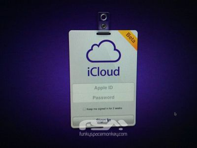
icloud login screenshot
FunkySpaceMonkey.com posts a screenshot of what it claims to be the login page for a beta version of Apple's iCloud service, claiming to have obtained the image from "Apple's internal server".

If you want all the rumors about they'ree [sic] easy to find on every site. But here's the first fact about it. We got a first look at the beta login page of iCloud, from Apple's internal server.

The meaning behind use of a "name badge" style window for the login is not entirely clear, although it could be construed to be offering users the feeling of gaining access to Apple's data centers.

FunkySpaceMonkey.com does not have a significant track record of posting Apple-related rumors, and so we are hesitant to put too much faith in it. We also do tend to see significant numbers of questionable claims and images showing up in the lead-up to major Apple events, but we felt that this one was interesting enough to publish.

Top Rated Comments

boshii Avatar
157 months ago
Score: 4 Votes (Like | Disagree)
blybug Avatar
157 months ago
Hmmm... if you compare the cloud logo to the official one that's appeared on the WWDC publicity material, they don't quite seem the same. In particular, look at the angle of the join between the two 'bumps' at the top of the cloud - this one looks more acute than the WWDC one and - at least to me - a bit aesthetically wrong, which doesn't sit right for Apple. That said, the WWDC shots are at an angle so the difference could just be an illusion.

There is nowhere else but MacRumors where I can spend my Sunday morning drinking coffee and reading a serious detailed analysis of the differences in angles of the bumps between a spy shot photo versus a supposed screen shot of an icon of a cloud.

And somehow be interested enough to reply. :D
Score: 3 Votes (Like | Disagree)
hglk Avatar
157 months ago
Its definitely Apple's style and there is no one who can do the design like that, if can he/she would work in Apple as a designer. So stop being a Sherlock.

Ignorant...

Any mildly good designer can copy any style and mold it...
Score: 3 Votes (Like | Disagree)
Žalgiris Avatar
157 months ago
Not really...it'd take 1 maybe 2 hours to knock that up.

Looks Apple-ish at least.

What matters is that it's nice. Not a penis contest here, pal.
Score: 3 Votes (Like | Disagree)
NightFox Avatar
157 months ago
Hmmm... if you compare the cloud logo to the official one that's appeared on the WWDC publicity material, they don't quite seem the same. In particular, look at the angle of the join between the two 'bumps' at the top of the cloud - this one looks more acute than the WWDC one and - at least to me - a bit aesthetically wrong, which doesn't sit right for Apple. That said, the WWDC shots are at an angle so the difference could just be an illusion.
Score: 3 Votes (Like | Disagree)
Northgrove Avatar
157 months ago
What makes this interesting is that it's just a login page, nothing else. It doesn't say anything about the features. Just a login page. So it's nothing to base an exclusive news story on for FunkySpaceMonkey. Not much to gain on it. And that's why I think it could be legitimate.

If you spent time to fake something, you might just as well fake something to bring some interesting "news".
Score: 3 Votes (Like | Disagree)