macOS Tahoe Review: Spotlight Shines, Liquid Glass Disappoints - MacRumors
Skip to Content

macOS Tahoe Review: Spotlight Shines, Liquid Glass Disappoints

We're on the fourth developer beta and first public beta of macOS Tahoe, which means we're getting closer to the launch version that's set to come out in September. With ‌macOS Tahoe‌ now available to the public, we thought it would be a good time to share an initial review of the update.


Like iOS 26, ‌macOS Tahoe‌ adopts the Liquid Glass design. It's used for the Dock, widgets, Control Center, menu bars, navigation bars in apps, app icons, and a few other places, but its implementation is less widespread than it is in iOS and iPadOS. It's clear that Liquid Glass was not a Mac-first design, and the glass parts of the interface feel cobbled together with the previous design language.

The floating element of Liquid Glass looks natural on the iPhone and the iPad, where glassy buttons hover over the app's content to provide a sense of depth, but ‌macOS Tahoe‌ doesn't have enough of the glass-like transparency to make that work in the same way on the Mac. There are not-so-transparent gray-shaded buttons and navigation bars that have a dated-looking shadowing behind them, and the rounded look doesn't help make things appear modern either. Liquid Glass looks better on darker backgrounds, but it very much feels like a work in progress. This is a beta, of course, so we could see further updates to Liquid Glass on the Mac before Tahoe launches.

Apple has been updating the ‌macOS Tahoe‌ design from beta to beta. Up until beta 4, Safari had a design where non-active tabs were denoted as such with an underline, while the active tab had none. That's typically not how underlining works, so determining which tab was in use was confusing. Apple thankfully adopted a color-based design in beta 4, so it's now clear which tab is at the forefront.

Though Liquid Glass doesn't feel fully developed in ‌macOS Tahoe‌, there are other new features that make a positive change to customization and function.

The Control Center and Menu Bar can be customized with the apps and features that you need most, and other less useful options can be tucked away or removed. The Control Center is more like the iOS Control Center, and you can create multiple pages with options organized in a way that works for you. Third-party app functions will be able to be added to the Menu Bar and Control Center too.

macOS adopts the tinted icon option from iOS, so you can tint your icons all the same color, or choose the Liquid Glass-style clear option (though be warned, it's more gray than clear on macOS). Folder colors can be customized too, and you can add an emoji to a folder to make it stand out.

One of the biggest changes in ‌macOS Tahoe‌ is to Spotlight, which is now a one-stop spot for everything that you might need to do on a Mac. You can use it to open apps, find anything on your Mac, see your clipboard history, and complete actions. Spotlight replaces Launchpad, so when you want to open an app, you'll now use Spotlight.

Search is more comprehensive and you're more likely to find what you're looking for using the file searching feature, plus you can keep tabs on what you've copied and pasted with the new clipboard history option. It stores a log of what you've copied for 24 hours.

Actions is an all-new Spotlight function. You can do all kinds of things without ever opening an app, like sending an email or message, starting a timer, creating a note, placing a call, creating a reminder or calendar event, and much more. Apple added quick access buttons that are easy to learn, so you can use Command 1, 2, 3, and 4 to get to the different Spotlight functions. For things you use most often, you can set up your own quick keys.

The Phone app is now on the Mac, which could be useful depending on your daily habits. There was already an option to answer a call on the Mac or make a FaceTime audio or video call, but now you have access to the full suite of phone functions for placing calls from the Mac. You'll need a connected iPhone with Wi-Fi Calling, of course. The Phone app on Mac includes the new features like Hold Assist, Call Screening, and Live Translation that you'll also find on the iPhone.

There's a new Games app that basically includes what's in the Games section of the Mac App Store and Apple Arcade. There's a "Play Together" option for challenging friends to beat you at a specific goal in a single-player game, and there's a multiplayer section for finding games to play with friends. The Games app doesn't seem all that useful as of right now, but maybe it will get additional features to make it more appealing in the future.

The Journal app is also now available for Mac, which will be a welcome change for those who want to write journal entries using a Mac's keyboard.

Many of the most useful ‌iOS 26‌ features and changes are also available on the Mac, like personalized Messages backgrounds, Apple Intelligence support for organizing Reminders, new ChatGPT styles for Image Playground, and support for the updated Genmoji.

Have you tried ‌macOS Tahoe‌ yet? Let us know what you think of the update in the comments.

Read More About macOS Tahoe

We have a macOS Tahoe roundup that walks through all of the different features in the update.
Related Roundup: macOS Tahoe
Related Forum: macOS Tahoe

Popular Stories

iphone duo standby

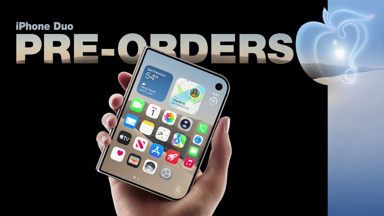
Apple Retail Staff Told to Warn Against iPhone Duo Walk-In Purchases

Saturday October 17, 2026 2:30 pm PDT by
Some Apple retail employees have been told to warn customers against visiting to purchase an iPhone Duo without a pre-order on Friday, October 23. Apple Store employees told MacRumors that they have been advised that there will likely be no iPhone Duo stock available for walk-in purchases on launch day. Staff have been instructed to discourage customers without pre-orders from coming in...
iPhone Handoff Feature

Verizon Will Charge $10 a Month for iPhone Handoff

Friday October 16, 2026 4:37 pm PDT by
Verizon plans to charge customers $10 per month for the iPhone Handoff feature that Apple added in iOS 27. iPhone Handoff allows one phone number to be shared across two separate iPhones. Pricing was included in Verizon's iPhone Duo announcement today, with the carrier confirming iPhone Handoff will work with the iPhone Duo and the iPhone 18 Pro models. Verizon will support iPhone Handoff,...
Black Apple Event Logo

Apple Now Inviting Media to October 28 'Launch Experience'

Thursday October 15, 2026 4:13 am PDT by
Apple has begun inviting selected members of the media to a product launch experience in Los Angeles on Wednesday, October 28, according to Bloomberg's Mark Gurman. In a post on X, Gurman described the gathering as an "all-day product launch experience" for touchscreen MacBooks, a new iPad mini, and Macs equipped with M6 chips. Gurman previously reported that Apple would introduce the...

Top Rated Comments

16 months ago
Remember when the Mac's entire reason for being was simplicity?
Cook needs to honor the history of Apple, this ain't it.
Score: 24 Votes (Like | Disagree)
16 months ago
I read a comment about Liquid Glass being like a runny egg and thought that overblown. It's not. I tried for a couple of minutes and it's not useable. Even with "increased contrast" there are some windows where the Glass effect is visible. The Glass effect does not have any improvement for usability. Instead it's just frosting.

Some dialogs at least have a better width. But others have the most stupid word break. Some icons look horrible on the dock most of the time but not always.

@Smartuser: Apple has sometimes walked back on some tiny little changes but never on the big ugly ones like the utterly stupid System Settings Design. On Tahoe the complete UI revamp is for the bin.
Score: 22 Votes (Like | Disagree)
16 months ago
This 'Glass' nonsense seems like it might be a nightmare for folks like me with astigmatism.
Guess we'll find out soon enough.
Score: 22 Votes (Like | Disagree)
bradman83 Avatar
16 months ago
When I heard Apple was adopting the glassy look from visionOS I was initially excited because I was hoping they’d be going for the smoked glass gray look. Since Big Sur macOS had had just too much stark white in light mode. Tahoe compounds this problem with its sidebar design. Instead of subtly showing the contents of whatever is below the window with a gentle blur, as has been the case since Yosemite, sidebars are now a floating slab of Liquid Glass. The problem is that Liquid Glass only looks good when it has something underneath it to refract. For the majority of windows in Tahoe it’s just white underneath. So you have layers of white on white, with only the faintest of drop shadows to separate the interface elements. Same with the Apple Music redesign, where the control bar is now on the bottom of the screen on a Liquid Glass bar that’s bright white so it washes away against the equally white background of a playlist.

Tahoe could be great but it desperately needs contrast between interface elements. Toolbar buttons are equally bad. Liquid Glass should be an eye popping accent but on the Mac at least it makes the whole UI somehow seem even more staid and muted.
Score: 20 Votes (Like | Disagree)
16 months ago
I've been running Tahoe since the first dev betas and I have to say the new look is just not landing with me either. It's passable on iOS and iPadOS (though it still has plenty of things that need to, and I think will be, worked out before public release), but a desktop OS is just a different beast altogether.

The talk of "consistency" is just Apple marketing spin. You make UIs consistent across devices through things like following the same style for toggles, the same UX patterns for how you display data or navigate through views or do simple tasks like adjust columns in a list view. And having said that, as much as there's an argument that "for consistency, macOS buttons should look like liquid glass because that's what iOS buttons look like," let me point out an intentional decision in macOS Tahoe to introduce different window radii based on the type of window.


So consistency... with what, exactly? Here's a real world example of several windows overlapping. (This second source is from a Reddit user. Apologies for lack of a proper source citation!)


And that example brings up another pain point about Liquid Glass on a desktop OS. As some have mentioned, the glass effect works best when it has something behind it to refract, otherwise it's just sorta visual noise or at best, a frosted look that reminds folks of Windows Vista. Apple has tried this before, with the sidebar in Finder being semi-translucent, allowing some of the desktop wallpaper to peek through and give the sidebar more visual interest. That's seemingly worked well and is passable. But now, where possible, Apple is encouraging actual window content behind the sidebar. Obviously obscuring your own content would be bad, so they're literally going out of their way with programmatic hacks, like this iPadOS example where the system will dynamically mirror and blur the content to extend behind the sidebar. (This example is on an iPad, but the effect "backgroundExtensionEffect()" is available for all platforms ('https://developer.apple.com/documentation/SwiftUI/View/backgroundExtensionEffect()'), interestingly.


Don't get me wrong. The option on the left looks terrible. The option on the right is better, but still, pretty terrible and hackey.

Finally, going back to more of the Liquid Glass on UI elements itself, Apple, and UX folks more broadly, have talked for YEARS about how good UI should recede into the background when not in use, and for years, Apple has generally done a good job of continuing to push this principle. Yet, now all of the icons in the Safari and Finder toolbars have giant circles around them. They're doing that in order to make the liquid glass look work, especially when content moves under them, but that's also visually pulling my attention and focus towards the elements, not away from them. The effect is even worse when I have multiple windows open on my Mac, and background windows still are commanding dominance because they're highlighting liquid glass controls (this time in darker, filled in circles, but still, more visually noisy than it is today).


This example is from beta 3 and it has gotten better in the more recent betas, but it's still very frustrating.

And my last point in general is unlike iOS or even iPadOS, I have a larger screen for my Mac. I have more room for content. The UX and "chrome" of buttons and stuff around my content isn't "in the way" at all. Yes, I do want it to recede when not in use, but I also have no need to "hide it" so that "more of my content" can show. Seeing another 30-40 pixels of my Finder folders underneath glassy toolbar buttons as I scroll a window adds NOTHING valuable to my experience. As someone who's been in the UX industry for over 20 years, a decision like that is a nonstarter for me.

Apologies for the long rant, but like others, I'm not a fan of liquid glass on macOS. There's some potential for it, and some elements that can be brought froward, but by and large they're introducing a LOT of new problems and a lot of new things that will need to be fixed, and it's going to take a lot more work than what they can deliver between now and later this year.

Attachment Image

Attachment Image

Attachment Image

Attachment Image
Score: 14 Votes (Like | Disagree)
16 months ago
If the liquid glass on Mac isn't good - Sorry, but I'm going to complain about it. I'm a Mac-first user, have been for 30+ years.
Apple is (or was) always known for their impressive GUIs and thoughtful design. Sure, there have been blunders, but this sounds like a combination of very large blunders scattered all of the Mac UI.....NOT what I was hoping for. And I was definitely not hoping that the Mac would be last on the list for getting the new UI designs.

I have to use my Mac for work, so I don't dare to install the public beta on it. So I can't say first hand, but this report scares me.

It's just another Here we go again Apple. Massive failure at just about all levels.

Solution: Do some serious employee (including board members and executives) housecleaning. It's the only solution at this point. The sooner they recognize this, the sooner we might have an Apple company around that survives disaster after disaster.


I honestly just wish that the stock price just tanks. And I apologize in advance to anyone holding Apple stock, it's not personal. I had some back in the day. But these days, Apple is only driven by increasing their stock price, and it has just gotten out of control at this point. If the price drops, they'll have to actually work for once, which will bring the price back on up for anyone holding it.

Other than that, I only see declining products across the board.
Score: 10 Votes (Like | Disagree)
Latest Stories
Apple Retail Staff Told to Warn Against iPhone Duo Walk-In Purchases
9 hours ago
Apple Hires Former Meta Lawyer to Oversee Global Litigation
10 hours ago
Top Stories: Apple HomeView, New Apple TV and HomePod mini, and Sold-Out iPhone Duo
18 hours ago
Verizon Will Charge $10 a Month for iPhone Handoff
1 day ago
Apple Calls iPhone Duo Demand 'Extraordinary' After Orders Slip to 2027
1 day ago
New App Store Rules Target AI Deepfakes and Nudify Apps
1 day ago
Didn't Pre-Order Apple's HomeView? Here's How Long the Wait is Now
1 day ago
Apple's $79 iPhone Duo Case Sticks On With Adhesive
1 day ago
Apple TV 4K and HomePod Mini Price Increases 'Much More Striking' Than New Features
2 days ago
The MacRumors Show: Was HomeView Worth the Wait?
2 days ago
Apple Refers to HomeView as 'HomePodDevice' in Legal Document
2 days ago
Apple Pre-Orders Kick Off With First Discounts on HomeView and Apple TV 4K
2 days ago
Developers Question Scope of Potential Apple Antitrust Settlement
2 days ago
iPhone Duo Resold for $5,000 on eBay After Selling Out
2 days ago
Massive Discounts Hit 2026 MacBook Pro With Up to $800 Off
2 days ago
iPhone Duo is Sold Out for Christmas as Shipping Estimates Slip to 2027
2 days ago
Didn't Pre-Order an iPhone Duo Yet? Wait Times Are Significant Now
2 days ago
First Apple TV 4K Pre-Order Discount Arrives at Amazon
2 days ago
iPhone Duo Pre-Order Deals: The Best Carrier Offers From AT&T and T-Mobile
2 days ago
iPhone Duo Now Available to Pre-Order From Apple
2 days ago
iPhone 18 Pro vs. iPhone Duo Buyer's Guide: Which Should You Choose?
2 days ago
Apple Store Down Ahead of iPhone Duo Pre-Orders
2 days ago
Oops, Apple's Website Just Hinted at iPad Mini 8
2 days ago
OLED MacBook Pro Won't Get M7 Chips Until Late 2027
2 days ago
Apple Pledged $25 Million to Trump's White House Ballroom
2 days ago
Touchscreen MacBook Pro Could Launch on November 6
2 days ago
New Withings Users Must Pay $99/Year for Apple Health Syncing
2 days ago
Meta and Apple Bring Muse Spark Open AI Model to Mac Studio
3 days ago
iPad Mini 8: Apple Has Tested Both 60Hz and 120Hz ProMotion Displays
3 days ago
Apple TV 4K 2022 vs. 2026 Buyer's Guide: All Differences Compared
3 days ago