Apple this morning released the fourth beta of iOS 13 for developers, introducing bug fixes and adding and refining iOS 13 features.
Now that we're into the fourth beta, changes and updates are getting more minor, but there are still some small but notable tweaks that are worth highlighting in today's beta.
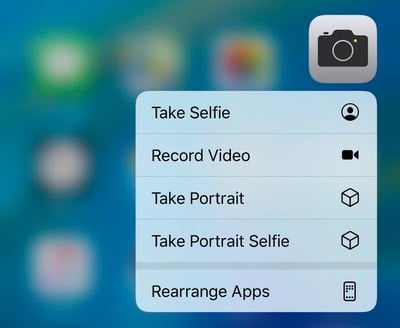
- Quick Actions - There's a refreshed look for Quick Actions on the Home screen, which adds a new "Rearrange Apps" option that lets you quickly get to the wiggle mode that allows apps to be moved around.
- Quick Actions Menu Size - The menu that pops up when using a Quick Action is also smaller in size with less obtrusive icons that have also been relocated to the right side of the menu interface.
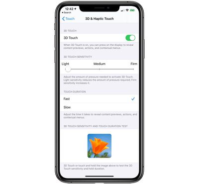
- 3D Touch Settings - In the Accessibility section of the Settings app, there are new options for 3D Touch in the 3D & Haptic Touch section (which was previously just 3D Touch). There's a new "Touch Duration" section alongside the sensitivity slider. The Touch Duration option changes the amount of time it takes to reveal content previews, actions, and contextual menus.
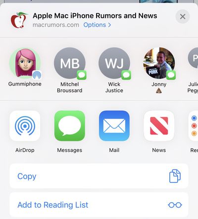
- Share Sheet - Some minor design changes have been made to the Share Sheet in iOS 13, tweaking the colors and adding some transparency.
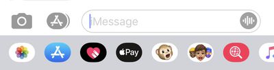
- Voice Messages - When using the option in Messages to record a voice-based message, there's a new icon for the option. It's now a waveform rather than a microphone icon.
- Widgets - When editing Widgets in the Today View, you'll see a new look for the edit button, which is now pill-shaped rather than circular.
Know of a feature that's new in iOS 13 beta 4 that we left out? Make sure to let us know in the comments and we'll update this article.
Top Rated Comments
I really hate the share sheet
I am a fan of the new share sheet. I find it a lot more useful.I really hate the share sheet
As an introvert, it’s irking me to have all my contacts right there. It sounds a bit bad, but what can I say! I don’t need to see them to think of them when sending something. This Share Sheet is made for extroverts.I’ve been playing around with the beta. The vertical options is a curveball. It remains to be seen if it’ll be equally or more effective than the current horizontal panel, or if it will be as cumbersome as it appears…
That said, it appears there are suggestions based of usage history, and that could be useful.
As an introvert, it’s irking me to have all my contacts right there. It sounds a bit bad, but what can I say! I don’t need to see them to think of them when sending something. This Share Sheet is made for extroverts.
I’ve been playing around with the beta. The vertical options is a curveball. It remains to be seen if it’ll be equally or more effective than the current horizontal panel, or if it will be as cumbersome as it appears…
That said, it appears there are suggestions based of usage history, and that could be useful.
As an introvert myself it doesn’t bother me in the slightest. There are still a few people I keep in contact with and this makes it a lot easier to share.
As another introvert, I like this share sheet because it removes a step from sending something to my wife or daughter.As an introvert, it’s irking me to have all my contacts right there. It sounds a bit bad, but what can I say! I don’t need to see them to think of them when sending something. This Share Sheet is made for extroverts.
As an introvert myself it doesn’t bother me in the slightest. There are still a few people I keep in contact with and this makes it a lot easier to share.