Netflix Rolling Out iOS Update That Adds Bottom Tab Bar for Easier Navigation - MacRumors
Skip to Content

Netflix Rolling Out iOS Update That Adds Bottom Tab Bar for Easier Navigation

by

Over the past few days there have been multiple reports of a new update to the Netflix app on iOS and Android devices, which includes a design overhaul for the streaming service's navigation bar on smartphones. Instead of placing every piece of navigation within the top lefthand corner "hamburger" menu, Netflix has introduced a simpler tab bar at the bottom of the app with four tabs for Home, Search, Downloads, and More.

netflix update ios

Netflix's hamburger menu (iPad) compared to the new bottom tab bar (iPhone)

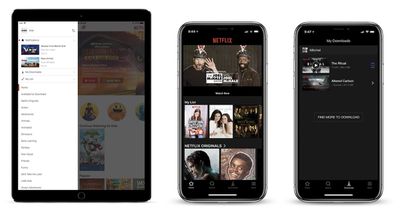
Previously, the left-handed menu housed profile switching, notifications, downloads, My List, and various themed categories. Now, these options are mostly located in the "More" tab, and Netflix has broken out Search and Downloads as a quicker method of jumping into those areas of the app. TV and film categories are also now located in the Search tab, including those Available for Download, Netflix Originals, Action, Dramas, Horror, and more. On Android, it appears that there will be an additional tab for users called "Coming Soon," displaying TV shows and movies launching soon on Netflix.

Apple encourages developers to use tab bars at the bottom of their apps in its Human Interface Guidelines, since they're easier to use one-handed and provide more information at a glance. Two years ago Spotify made a similar change, replacing its hamburger menu with five tabs for Home, Browse, Search, Radio, and Your Library, akin to Apple Music's tabs on iOS. Earlier this month, Google Maps added a bottom tab bar in its iOS app as well, so users could easily jump to Explore, Driving, or Transit information.

Netflix's rollout plan for the new tab bar remains unclear, with some iPhone and iPad users already seeing the update and others remaining on the older hamburger menu style.

Tag: Netflix

Top Rated Comments

Iconoclysm Avatar
107 months ago
Netflix ... just please do NOT screw up the AppleTV UI like Google did with their YouTube app. Please I'm begging you!!
Netflix's AppleTV app wastes massive amounts of space. You can literally only see one row at a time. Youtube's app isn't great but at least they don't devote 2/3 of the screen to a jpeg image.
Score: 6 Votes (Like | Disagree)
WiseAJ Avatar
107 months ago
Can they make the Apple TV app easier to navigate now?
Score: 2 Votes (Like | Disagree)
107 months ago
I hate hamburger menus. They literally looked at the worst design mistake you can ever make, mystery meat navigation, and said “YES! LETS DO THAT!” And to add insult injury they even made it look like a hamburger
Score: 2 Votes (Like | Disagree)
107 months ago
Care to provide some suggestions for improvements? I feel the UI their using is pretty much standard: Tubi, Twitter is the same for scrubbing, Tubi the same for icon layout of videos, no auto preview. I don't like how auto previews have some Netflix custom audio that doesn't match with the video (Tron Classic) and is repeated for other movies.
#1: get rid of auto-play. It's an abomination. No app should just start randomly playing crap if you leave it sitting alone for a moment.
Score: 1 Votes (Like | Disagree)
supercoolmanchu Avatar
107 months ago
Netflix ... just please do NOT screw up the AppleTV UI like Google did with their YouTube app. Please I'm begging you!!
Netflix’s Apple TV UI is 100% pure *******.

Love ‘me for the video content, but their software warrants war crime prosecutions.

Worst use of space, horribly sized content thumbnails, obnoxious new auto-audio when browsing adds new lows in overall piss poor user experience, which already includes perhaps the worst content browsing of any modern media platform.

And the cherry on Netflix’s software failure is the absolutely stupid profile select screen you’re forced to click thru every time you select the app, even if your home is using only one profile.
Score: 1 Votes (Like | Disagree)
107 months ago
It’s a welcome improvement, but still not enough to make it a great app.

Why didn’t they add ‘My List’ to the tab bar as well? To me that item is more important than the download section. The app also still kicks you out of the app when you attempt to access the account settings.

I personally also still hate the horizontal scrolling. I’d rather have vertical scrolling only (you can do this on the web version).
Score: 1 Votes (Like | Disagree)

Popular Stories

Dynamic Island iPhone 18 Pro Feature

11 Reasons to Wait for the iPhone 18 Pro

Monday May 11, 2026 9:01 am PDT by
We're only four months out from the launch of Apple's premium next-generation smartphone lineup, and while we're not expecting a sea change in terms of functionality, there are still several enhancements rumored to be coming to the iPhone 18 Pro and iPhone 18 Pro Max. One thing worth noting is that Apple is reportedly planning a major change to its iPhone release cycle this year, adopting a...
iOS 26

iOS 26.5 Features: Everything New in iOS 26.5

Monday May 11, 2026 5:09 pm PDT by
Apple released iOS 26.5 after a few months of beta testing, and while it doesn't have the Siri features we were hoping for since those are being held until iOS 27, there are a handful of useful changes worth knowing about. Subscribe to the MacRumors YouTube channel for more videos. End-to-End Encryption for RCS Support for end-to-end encryption (E2EE) for RCS messages between iPhone and...
General Apps Reddit Feature

Reddit Starts Blocking Mobile Website, Pushing Users to App Instead

Monday May 11, 2026 6:10 am PDT by
Social network Reddit recently began blocking mobile visitors to its website while pushing them to download the official Reddit app, and it's fair to say that the move is not going down well with users. If you visit reddit.com on your iPhone today, you may see a new popup that can't be dismissed, asking you to "get the app to keep using Reddit." A Reddit spokesperson told Ars Technica...