Apple today announced that macOS Ventura will be available on Monday, October 24, the same day that iPadOS 16.1 will be available to iPad customers.
macOS Ventura is a notable update for the Mac, bringing new features such as Stage Manager, a new Clock and Weather app, and updates to core system apps like Messages and Safari. System Settings, previously known as System Preferences, has also been completely redesigned to make it more in line with the design on iOS and iPadOS. For a full breakdown of everything new in macOS Ventura, see our roundup.
Apple has unveiled a whopping nine new products so far this March, including an iPhone 17e, iPad Air models with the M4 chip, MacBook Air models with the M5 chip, MacBook Pro models with M5 Pro and M5 Max chips, the all-new MacBook Neo, an updated Studio Display, a higher-end Studio Display XDR, AirPods Max 2, and now the Nike Powerbeats Pro 2.
iPhone 17e features the same overall design as...
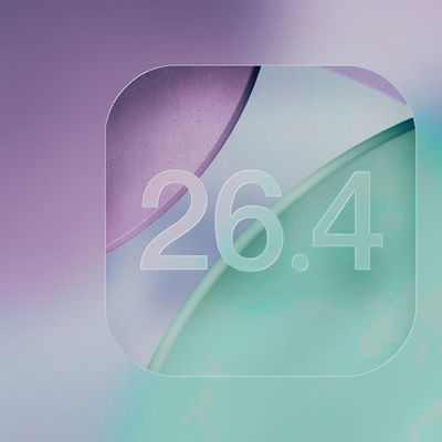
iOS 26.4 isn't the major update with new Siri features that we hoped for, but there are some useful quality of life improvements, and a little bit of fun with an AI playlist generator and new emoji characters.
Playlist Playground - Apple Music has a Playlist Playground option that lets you generate playlists from text-based descriptions. You can include moods, feelings, activities, or...
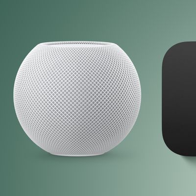
Apple has unveiled nine new products this month, but the wait continues for the next-generation Apple TV 4K and HomePod mini models.
In his Power On newsletter today, Bloomberg's Mark Gurman said new versions of the Apple TV and HomePod mini have been "ready" since last year, but he reiterated that Apple has held off on releasing them until the more personalized version of Siri and other...
I wish they would add *BACK* a freaking hint of contrast in apps like Mail so the folders bar, commands up top, emails/folder summary, and email preview didn’t all blend together in a complete white-out!
Edit: I added *BACK* because the OS interface for Mail (and other native apps) used to be quite attractive *and* intuitive with how it was laid out before Mac OS was “improved” to the minimalist white-out it is today.
Edit #2: I’ve been experimenting since day 1 with increase contrast and other adjustments Apple condescendingly and dismissively hides under “Accessibility.” Not enough improvement/change back to similar to how it was before. Those settings belong under a section titled “Common Sense and Intuitive User Interface Element Options” and not “Accessibility.”
I wish they would add a freaking hint of contrast in apps like Mail so the folders bar, commands up top, emails/folder summary, and email preview didn’t all blend together in a complete white-out!