In the third developer beta of macOS Monterey, which came out this morning, Apple has overhauled the design of Safari, making the tab bar more similar to the current tab bar in macOS Big Sur.
The prior Safari design did away with the dedicated URL and search interface, instead allowing any individual tab to be used for navigation input. Tabs were also all arranged at the top of the display to minimize the space taken up at the top of a Safari window.
In macOS Monterey, Apple has walked this back. There's a dedicated URL/search bar at the top of the Safari window, with the tabs arranged below it. Clicking on a tab makes it the active window and it's easier to drag tabs for rearranging or opening in a new window.
It's still quite far off from the current Safari design in macOS Big Sur, but it's certainly an improvement over the initial macOS Monterey design.
The new and separate tab bar is enabled by default when upgrading to macOS Monterey beta three, but Apple has included an option to revert to the original Monterey design. If you to go View and toggle off "Show Separate Tab Bar," you can use the original design.
macOS Monterey beta 3 also appears to lay the groundwork for Universal Control. Under System Preferences -> Displays -> Add Display -> Advanced, there are now preferences that can be selected for the Universal Control feature.
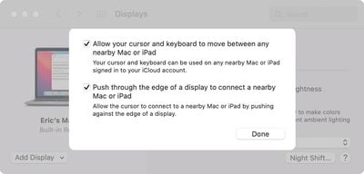
Unfortunately, Universal Control is not functional and we'll have to wait for a later beta to experience a working version.
Following nearly two years of rumors about a fourth-generation iPhone SE, The Information today reported that Apple suppliers are finally planning to begin ramping up mass production of the device in October of this year. If accurate, that timeframe would mean that the next iPhone SE would not be announced alongside the iPhone 16 series in September, as expected. Instead, the report...
Key details about the overall specifications of the iPhone 17 lineup have been shared by the leaker known as "Ice Universe," clarifying several important aspects of next year's devices. Reports in recent months have converged in agreement that Apple will discontinue the "Plus" iPhone model in 2025 while introducing an all-new iPhone 17 "Slim" model as an even more high-end option sitting...
Wednesday July 24, 2024 9:06 am PDT by Joe Rossignol
Apple supply chain analyst Ming-Chi Kuo today shared alleged specifications for a new ultra-thin iPhone 17 model rumored to launch next year. Kuo expects the device to be equipped with a 6.6-inch display with a current-size Dynamic Island, a standard A19 chip rather than an A19 Pro chip, a single rear camera, and an Apple-designed 5G chip. He also expects the device to have a...
Thursday July 25, 2024 5:43 am PDT by Tim Hardwick
Apple typically releases its new iPhone series around mid-September, which means we are about two months out from the launch of the iPhone 16. Like the iPhone 15 series, this year's lineup is expected to stick with four models – iPhone 16, iPhone 16 Plus, iPhone 16 Pro, and iPhone 16 Pro Max – although there are plenty of design differences and new features to take into account. To bring ...
Apple’s iCloud Private Relay service is down for some users, according to Apple’s System Status page. Apple says that the iCloud Private Relay service may be slow or unavailable. The outage started at 2:34 p.m. Eastern Time, but it does not appear to be affecting all iCloud users. Some impacted users are unable to browse the web without turning iCloud Private Relay off, while others are...
I feel like I’m the only person that liked the change! Oh well, not a big deal to me at the end of the day as I’m one to never really have more than 5 tabs open and close them as soon as I’m done. I mostly appreciated how the interface stayed thin with more than one tab open. Oh well, can’t please everyone!
edit: as others have pointed out, there’s a choice between the two styles! Happy day :)