Google Maps developers yesterday introduced some visual changes and subtle navigation aids for both desktop and iOS that aim to make it easier for users to explore the world around them.
Google Maps
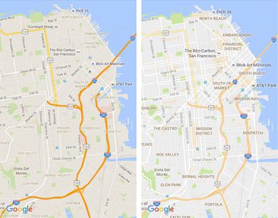
The most immediately obvious visual changes include the removal of road outlines to make traffic and transit routes easier to delineate, as well as clearer typography for street names, points of interest, transit stations, and so on, making them more distinguishable.


Another, less obvious but significant change is the way Google Maps represents high density areas of interest – restaurants, bars, shops, and so on – which now appear as orange shaded hotspots on the map. As the video above demonstrates, zooming into an orange area brings more details into focus, allowing users to tap them for more information.
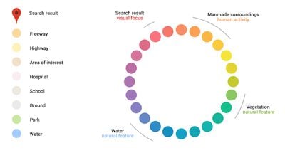
Google Maps color schemeThe new Maps also gains a more subtle and balanced color scheme to help users differentiate between man-made and natural topographic features, as well as identify places like hospitals, schools and highways more easily.

Google Maps is a free download for iPhone and iPad available on the App Store. [Direct Link]

Top Rated Comments

Sandstorm Avatar
116 months ago
I like the new design. And either way - everything Google Maps offers is still LIGHT YEARS ahead of the Apple Maps.
Score: 7 Votes (Like | Disagree)
Northgrove Avatar
116 months ago
Looking... hmm, OK. With reservations for how this looks in daylight.

At first glance I thought they had just lowered contrast by brightening everything and bringing earlier bold colors to be more pastel like, which would be a bad thing since low contrast sucks especially in daylight.

However, due to how ridiculously poor contrast streets already were (mid grey with a hint of warmth against a little bit darker grey), I think the new style (light grey against white) is slightly better although clearly not perfect if in broad daylight.

The highway above is now more pastel like which I don't think matters too much because it still clearly stands out thanks to its deviating color. This also helps bring attention to route numbers and the district names that are all given better attention.

Still, this is one pastel like map. It seems like Google is shooting for a 50/50 split between style and usability. I'd prefer a bolder move there, 30/70? These maps are, after all, heavily used outdoors and then bright pastel colors are far from optimal.

Another idea is if Google Maps (and Apple Maps?) would have a switch to enable bolder colors. That would help a lot sometimes. Here's an example from the Swedish Eniro service which I think has a map much more tuned towards actual use: http://i.imgur.com/FhYn5ov.jpg (sorry for JPG on what should have been a PNG; Imgur is being stupid)
Score: 5 Votes (Like | Disagree)
Michael Scrip Avatar
116 months ago
Hmmmm... I like the larger, more prominent names... but I'm not a fan of the lightening of the major highways.
Score: 4 Votes (Like | Disagree)
Aston441 Avatar
116 months ago
Looking... hmm, OK. With reservations for how this looks in daylight.

At first glance I thought they had just lowered contrast by brightening everything and bringing earlier bold colors to be more pastel like, which would be a bad thing since low contrast sucks especially in daylight.

However, due to how ridiculously poor contrast streets already were (mid grey with a hint of warmth against a little bit darker grey), I think the new style (light grey against white) is slightly better although clearly not perfect if in broad daylight.

The highway above is now more pastel like which I don't think matters too much because it still clearly stands out thanks to its deviating color. This also helps bring attention to route numbers and the district names that are all given better attention.

Still, this is one pastel like map. It seems like Google is shooting for a 50/50 split between style and usability. I'd prefer a bolder move there, 30/70? These maps are, after all, heavily used outdoors and then bright pastel colors are far from optimal.

Another idea is if Google Maps (and Apple Maps?) would have a switch to enable bolder colors. That would help a lot sometimes. Here's an example from the Swedish Eniro service which I think has a map much more tuned towards actual use: http://i.imgur.com/FhYn5ov.jpg (sorry for JPG on what should have been a PNG; Imgur is being stupid)
Agree 100%


Back in the day I used a custom color scheme with my TomTom that was similar to the Swedish one you linked too.

Contrast and usability should always trump style, especially at 80mph.

I guarantee a color scheme like GMap's latest would never be installed in an F-35.
[doublepost=1469533382][/doublepost]
I don't care about Google Maps because I don't use them but I will reply because some comments here are about Apple Maps.


Readability issue should be solved with hardware. Screen should be bright enough to work on the sunlight. Apple moves toward this goal. Compare iPhone 6 and 5.
I don't think different contrast would perform better on the sunlight. When you are using bad screen, like Nintendo 3DS for example, it is impossible to see what's on it, no matter what game are you playing.


Bad idea. Adding a switch is easy but it is bloating UI, makes it more dangerous because you now need to think about this switch and you need to manage it. It also makes it more complicated and most people will don't understand it. I saw people having troubles navigation because the've been using car navigation when walking. Adding one more switch will not make things better.


This Swedish map makes me want to puke. I am using maps almost every day and if I would have to use this, I would become depressed in a week. Design is not just for prettiness, it affects our mood and perception.
Dear Lord what is going on with our millennials?

Depressed? Mood?

Holy...

Dude at 80mph I don't give a flying about your mood. I'm trying to navigate safely at high speed. Shove your feels.
Score: 4 Votes (Like | Disagree)
sshambles Avatar
116 months ago
I always thought Apple Maps looked a little out of place at first (with its colour tones), but now Google Maps have just done exactly that too. Makes sense, but still.
Score: 3 Votes (Like | Disagree)
urtules Avatar
116 months ago
I don't care about Google Maps because I don't use them but I will reply because some comments here are about Apple Maps.

Increasing colour contrast to make map more readable...
Readability issue should be solved with hardware. Screen should be bright enough to work on the sunlight. Apple moves toward this goal. Compare iPhone 6 and 5.
I don't think different contrast would perform better on the sunlight. When you are using bad screen, like Nintendo 3DS for example, it is impossible to see what's on it, no matter what game are you playing.

Another idea is if Google Maps (and Apple Maps?) would have a switch to enable bolder colors.
Bad idea. Adding a switch is easy but it is bloating UI, makes it more dangerous because you now need to think about this switch and you need to manage it. It also makes it more complicated and most people will don't understand it. I saw people having troubles navigation because the've been using car navigation when walking. Adding one more switch will not make things better.

Here's an example from the Swedish Eniro service which I think has a map much more tuned towards actual use: http://i.imgur.com/FhYn5ov.jpg
This Swedish map makes me want to puke. I am using maps almost every day and if I would have to use this, I would become depressed in a week. Design is not just for prettiness, it affects our mood and perception.
Score: 1 Votes (Like | Disagree)

Popular Stories

iPhone 17 Pro Blue Feature Tighter Crop

iPhone 17 Pro Launching in Three Months With These 12 New Features

Saturday June 14, 2025 5:45 pm PDT by
The iPhone 17 Pro and iPhone 17 Pro Max are three months away, and there are plenty of rumors about the devices. Below, we recap key changes rumored for the iPhone 17 Pro models as of June 2025:Aluminum frame: iPhone 17 Pro models are rumored to have an aluminum frame, whereas the iPhone 15 Pro and iPhone 16 Pro models have a titanium frame, and the iPhone X through iPhone 14 Pro have a...
apple watch ultra 2 new black

Apple Watch Ultra 3 Finally Coming After Two-Year Hiatus

Monday June 16, 2025 8:45 am PDT by
Apple will finally deliver the Apple Watch Ultra 3 sometime this year, according to analyst Jeff Pu of GF Securities Hong Kong (via @jukanlosreve). The analyst expects both the Apple Watch Series 11 and Apple Watch Ultra 3 to arrive this year (likely alongside the new iPhone 17 lineup, if previous launches are anything to go by), according to his latest product roadmap shared with...
Logitech Logo Feature

Logitech Announces Two New Accessories for WWDC

Friday June 13, 2025 7:22 am PDT by
Alongside WWDC this week, Logitech announced notable new accessories for the iPad and Apple Vision Pro. The Logitech Muse is a spatially-tracked stylus developed for use with the Apple Vision Pro. Introduced during the WWDC 2025 keynote address, Muse is intended to support the next generation of spatial computing workflows enabled by visionOS 26. The device incorporates six degrees of...
iPadOS 26 App Windowing

Apple Explains Why iPads Don't Just Run macOS

Friday June 13, 2025 7:46 am PDT by
iPadOS 26 allows iPads to function much more like Macs, with a new app windowing system, a swipe-down menu bar at the top of the screen, and more. However, Apple has stopped short of allowing iPads to run macOS, and it has now explained why. In an interview this week with Swiss tech journalist Rafael Zeier, Apple's software engineering chief Craig Federighi said that iPadOS 26's new Mac-like ...
iphone 16 pro models 1

17 Reasons to Wait for the iPhone 17

Thursday June 12, 2025 8:58 am PDT by
Apple's iPhone development roadmap runs several years into the future and the company is continually working with suppliers on several successive iPhone models simultaneously, which is why we often get rumored features months ahead of launch. The iPhone 17 series is no different, and we already have a good idea of what to expect from Apple's 2025 smartphone lineup. If you skipped the iPhone...
terminal macos tahoe

Apple's Terminal App Gets Colorful Redesign in macOS Tahoe

Monday June 16, 2025 4:12 am PDT by
Apple's Terminal app is getting a visual refresh in macOS Tahoe, and it's the first notable design update since the command-line tool debuted. The updated Terminal will support 24-bit color and Powerline fonts, according to Apple's State of the Platforms presentation at WWDC25. The app will also adopt the new Liquid Glass aesthetic with redesigned themes that align with macOS 26's broader...
apple watch ultra snow

6 Features Coming to the Apple Watch Ultra 3

Tuesday February 25, 2025 9:00 am PST by
The Apple Watch Ultra 3 is expected to launch later this year, arriving two years after the previous model with a series of improvements. While no noticeable design changes are expected for the third generation since the company tends to stick with the same Apple Watch design through three generations before changing it, there are a series of internal upgrades on the way. By the time the ...
iOS 26 Feature

Apple Seeds Revised iOS 26 Developer Beta to Fix Battery Issue

Friday June 13, 2025 10:15 am PDT by
Apple today provided developers with a revised version of the first iOS 26 beta for testing purposes. The update is only available for the iPhone 15 and iPhone 16 models, so if you're running iOS 26 on an iPhone 14 or earlier, you won't see the revised beta. Registered developers can download the new beta software through the Settings app on each device. The revised beta addresses an...