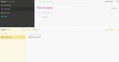
iCloud.com has received a makeover with new icons and design inspired by iOS 7, after previously rolling out to beta customers back in August. The background wallpaper mirrors the dynamic, slowly changing wallpaper offered in iOS 7 as well.
The site is using new icons for Mail, Contacts, Calendar, Notes, Reminders and Find My iPhone; while iWork for iCloud is still using the older-style iWork for iOS icons.
The apps -- with the exception of iWork -- have all received extensive redesigns as well, using lighter pastel colors and slimmer fonts.
Apple's first high-end MacBook redesign in five years is expected to arrive in the near future, bringing a run of firsts to the Mac.
Bloomberg's Mark Gurman expects the laptop to arrive between late 2026 and early 2027, with the later window now looking more likely owing to the global memory chip shortage. Analyst Ming-Chi Kuo expects mass production to begin by late 2026.
Apple last...
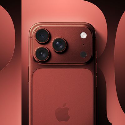
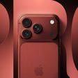
It is now late July, and that means the iPhone 18 Pro and iPhone 18 Pro Max are less than two months away. The devices are expected to look similar to the iPhone 17 Pro and iPhone 17 Pro Max, but there will still be many year-over-year changes, with rumored features including a smaller Dynamic Island, 5G via satellite, and more.
Apple is expected to unveil the iPhone 18 Pro, iPhone 18 Pro...
Thursday July 23, 2026 8:26 am PDT by Tim Hardwick
Apple's iPhone 18 Pro models and its first foldable are less than two months from being unveiled. That may sound like a reason to sit tight if you're looking to upgrade from an iPhone 16 or older series, but between looming price hikes and Apple's new split-launch calendar, there's a decent case for grabbing an iPhone 17 series model right now. Here are five reasons in favor of putting your order ...
I must be on my own, but I still find the design style of iOS7 to be off putting and unrefined. Not that I preferred the look in iOS6, I didn't - a change was most definitely necessary - I just think Apple missed the mark on this.
Seriously, I can't wait for Apple bringing back shadows and gradients, followed by usability and taste. Let's give them about 5 years.... If that's the future of OS X, I need to go look for something else in the meantime…
C'mon, using some pseudo-fancy style of Helvetica and random icons doesn't make a user interface as expected from Apple...
Never thought I'd miss linen in my life, but this is just tragic. I'm glad to see that many agree. I like the overall look of iOS 7, but this looks like Microsoft trying to copy it
For those looking around Elementary/Ubuntu (http://elementaryos.org) is looking pretty good these days.
What it lacks is what we're looking at here - Apple's ecosystem, which sadly, requires OS X.
I don't like the way OS X is heading, either - iOS is deliberately limited because the processors can't handle a full OS, and that just happens to be good for beginners, but that's no reason to dumb down OS X.
Sadly OS X was never as user friendly as the Mac OS, and I'm almost glad they took the Mac off Mac OS X, because it never came close to Mac intelligence. If you came from Windows you wouldn't know, but fiddlying text files is 1960s technology (as is unix, yes I know Elementary is Unix). Mac had a gui for everything but machine code.
It's the little things, like opening an app and putting into the background because it's going to take a while to start up, and having the ****** app stay there until I ask for it again. Only OS X could give us backgrounded apps jumping to the front on a Mac.
Or how about actually calculating folder sizes in a list view (I have a thunderbolt drive that does that, but nothing Apple ships does it).
And the disturbing trend - opening multiple Tabs in the background in Safari, and finding they don't actually load until you switch to each tab - iOS comes to OS X in the worst possible way.
Disturbing as yellow on white is (and it truly is Microsoft-level clueless), Mac owners have much more to worry about.
Apple's first foldable iPhone, with a book-style design featuring a ~5.5-inch outer display and a ~7.8-inch inner display with a minimal crease down the middle.