Apple has quietly made some changes to iOS 6's App Store app formatting tonight and introduced a new search results format that seem clearly inspired by Chomp.
Chomp was a three-year old search and app discovery startup that was acquired by Apple earlier this year. The reason for the acquisition was reportedly to improve the App Store search and app discovery. It appears the first of those efforts are being deployed in iOS 6.
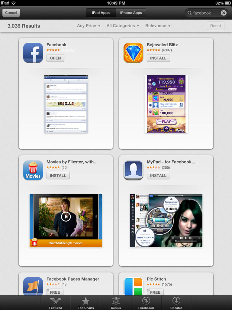
iOS 6 search results on left, Chomp app shown on right
On the iPhone, the new search results show a single tile result that can be swiped to move to each new result. Chomp's iOS app used a similar tile system in their search results.
In a thread in our forums, some users are already unhappy with the shift as it is slower to browse through many results.
Meanwhile, 9to5Mac notes several other changes in App Store functionality such as Genius support, Purchased section and Podcast search:
Also adding to the iOS 6 App Store updates, Apple has enabled the Genius recommendation section this evening, providing users with apps that may be in their interest to download. Furthermore, the purchased section has also joined the party, displaying all the apps a user has downloaded to their account, making it easy to retrieve favorite apps. Last but certainly not least, the iTunes Store has been updated with the ability to once again search for podcasts.
The iPad version of iOS 6 also shows the new tile-based results, but is able to show four results at a time. (screenshot).
The long wait for an Apple Watch Ultra 3 appears to be nearly over, and it is rumored to feature both satellite connectivity and 5G support.
Apple Watch Ultra's existing Night Mode
In his latest Power On newsletter, Bloomberg's Mark Gurman said that the Apple Watch Ultra 3 is on track to launch this year with "significant" new features, including satellite connectivity, which would let you...
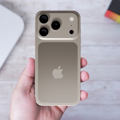
Apple's next-generation iPhone 17 Pro and iPhone 17 Pro Max are just over two months away, and there are plenty of rumors about the devices.
Below, we recap key changes rumored for the iPhone 17 Pro models.
Latest Rumors
These rumors surfaced in June and July:Apple logo repositioned: Apple's logo may have a lower position on the back of the iPhone 17 Pro models, compared to previous...
The iPhone 17 Pro Max will feature the biggest ever battery in an iPhone, according to the Weibo leaker known as "Instant Digital."
In a new post, the leaker listed the battery capacities of the iPhone 11 Pro Max through to the iPhone 16 Pro Max, and added that the iPhone 17 Pro Max will feature a battery capacity of 5,000mAh:
iPhone 11 Pro Max: 3,969mAh
iPhone 12 Pro Max: 3,687mAh...
Apple's position as the dominant force in the global true wireless stereo (TWS) earbud market is expected to continue through 2025, according to Counterpoint Research.
The forecast outlines a 3% year-over-year increase in global TWS unit shipments for 2025, signaling a transition from rapid growth to a more mature phase for the category. While Apple is set to remain the leading brand by...
AppleInsider's Marko Zivkovic today shared a list of alleged identifiers for future Mac models, which should roll out over the next year or so.
The report does not reveal anything too surprising, but it does serve as further evidence that Apple is seemingly working on new models of every Mac, including the MacBook Air, MacBook Pro, iMac, Mac mini, Mac Studio, and Mac Pro.
Apple is...
The upcoming iPhone 17 Pro and iPhone 17 Pro Max are rumored to have a slightly different MagSafe magnet layout compared to existing iPhone models, and a leaked photo has offered a closer look at the supposed new design.
The leaker Majin Bu today shared a photo of alleged MagSafe magnet arrays for third-party iPhone 17 Pro cases. On existing iPhone models with MagSafe, the magnets form a...
Somehow I don't think this is done. There needs to be a way to toggle between this view and the normal list view, otherwise it would take forever to look at your search results. :confused:
It's like they made the Music app with only the coverflow interface.
When I want to "search" for something I don't want to have to scroll through each. and. every. one. of. them. at. a. time. *sigh* What was the point of this? How does it improve the user experience at all?
I prefer the Top 25 in the middle rather than Genius. This tiled theme will also be slower to look through the apps. Plus they take away streetview & youtube. Tempted to stay with ios 5.
It now means that someone searching for your app that doesn't quite remember the name will likely not find it.
I think it is fine that they show more info on the results page, but only a single result at a time? It is like using Google just with the "I'm Feeling Lucky" button.
Biggest design overhaul since iOS 7 with Liquid Glass, plus new Apple Intelligence features and improvements to Messages, Phone, Safari, Shortcuts, and more. Developer beta available now ahead of public beta in July.
 iOS 6 search results on left, Chomp app shown on right
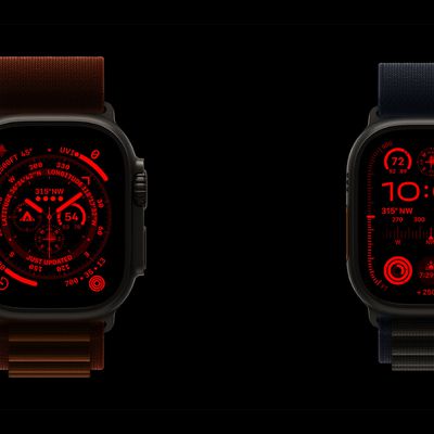


