The prototype is implemented on an Apple iPad but reportedly uses private Apple APIs, according to the video description. The use of private APIs would prevent the app from being approved for the App Store, but the video shows a number of novel ways to navigate eBooks besides the simple "page flip" motion found on Apple's iBooks app.
The new gestures shown include:
- Page Flipping, by spreading pages and then flipping through - Page Flipping with finger bookmarking - Multiple page turning using multiple fingers - Faster swipes turning multiple page - Longer presses, then swiping can turn multiple pages - Writing the page number
Interactive eBooks have been a big topic of discussion over this past week, since Apple's launch of iBooks 2 with their new electronic textbooks. (via Reddit)
There are some good ideas here and there and I too want Apple to incorporate some of these features on iBooks.
The one problem I see is that the gestures are too complicated and confusing. The one thing people like about ebook reading on the iPad is the simplicity of it. People could easy get confused if you add that much functionality.
But I'm sure Apple will find a way to make them less complicated. :)
Wednesday April 17, 2024 9:58 am PDT by Juli Clover
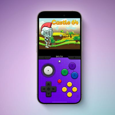
Game emulator apps have come and gone since Apple announced App Store support for them on April 5, but now popular game emulator Delta from developer Riley Testut is available for download. Testut is known as the developer behind GBA4iOS, an open-source emulator that was available for a brief time more than a decade ago. GBA4iOS led to Delta, an emulator that has been available outside of...
Tuesday April 16, 2024 11:33 am PDT by Joe Rossignol
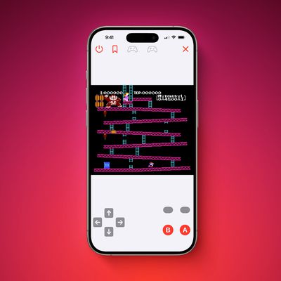
The first approved Nintendo Entertainment System (NES) emulator for the iPhone and iPad was made available on the App Store today following Apple's rule change. The emulator is called Bimmy, and it was developed by Tom Salvo. On the App Store, Bimmy is described as a tool for testing and playing public domain/"homebrew" games created for the NES, but the app allows you to load ROMs for any...
Tuesday April 16, 2024 6:54 am PDT by Tim Hardwick
Last September, Apple's iPhone 15 Pro models debuted with a new customizable Action button, offering faster access to a handful of functions, as well as the ability to assign Shortcuts. Apple is poised to include the feature on all upcoming iPhone 16 models, so we asked iPhone 15 Pro users what their experience has been with the additional button so far. The Action button replaces the switch ...
Wednesday April 17, 2024 12:19 pm PDT by Juli Clover
A decade ago, developer Riley Testut released the GBA4iOS emulator for iOS, and since it was against the rules at the time, Apple put a stop to downloads. Emulators have been a violation of the App Store rules for years, but that changed on April 5 when Apple suddenly reversed course and said that it was allowing retro game emulators on the App Store. Subscribe to the MacRumors YouTube channel ...
iOS 18 is expected to be the "biggest" update in the iPhone's history. Below, we recap rumored features and changes for the iPhone. iOS 18 is rumored to include new generative AI features for Siri and many apps, and Apple plans to add RCS support to the Messages app for an improved texting experience between iPhones and Android devices. The update is also expected to introduce a more...


Top Rated Comments
The one problem I see is that the gestures are too complicated and confusing. The one thing people like about ebook reading on the iPad is the simplicity of it. People could easy get confused if you add that much functionality.
But I'm sure Apple will find a way to make them less complicated. :)
Agreed.
A bit too much