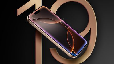
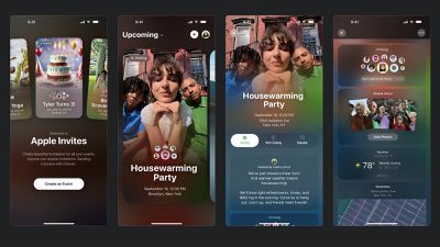
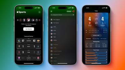
"The last new Apple app, Apple Sports, already felt out of place in iOS 18," wrote Ortolani. "It has a more visionOS or watchOS-like design language utilizing colorful backgrounds, glassy floating UI elements, expanding buttons, and lots of layered shapes. Apple Invites takes it all even further. It's got big beautiful cards, translucent cells, big bold buttons, and an emphasis on content. It feels so clearly like a hint of what is to come in a future iOS update."
It seems like a reasonable possibility that this "glassy" design could extend to other iOS 19 apps and interfaces, although this is purely speculation for now.
Apple should announce iOS 19 at WWDC 2025 in June.
Tuesday October 27, 2026 5:16 am PDT by Tim Hardwick
Among the flurry of iOS 27.2 releases on Monday, Apple also pushed a wave of software updates for its older operating systems, including a fix for a CoreGraphics vulnerability that Apple says may have been exploited in targeted attacks.
The releases include iOS 26.7.2, iPadOS 26.7.2, iOS 18.7.11, iPadOS 18.7.11, macOS Tahoe 26.7.2, macOS Sequoia 15.8.2, and tvOS 26.6.1.
iOS 18.7.11 and...
Sunday November 8, 2026 7:42 am PST by Joe Rossignol
Apple has made a change to its development process for iOS 28, macOS 28, and corresponding software updates, according to Bloomberg's Mark Gurman.
In his Power On newsletter today, he said Apple separates development of each year's new operating systems into three major stages. Typically, he said each stage consists of four weeks of coding followed by a four-week "convergence" period where...
Monday November 9, 2026 4:22 am PST by Tim Hardwick
The Apple launches keep coming! The company is set to release two new products on Friday, November 13: the all-new Apple HomeView and the fourth-generation Apple TV 4K, both of which have been available to pre-order since mid-October.
Apple HomeView: Apple's new smart home display, powered by Apple Intelligence with Siri AI, for entertainment and managing the home. Available in tabletop and...
It's got big beautiful cards, translucent cells, big bold buttons
I'll be glad if that's true. Ever since iOS shifted to their text-as-buttons aesthetic, I've had numerous problems navigating, often by hitting the wrong area of the word (which produces nothing, with no feedback). There's a reason Steve Jobs liked the work of Scott Forstall; he understood intuitive interfaces.
just don't make "dark mode" the default, worse, the Sports app is white/gray on black background with no option to change, really hard to impossible to read in sunlight.
What's the point of putting bigger screens if they're going to put the equivalent of software bezels so it can display the same amount of information as a smaller screen on an older iOS?