Apple today announced that macOS Ventura will be available on Monday, October 24, the same day that iPadOS 16.1 will be available to iPad customers.
macOS Ventura is a notable update for the Mac, bringing new features such as Stage Manager, a new Clock and Weather app, and updates to core system apps like Messages and Safari. System Settings, previously known as System Preferences, has also been completely redesigned to make it more in line with the design on iOS and iPadOS. For a full breakdown of everything new in macOS Ventura, see our roundup.
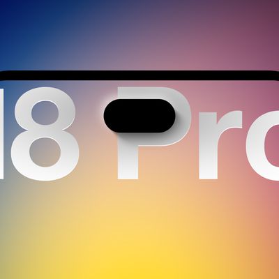
We're only four months out from the launch of Apple's premium next-generation smartphone lineup, and while we're not expecting a sea change in terms of functionality, there are still several enhancements rumored to be coming to the iPhone 18 Pro and iPhone 18 Pro Max.
One thing worth noting is that Apple is reportedly planning a major change to its iPhone release cycle this year, adopting a...
Apple released iOS 26.5 after a few months of beta testing, and while it doesn't have the Siri features we were hoping for since those are being held until iOS 27, there are a handful of useful changes worth knowing about.
Subscribe to the MacRumors YouTube channel for more videos.
End-to-End Encryption for RCS
Support for end-to-end encryption (E2EE) for RCS messages between iPhone and...
Social network Reddit recently began blocking mobile visitors to its website while pushing them to download the official Reddit app, and it's fair to say that the move is not going down well with users.
If you visit reddit.com on your iPhone today, you may see a new popup that can't be dismissed, asking you to "get the app to keep using Reddit."
A Reddit spokesperson told Ars Technica...
I wish they would add *BACK* a freaking hint of contrast in apps like Mail so the folders bar, commands up top, emails/folder summary, and email preview didn’t all blend together in a complete white-out!
Edit: I added *BACK* because the OS interface for Mail (and other native apps) used to be quite attractive *and* intuitive with how it was laid out before Mac OS was “improved” to the minimalist white-out it is today.
Edit #2: I’ve been experimenting since day 1 with increase contrast and other adjustments Apple condescendingly and dismissively hides under “Accessibility.” Not enough improvement/change back to similar to how it was before. Those settings belong under a section titled “Common Sense and Intuitive User Interface Element Options” and not “Accessibility.”
I wish they would add a freaking hint of contrast in apps like Mail so the folders bar, commands up top, emails/folder summary, and email preview didn’t all blend together in a complete white-out!