Shazam App for Mac Gains Apple Silicon Support, New Icon
Apple today updated its Shazam app for the Mac for the first time in two years, introducing Apple silicon support for M1 and M2 Macs and adding a refreshed icon that is in line with the look of macOS Monterey.
The Shazam app for Mac is now using Apple's universal binary so it runs natively on both Intel Macs and those that have Apple-designed chips inside.
Apple finalized its purchase of Shazam back in 2018, but the Mac app has received few updates since then, making this the most notable update since the acquisition.
The Shazam app adds an icon to the Mac's menu bar that can be clicked to identify a song that is playing. The functionality is built into Siri so Mac users can access Shazam without having to install an app, but some may prefer an easy access menu bar app.
(Thanks, Aaron!)
Popular Stories
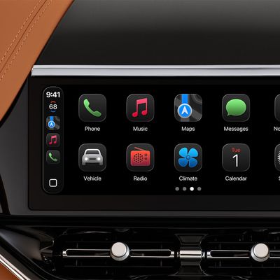
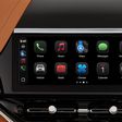
Last year, Apple launched CarPlay Ultra, the long-awaited next-generation version of its CarPlay software system for vehicles. Nearly a year later, CarPlay Ultra is still limited to Aston Martin's latest luxury vehicles, but that should change fairly soon.
In May 2025, Apple said many other vehicle brands planned to offer CarPlay Ultra, including Hyundai, Kia, and Genesis.
CarPlay Ultra...
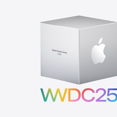
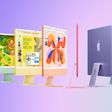
As we wait for WWDC to kick off next Monday, Apple today announced the winners of its annual Apple Design Awards, recognizing apps and games for their innovation, ingenuity, and technical achievement.
The 2025 Apple Design Award winners are listed below, with one app and one game selected per category:
Delight and Fun - CapWords (App) and Balatro (Game)
Innovation - Play (App) and PBJ -...
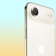
While the AirPods Max 2 received more attention, Apple also released a second pair of headphones last month: Nike Powerbeats Pro 2.
Nike Powerbeats Pro 2 are the same as the regular Powerbeats Pro 2, except they have a two-tone design consisting of black and Nike's signature Volt neon green-yellow color. The headphones were released on March 20 in the U.S., Canada, Australia, the U.K., and a ...
Popular Stories
Last year, Apple launched CarPlay Ultra, the long-awaited next-generation version of its CarPlay software system for vehicles. Nearly a year later, CarPlay Ultra is still limited to Aston Martin's latest luxury vehicles, but that should change fairly soon.
In May 2025, Apple said many other vehicle brands planned to offer CarPlay Ultra, including Hyundai, Kia, and Genesis.
CarPlay Ultra...
As we wait for WWDC to kick off next Monday, Apple today announced the winners of its annual Apple Design Awards, recognizing apps and games for their innovation, ingenuity, and technical achievement.
The 2025 Apple Design Award winners are listed below, with one app and one game selected per category:
Delight and Fun - CapWords (App) and Balatro (Game)
Innovation - Play (App) and PBJ -...
While the AirPods Max 2 received more attention, Apple also released a second pair of headphones last month: Nike Powerbeats Pro 2.
Nike Powerbeats Pro 2 are the same as the regular Powerbeats Pro 2, except they have a two-tone design consisting of black and Nike's signature Volt neon green-yellow color. The headphones were released on March 20 in the U.S., Canada, Australia, the U.K., and a ...