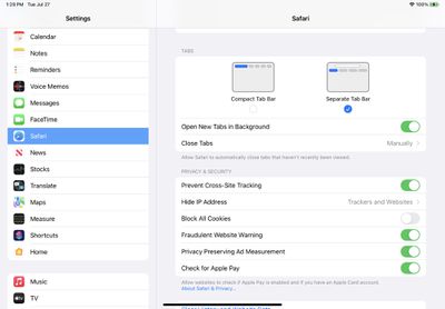
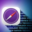
The fourth beta of iPadOS 15 that was released today introduces tweaks to Safari, with the Safari layout now mirroring the updated layout that was introduced in macOS Monterey Beta 3.
The new Safari design in iPadOS 15 beta 4
Prior to this beta, Safari on iPad was similar to Safari on iOS with no dedicated tab bar, but after the update, Apple has added a dedicated tab bar that's activated by default, which is the same layout that's now used in macOS Monterey.
The original Safari design in iPadOS 15 beta 3
While the separate tab bar is enabled automatically when updating, in the Safari section of Settings, there is an option to toggle on the original compact tab bar that merged everything together.
Apple in iOS and iPadOS 15 introduced a compact and unified Safari design that did away with the dedicated URL and search interface, instead letting any individual tab be used for navigation input.
This design has not been popular with users, which has led to Apple making some changes during the beta testing period. As of now, Safari on iPadOS mirrors Safari on macOS Monterey, though additional design tweaks could come in the future.
Apple has unveiled a whopping nine new products so far this March, including an iPhone 17e, iPad Air models with the M4 chip, MacBook Air models with the M5 chip, MacBook Pro models with M5 Pro and M5 Max chips, the all-new MacBook Neo, an updated Studio Display, a higher-end Studio Display XDR, AirPods Max 2, and now the Nike Powerbeats Pro 2.
iPhone 17e features the same overall design as...
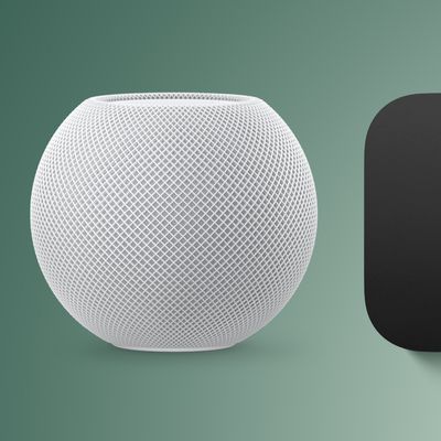
Apple has unveiled nine new products this month, but the wait continues for the next-generation Apple TV 4K and HomePod mini models.
In his Power On newsletter today, Bloomberg's Mark Gurman said new versions of the Apple TV and HomePod mini have been "ready" since last year, but he reiterated that Apple has held off on releasing them until the more personalized version of Siri and other...
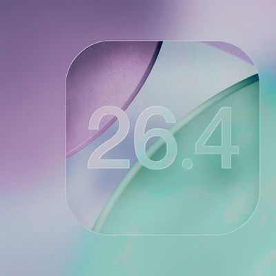
iOS 26.4 isn't the major update with new Siri features that we hoped for, but there are some useful quality of life improvements, and a little bit of fun with an AI playlist generator and new emoji characters.
Playlist Playground - Apple Music has a Playlist Playground option that lets you generate playlists from text-based descriptions. You can include moods, feelings, activities, or...
It is interesting that - at least to me - the UX of the icons in the options page is better than the actual implementation. The blue bars clearly indicate what is selected. The actual implementation leaves me confused.
Why do the bubbles have white padding below them? If they're not connected to the web content rectangle then it breaks the metaphor of what a tab is.
I totally agree. Not having the tab connected to the content it is associated with makes it much harder to know which tab is the active one. This update is better than the previous beta but I think it’s still worse than Safari 14.