Skip to Content

Here's What the Status Bar and iPad-Style Dock Could Look Like on 'iPhone 8'

Earlier today, well-connected Apple reporter Mark Gurman said the so-called "iPhone 8" will have a thin software-based bar along the bottom of the home screen, controlled by gestures, in lieu of a physical home button.

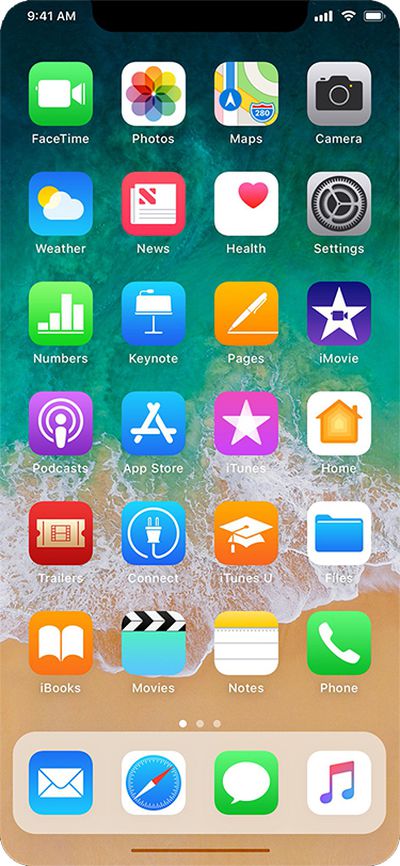
Gurman also said the Dock, which houses up to four commonly used apps, will be redesigned with a new interface similar to the one on the iPad version of iOS 11. Above it, there will still be six rows of apps, with up to 24 apps per page.

The status bar is said to be split into left and right sides, which some Apple employees supposedly call "ears" internally. By default, the left side shows the time, while the right side displays Wi-Fi, signal bars, and battery life.

With those details in mind, graphic designer Olivier Charavel created a mockup of what the Home screen could look like on the iPhone 8.

iphone 8 mockup with dock and gesture bar
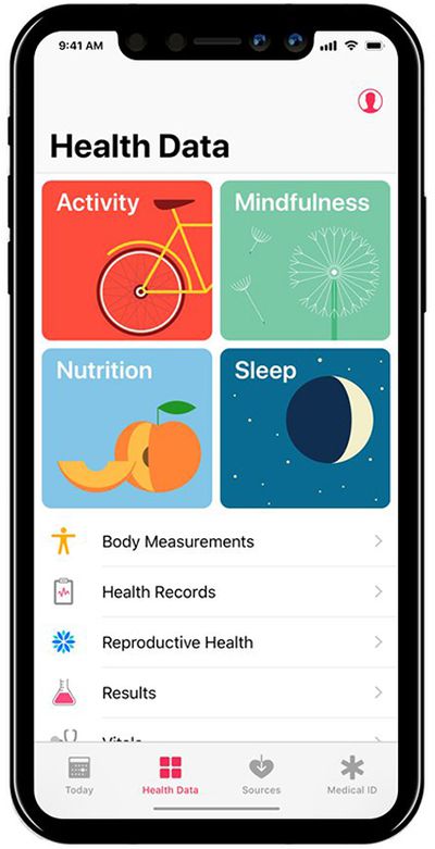
Charavel also shared a mockup of Apple's Health app as an example of what apps could look like on the iPhone 8 accordingly.

iphone 8 health
Gurman said users can drag the gesture bar up to the middle of the screen to unlock the device. When inside an app, a similar gesture starts multitasking, and users can continue to flick upwards to close the app and go back to the home screen.

Guilherme Rambo shared a video that demonstrates how it could look once the Dock has been summoned, based on Apple's iOS simulator for developers.

More Coverage: iOS 11 Dock and Gesture Controls to Replace "iPhone 8" Home Button Entirely by Tim Hardwick

Related Forum: iPhone

Popular Stories

MacBook Neo Feature Pastel 1

First MacBook Neo Benchmarks Are In: Here's How It Compares to the M1 MacBook Air

Thursday March 5, 2026 4:07 pm PST by
Benchmarks for the new MacBook Neo surfaced today, and unsurprisingly, CPU performance is almost identical to the iPhone 16 Pro. The MacBook Neo uses the same 6-core A18 Pro chip that was first introduced in the iPhone 16 Pro, but it has one fewer GPU core. The MacBook Neo earned a single-core score of 3461 and a multi-core score of 8668, along with a Metal score of 31286. Here's how the...
HomePod mini and Apple TV Sage

New Apple TV and HomePod Mini Are Still Missing, Here's Why

Thursday March 5, 2026 6:11 am PST by
Apple this week unveiled seven products, ranging from the iPhone 17e to the MacBook Neo, but new Apple TV and HomePod mini models were not among them. Given that there have been rumors about the next-generation Apple TV and HomePod mini since all the way back in late 2024, some customers are wondering why the devices have yet to launch, and the answer likely relates to Siri. In September, ...
MacBook Neo Feature Pastel 1

Apple Announces $599 'MacBook Neo' With A18 Pro Chip

Wednesday March 4, 2026 6:15 am PST by
Apple today announced the "MacBook Neo," an all-new kind of low-cost Mac featuring the A18 Pro chip for $599. The MacBook Neo is the first Mac to be powered by an iPhone chip; the A18 Pro debuted in 2024's iPhone 16 Pro models. Apple says it is up to 50% faster for everyday tasks than the bestselling PC with the latest shipping Intel Core Ultra 5, up to 3x faster for on-device AI workloads,...

Top Rated Comments

Dwalls90 Avatar
111 months ago
Okay, but really hope app "cards" look like this instead of the Health app picture in the article.

Score: 20 Votes (Like | Disagree)
drinkingtea Avatar
111 months ago
Ugly, honestly.
Score: 15 Votes (Like | Disagree)
redscull Avatar
111 months ago
Really hoping there is still some sort of "home button" in software. I can't see any kind of usability at all with some hidden idea of "gestures" to get things done. I just can't see my mother (or any older person) being comfortable with an iPhone that doesn't have an obvious "home" button, even if it's a virtual one drawn in the same place on the screen as the hardware one.
Strongly agree. Apple has been reducing usability steadily ever since they shed skeumohism, which is when a hardware design expert started pretending he was skilled at software user experience design. Getting rid of the home button is that final step in eliminating what made the iPhone so approachable to so many. It's a sad day if true.
Score: 15 Votes (Like | Disagree)
MareLuce Avatar
111 months ago
This I'm okay with. Show carrier name when swiping down like Android and it'll be fine. Just don't get rid of the clock!
Excellent point - the carrier name won't be visible.

Yay! Be gone, extraneous data.
Score: 13 Votes (Like | Disagree)
111 months ago
Really hoping there is still some sort of "home button" in software. I can't see any kind of usability at all with some hidden idea of "gestures" to get things done. I just can't see my mother (or any older person) being comfortable with an iPhone that doesn't have an obvious "home" button, even if it's a virtual one drawn in the same place on the screen as the hardware one.

My expectation is the virtual home button will automatically appear "on raise", based on the motion and proximity sensors.
Score: 11 Votes (Like | Disagree)
111 months ago
I want to reserve judgement but I'm not gonna. Hate the notch. Hate it. My brain will never accept the visual distraction.
Score: 9 Votes (Like | Disagree)