Apple in iOS 18 has made a wealth of customization options available for your iPhone Home Screen, one of which is the ability to add a tint to your app icons.
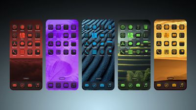
Essentially, the tint feature offers a unique way to customize your device's appearance by changing the color of all your icons at once. Unlike individual icon customization, tinting affects every icon on your app pages, Home Screen, and App Library, creating a unified look across your entire interface.
Tinting works by first desaturating all icons and then applying a single color overlay. This process results in a monochromatic appearance, which means you'll lose the original colors of your app icons and widgets, but what you gain is a more cohesive look. It's a powerful tool for creating a coordinated, stylish interface that reflects your personal taste, so be sure to experiment with it.
To choose a tint color, you can also use an eyedropper tool to select a shade from your wallpaper, or manually adjust hue and saturation using two slider bars. This flexibility allows you to perfectly match your icons to your background or create a contrasting color scheme.
Lastly, it's important to remember that the tint setting is universal. You can't apply different tints to different app pages or sections of your device. Whatever color you choose will be applied everywhere icons appear. Here's how to tint your icons in iOS 18:
- Long press a space on your Home Screen.
- Tap Edit in the top-right corner.
- Tap Customize.
- Select the Tinted option.
- Adjust the sliders to change the tint. Note that you can also use the eyedropper icon to select a hue from a region of your wallpaper.
- Tap anywhere outside of the Customize panel to finish.
![]()
The tint feature is in addition to a new Dark mode option for your app icons in iOS 18, which you can learn more about by checking out our dedicated how-to.


Top Rated Comments
Edit: I am running iOS Beta 18 and I have already dicovert it. But when I see this 5 tint next to it in the picture above, I am glad I did not turn it on.
I don’t want to be that guy, but no way Steve Jobs would have ever allowed such customisation and deviation from the default Apple experience and intended aesthetics.
And that’s coming from someone who still finds the default icons to be hideous as hell 10 years after iOS 6.