iOS 26 Liquid Glass Design Makes App Icons Look Crooked, Report Users - MacRumors
Skip to Content

iOS 26 Liquid Glass Design Makes App Icons Look Crooked, Report Users

iOS 26's new Liquid Glass interface has been criticized for making some content illegible in certain circumstances, and now the UI design is reportedly causing another unusual visual problem for some users.

ios 26 liquid glass dark mode
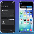
Liquid Glass adds subtle glowing effects to the corners of app icons, creating a dynamic glass-like appearance with depth and parallax effects. However, as noted by Gizmodo, this design choice can produce an optical illusion that makes icons appear tilted. Users impacted by the phenomenon report feeling disoriented, with some experiencing dizziness from the perceived slanting effect.

The issue has gained attention on Reddit, with one post receiving over 3,000 upvotes. "The frame glow effect makes apps look tilted, and it's really distracting," complained one user, while another said the update made them "feel drunk."

"All of iOS 26 is an optical nightmare," added another user. "It's horrible."

The tilting effect is most pronounced when icons are set to "Dark," "Clear," or "Tinted" modes against dark or black backgrounds, while colorful wallpapers seem to help mask the illusion by drawing attention away from the refractive corners.

Apple's transparency reducing options and the "Reduce Motion" setting (Settings ➝ Accessibility ➝ Motion ➝ Reduce Motion) don't seem to help minimise the illusion, with reports indicating most users fail to see a difference. Hopefully, Apple adds a dedicated control in a future update to adjust the icon effect that's causing the issue.

Are you suffering from the Liquid Glass optical illusion? Let us know in the comments.

Popular Stories

WWDC26 MR Live Coverage Article

WWDC 2026 Apple Event Live Keynote Coverage: iOS 27, Revamped Siri, and More

Monday June 8, 2026 9:15 am PDT by
Apple's Worldwide Developers Conference (WWDC) starts today with the traditional keynote kicking things off at 10:00 a.m. Pacific Time. MacRumors is on hand for the event and we'll be sharing details and our thoughts throughout the day. We're expecting to see a number of software-related announcements today, headlined by a reset on Apple's push into AI that should see a significant overhaul...
macOS Golden Gate Mac

Apple Announces macOS 27 Golden Gate With New Siri and 'Tons' of Refinements

Monday June 8, 2026 10:19 am PDT by
Apple today announced that macOS 27 is named macOS Golden Gate. Much like Mac OS X Snow Leopard in 2009, Apple said it focused on improving macOS's performance and dozens of underlying technologies this year. Apple says macOS Golden Gate offers quicker AirDrop transfers, faster network file browsing, improved syncing in the Messages app, better Spotlight search suggestions, and other...
CarPlay Siri AI

Apple Announces New CarPlay Features on iOS 27, Including Video Apps

Monday June 8, 2026 4:17 pm PDT by
Back at WWDC 2025, Apple revealed that it was planning to allow CarPlay users to watch video via AirPlay in their vehicles while they are not driving, but we did not hear many specific details about this functionality until now. In a WWDC 2026 video aimed at developers, Apple said the CarPlay video feature is available in new vehicles that support it. When playing a video in an iPhone app...

Top Rated Comments

10 months ago
I had a feeling Liquid Glass would create accessibility issues... it feels like such an unnecessary way to alienate users.
Score: 43 Votes (Like | Disagree)
TheMacDaddy1 Avatar
10 months ago
IMHO this update on the phone and more importantly the Mac is a disaster. For the first time ever I want to roll back my Mac.
Score: 41 Votes (Like | Disagree)
10 months ago
"Are you suffering from the Liquid Glass optical illusion? Let us know in the comments."

No I'm not experiencing it or "suffering" from it.

Edit: the linked Gizmodo article has at least one inaccuracy: "To create the effect of glass and all of its reflective and shimmering properties, iOS 26 forces every icon on your iPhone home screen to have a slight glow to them in the top left and lower right corners."

Unless that's referring to some other effect, that slight glow is around the icons and shifts as you tilt your phone -- it's not just the top left and lower right corners. If I tilt my phone, the glow will travel around the icons (easier to see on folders), shifting from the top/bottom/corners/sides to another location. It's a subtle effect that I think is a cool little detail.

2nd edit: I'm not saying other people are not experiencing the effect, just that I'm not, which is what the author of the Macrumors article asked us to do. Also, while it can be thought of as an optical illusion, it's a different type of one that only appears to affect a small number of people (or at least a small enough subset who care to comment online about it). Optical illusions typically affect most to all people ('https://www.sciencefocus.com/the-human-body/the-top-ten-best-optical-illusions') who are not seeing impaired. That this is only affecting a subset of people suggests it is a peculiar intersection of how those individual's brains are working and the specific stimulus of iOS's UI. Most to all human behavior is understood to be on a normal (Gaussian) distribution. There will always be people who have and experience things that are "abnormal" (in one of the distribution tails). That's not inherently bad. In many instances it's thought to be positive (e.g, 'superior' IQ).

While there are people experiencing this particular effect, what complicates the potential issue is the effect of suggestion through social pressure. What this means is that some people don't really notice the effect but when it's brought to their attention they start to and might even state, "Now I can't unsee it!" That's because what we perceive is affected by what we pay attention to (we can perceive things we are not aware of) and how we interpret what we perceive.

In effect, some people experience the effect but others do not notice the effect until it's brought to their attention. Some other people also convince themselves or are convinced by others that it's there when they do not really experience it. That's not lying (although it's possible some people are lying about it), it's just the nature of how our brains work. Brains are kind of weird in that way. They are amazing, but weird.

It's possible that some people will adjust to the changes and their brains will stop perceiving the effect (e.g., https://news.uci.edu/magazines/articles/flipped-reality/). It's also possible some people will continue to experience it. Our brains are excellent at adapting and normalizing (adjusting to) new experiences most of the time.

If you are experiencing this effect, give it time and it might go away. If it doesn't go away and it is too distracting, hopefully various accessibility settings will rectify it.

3rd edit: "The issue has gained attention on Reddit, with one post receiving over 3,000 upvotes". Can we stop using things like this as a metric of anything meaningful? There's the issue of selection bias, bots, and more. It's data but unscientific and potentially useless and even misleading data. The data can be used in peer-reviewed research, but it's not a great way to accurately assess prevalence of something.
Score: 34 Votes (Like | Disagree)
10 months ago
I notice it most pronounced on the black icons (in regular icon mode).


Attachment Image
Score: 31 Votes (Like | Disagree)
wanha Avatar
10 months ago
genuinely jealous of whoever "felt drunk" simply by looking at the icons on their iPhone screen
Score: 28 Votes (Like | Disagree)
MacUserFella Avatar
10 months ago
Thank god it’s not just me, thought I was going insane or something
Score: 27 Votes (Like | Disagree)