Skip to Content

System Settings App in macOS Ventura Beta Still Riddled With UI Issues

It seems Apple's redesigned macOS Ventura System Settings app, which replaces the System Preferences found in macOS Monterey and earlier versions, is still not without its problems five betas in, as catalogued by developer Niki Tonsky on Twitter.

macos ventura system settings featured
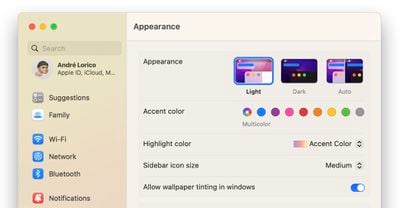
For those unfamiliar with it, the new System Settings app looks more akin to the Settings app on the iPhone and iPad than it does to the earlier macOS preferences panels, with settings placed in a sidebar for supposedly easier access.

However, Tonsky's thread highlights several bugs and issues with the interface layout in developer betas 4 and 5 of macOS Ventura, including inconsistent use and erratic behavior of basic UI elements like dropdowns and buttons, misaligned text and poorly sized windows, menu titles that are cut off by menu windows, misplaced content, and more.

The System Settings app is built using SwiftUI, Apple's cross-platform user interface layer that works across iOS, macOS, tvOS, and watchOS. Another complex app written in SwiftUI, Shortcuts, has also drawn criticism for similar UI and performance bugs on both macOS and iOS.


Linking to and commenting on Tonsky's tweet thread on his own website, Daring Fireball's John Gruber said there is "something deeply wrong with SwiftUI that, even while in-progress, so many little layout details are apparently hard to get right."

There are buttons that are halfway cut off by their parent view. When has Apple ever shipped beta software with problems like that? Putting aside the philosophical issue of whether the Mac's system prefs/settings app should follow the basic model of Settings on iOS/iPadOS, no matter what style MacOS's System Settings is supposed to look like, there should be no question that it should look pixel-perfect.

In an interview with Gruber on The Talk Show Live at WWDC 2022, Craig Federighi said that despite what some may think, ‌macOS Ventura‌'s System Settings redesign was not largely inspired by iOS. Federighi insisted that the development team's main goal was consistency for users, and said System Settings on ‌macOS Ventura‌ is a "great interface."

Despite the lingering issues, there's still time for Apple to correct them, as macOS Ventura isn't likely to be scheduled for release until October, or perhaps even early November. Have you had similar experiences interacting with System Settings in the latest beta? What do you think of the new look? Let us know in the comments.

Related Forum: macOS Ventura

Popular Stories

Apple MacBook Pro M4 hero

Apple Planning 'MacBook Ultra' With Touchscreen and Higher Price

Sunday March 8, 2026 8:05 am PDT by
Apple is planning to launch an all-new "MacBook Ultra" model this year, featuring an OLED display, touchscreen, and a higher price point, Bloomberg's Mark Gurman reports. Gurman revealed the information in his latest "Power On" newsletter. While Apple has been widely expected to launch new M6-series MacBook Pro models with OLED displays, touchscreen functionality, and a new, thinner design...
imac video apple feature

Apple Unveils Seven New Products

Friday March 6, 2026 11:48 am PST by
Apple this week unveiled seven products, including an iPhone 17e, an iPad Air with the M4 chip, updated MacBook Air and MacBook Pro models, a new Studio Display, a higher-end Studio Display XDR, and an all-new MacBook Neo that starts at just $599. iPhone 17e features the same overall design as the iPhone 16e, but it gains Apple's A19 chip, MagSafe for magnetic wireless charging and magnetic...
ios 26 4 yellow

Everything New in iOS 26.4 Beta 4

Monday March 9, 2026 3:50 pm PDT by
Apple is continuing to test the iOS 26.4 beta, and the latest update is now available for developers and public beta testers. As testing goes on, there are fewer new features in each beta, but today’s release adds new emoji characters and a few other changes. New Emoji Apple added new emoji characters, including trombone, treasure chest, distorted face, hairy creature, fight cloud, orca,...

Top Rated Comments

47 months ago
"How cool is that"

Attachment Image
Score: 51 Votes (Like | Disagree)
47 months ago
I remember when UI elements were a reason for a keynote:


"You spend months working on a button."

"We paid a lot of attention to dynamics. Not only how the things look but how do they move, how do they behave."
Score: 42 Votes (Like | Disagree)
47 months ago
Long time Mac users: "We want more macOS on i(Pad)OS."
Apple: "We think iOS users want to see more of it on macOS, but we didn't ask anyone and we're gonna do it in a hurry"

I don't really understand why Apple wants to port iOS stuff to macOS. The (back then) refreshed Airport Utility is a complete disaster, lost functionality and is generally harder to use. And this has been with all the apps Apple is porting from iOS. Yes, we have apps like Stocks now, but does it behave and act like a truly native Mac app? Well, after all those years it's getting close, but we're still not there yet. The Music app is still a native Mac app from the core, but all functionality that Apple didn't have to change from iTunes was changed and vice versa.

But the new Settings app is setting a new example for total awkwardness. macOS isn't a vertical system, yet they introduce a vertical UI (as it comes from iOS). It doesn't feel like a Mac app and doesn't behave like one. System Preferences isn't perfect, but at least everything is clear. macOS isn't iOS, but Apple doesn't understand that while they do say so. I generally hope they don't ship it and avoid another discoveryd ('https://www.macrumors.com/2015/05/26/apple-discoveryd-replaced-with-mdnsresponder/') fiasco.


Breaking news: Beta software isn't 100% perfect.
This isn't just beta software. It's completely broken and will be almost impossible to properly fix. A few issues can certainly arise when something goes into beta, but this is just a disaster.
Score: 31 Votes (Like | Disagree)
47 months ago
I hate the new System Settings app on macOS Ventura. I will be sticking with Monterey for a while I think. I don't see why they had to change it. There is nothing wrong with how it functions now. It feels like they are trying to dumb it down to an iPad level.
Score: 27 Votes (Like | Disagree)
47 months ago
Ug, record profits but a fading software experience and the specter of ads in all the base apps?
Score: 25 Votes (Like | Disagree)
randolorian Avatar
47 months ago
Hopefully, the new System Settings will be pulled before release, similar to last year's Safari fiasco.
Score: 23 Votes (Like | Disagree)