Gmail to Get New Icon as Part of G Suite Rebranding
The Gmail app is set to get a new icon as part of a broader rebrand of Google's G Suite software, which includes Gmail, Docs, Meet, Sheets, and Calendar.

Replacing the classic Gmail envelope logo is an M made out of Google's blue, red, yellow, and green brand colors. The new design aligns Gmail with Google's core brand as well as Google Maps, Google Photos, Google Chrome, and other Google products.
According to Fast Company, Google considered dropping the M altogether or fully removing the red color from the Gmail icon, but user research studies showed that people weren't happy with those changes.
Google has also redesigned its Calendar, Docs, Meet, and Sheets logos to match the new Gmail design, while G Suite has become "Google Workspace" in an attempt to merge Gmail, Chat, and Docs into a more integrated whole.
Popular Stories
Starting today, the seven new Apple products that were announced last week are available at Apple Stores and beginning to arrive to customers.
The colorful MacBook Neo and all of the other new products are on display at most Apple Store locations around the world starting today. Apple Stores have inventory of the new products for both walk-in customers and Apple Store pickup, but...
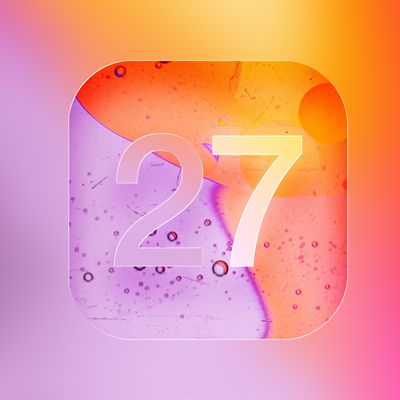
We're only three months away from Apple's WWDC 2026 event, which will see the company unveil iOS 27. With the fully revamped version of Siri possibly delayed until September, iOS 27 is shaping up to be the update we wanted iOS 26 to be.
There will be new Apple Intelligence features, updates for the iPhone Fold, and more, with the latest rumors summarized below.
Foldable iPhone Features...
In his Power On newsletter today, Bloomberg's Mark Gurman reiterated that iOS 27 will be similar to 2009's Mac OS X Snow Leopard, in the sense that one of Apple's biggest priorities is bug fixes for improved performance and stability.
At WWDC 2008, Apple showed a presentation that said Mac OS X Snow Leopard had "0 new features," as it opted to focus on performance and stability...