Apple has published its iOS Human Interface Guidelines to iBooks. The guidelines are Apple's recommendations and suggestions to developers for designing cohesive and usable apps that follow similar user interface principles to other iOS applications.

The company has long offered user interface guidelines, dating back to the original Macintosh, but has recently only offered its iOS 7 guidelines on the Developer Portal. By making them available to anyone via iBooks, the company appears to be looking to inform and inspire more designers.

IosHIguidelines
An excerpt from the book:

Designing for iOS 7

iOS 7 embodies the following themes:

- Deference. The UI helps users understand and interact with the content, but never competes with it.
- Clarity. Text is legible at every size, icons are precise and lucid, adornments are subtle and appropriate, and a sharpened focus on functionality motivates the design.
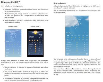
- Depth. Visual layers and realistic motion impart vitality and heighten users’ delight and understanding.

Whether you’re redesigning an existing app or creating a new one, consider approaching the job in the way that Apple approached the redesign of the built-in apps:

- First, strip away the UI to expose the app’s core functionality and reaffirm its relevance.
- Next, use the themes of iOS 7 to inform the design of the UI and the user experience. Restore details and embellishments with care and never gratuitously.
- Throughout, be prepared to defy precedent, question assumptions, and let a focus on content and functionality motivate every design decision.

The iOS Human Interface Guidelines are a free download from iBooks.

Top Rated Comments

Panu Avatar
153 months ago
I notice that the iOS 6 version of Weather is much easier to read and use than the iOS 7 version. If iOS 8 has the same esthetic and usability problems as iOS7, Apple has not listened to any user feedback. Or at least not to the user feedback that disagrees with Jony Ive.

Apple loves Jony Ive more than it loves all its customers combined. Wouldn't it be wonderful to be Jony Ive! I admired his industrial design. Then he started trashing user interfaces, and I wish he'd just go away.
Score: 12 Votes (Like | Disagree)
redscull Avatar
153 months ago
Pardon me but in my opinion the iOS 6 weather app looks hideous, iOS 7 is UI/UX design done right.

About Jony, I remember Steve once said Ive was the most powerful guy at Apple after him :O

The new weather app is pretty, but it's less usable. The text is much harder to read in many areas, and its layout is almost devoid of organization. When you need more info than the background weather fx conveys, it actually takes more time and mental effort to find and absorb it compared to the older app. It's like a work of art instead of a tool. Pretty. Not efficient. Prettiness awes initially, but tools actually stay useful.

----------

The readability of the weather app in iOS 7 here is due to compression making the text blend with the background - I can assure you it's not an issue on the actual phone and is a million miles better looking than the previous version.

Your assurances are bologna. It is harder to read. Period. Impossible to read? No. But less legible than the iOS 6 weather. Irrefutably.
Score: 10 Votes (Like | Disagree)
B4U Avatar
153 months ago
Dear iOS app developers:

Just in case you don't know how to fuglify your app, here is a guideline for you.
Score: 6 Votes (Like | Disagree)
LordQ Avatar
153 months ago
I notice that the iOS 6 version of Weather is much easier to read and use than the iOS 7 version. If iOS 8 has the same esthetic and usability problems as iOS7, Apple has not listened to any user feedback. Or at least not to the user feedback that disagrees with Jony Ive.

Apple loves Jony Ive more than it loves all its customers combined. Wouldn't it be wonderful to be Jony Ive! I admired his industrial design. Then he started trashing user interfaces, and I wish he'd just go away.

Pardon me but in my opinion the iOS 6 weather app looks hideous, iOS 7 is UI/UX design done right.

About Jony, I remember Steve once said Ive was the most powerful guy at Apple after him :O
Score: 6 Votes (Like | Disagree)
.X. Avatar
153 months ago
I notice that the iOS 6 version of Weather is much easier to read and use than the iOS 7 version. If iOS 8 has the same esthetic and usability problems as iOS7, Apple has not listened to any user feedback. Or at least not to the user feedback that disagrees with Jony Ive.
Agreed, the iOS6 version is not only much easier to read, it is also much better looking.

Apple loves Jony Ive more than it loves all its customers combined. Wouldn't it be wonderful to be Jony Ive! I admired his industrial design. Then he started trashing user interfaces, and I wish he'd just go away.
This. He managed to completely ruin a perfectly fine and gorgeous UI.

I like the new functions in iOS7, but the design? Ugh... Worst thing I have seen in a very long time. I'm shocked they let this happen.
Score: 5 Votes (Like | Disagree)
Peel Avatar
153 months ago
I still have a copy of the original Macintosh Human Interface Guidelines from 1984.
Score: 5 Votes (Like | Disagree)

Popular Stories

Apple Logo Spotlight

Apple Expected to Unveil Five All-New Products This Year

Wednesday January 21, 2026 10:54 am PST by
In addition to updating many of its existing products, Apple is expected to unveil five all-new products this year, including a smart home hub, a Face ID doorbell, a MacBook with an A18 Pro chip, a foldable iPhone, and augmented reality glasses. Below, we have recapped rumored features for each product. Smart Home Hub Apple home hub (concept) Apple's long-rumored smart home hub should...
airtag prime day 2

Apple Developing AirTag-Sized AI Pin With Dual Cameras

Wednesday January 21, 2026 12:31 pm PST by
Apple is working on a small, wearable AI pin equipped with multiple cameras, a speaker, and microphones, reports The Information. If it actually launches, the AI pin will likely run the new Siri chatbot that Apple plans to unveil in iOS 27. The pin is said to be similar in size to an AirTag, with a thin, flat, circular disc shape. It has an aluminum and glass shell, and two cameras at the...
M5 MacBook Pro

MacBook Pro to Receive Up to Six New Features by Next Year

Thursday January 22, 2026 9:31 am PST by
Apple is expected to release MacBook Pro models with M5 Pro and M5 Max chips soon, but you might want to pass on them, as bigger changes are around the corner. It has been reported that the MacBook Pro will be receiving a major redesign in late 2026 or in 2027. Six new features have been rumored so far, including an OLED display, touch capabilities, a Dynamic Island, M6 Pro and M6 Max chips...
airpods pro 3 purple

New, Higher End AirPods Pro Coming This Year

Tuesday January 20, 2026 9:05 am PST by
Apple is planning to debut a high-end secondary version of AirPods Pro 3 this year, sitting in the lineup alongside the current model, reports suggest. Back in September 2025, supply chain analyst Ming-Chi Kuo reported that Apple is planning to introduce a successor to the AirPods Pro 3 in 2026. This would be somewhat unusual since Apple normally waits around three years to make major...
iPhone 18 Pro Dynamic Island Ice Universe

iPhone 18 Pro: Leaker Reveals Alleged Size of Smaller Dynamic Island

Thursday January 22, 2026 9:27 pm PST by
For now, rumors have settled on the iPhone 18 Pro and iPhone 18 Pro Max featuring a smaller Dynamic Island, and now a leaker has revealed its alleged size. iPhone 18 Pro with a smaller Dynamic Island (mockup via Ice Universe) The account "Ice Universe" today claimed the Dynamic Island cutout on the iPhone 18 Pro models will be approximately 35% narrower than it is on the iPhone 17 Pro models. ...