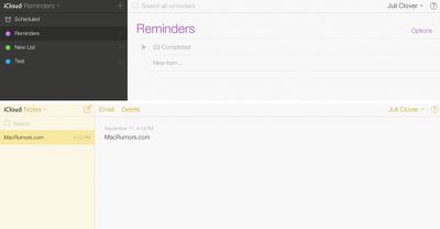
iCloud.com has received a makeover with new icons and design inspired by iOS 7, after previously rolling out to beta customers back in August. The background wallpaper mirrors the dynamic, slowly changing wallpaper offered in iOS 7 as well.
The site is using new icons for Mail, Contacts, Calendar, Notes, Reminders and Find My iPhone; while iWork for iCloud is still using the older-style iWork for iOS icons.
The apps -- with the exception of iWork -- have all received extensive redesigns as well, using lighter pastel colors and slimmer fonts.
Apple today unveiled AirPods Max 2, with key upgrades including the H2 chip, increased active noise cancellation, improved sound quality, and features such as Adaptive Audio, Conversation Awareness, Voice Isolation, and Live Translation.
The new AirPods Max have the same overall design as the previous generation, with most of the new features coming from the upgrade to the H2 chip:- Adaptive ...
Surprise! Apple today unveiled the AirPods Max 2, despite no rumors suggesting that a new version of Apple's over-ear headphones were imminent.
Key upgrades compared to the previous AirPods Max include Apple's H2 chip, increased active noise cancellation, improved sound quality, and features such as Adaptive Audio, Conversation Awareness, Voice Isolation, and Live Translation.
AirPods Max ...
In his Power On newsletter today, Bloomberg's Mark Gurman reiterated that iOS 27 will be similar to 2009's Mac OS X Snow Leopard, in the sense that one of Apple's biggest priorities is bug fixes for improved performance and stability.
During WWDC 2008's State of the Union, Apple showed a slide that said Mac OS X Snow Leopard had "0 new features," as it opted to focus on performance and...
I must be on my own, but I still find the design style of iOS7 to be off putting and unrefined. Not that I preferred the look in iOS6, I didn't - a change was most definitely necessary - I just think Apple missed the mark on this.
Seriously, I can't wait for Apple bringing back shadows and gradients, followed by usability and taste. Let's give them about 5 years.... If that's the future of OS X, I need to go look for something else in the meantime…
C'mon, using some pseudo-fancy style of Helvetica and random icons doesn't make a user interface as expected from Apple...
Never thought I'd miss linen in my life, but this is just tragic. I'm glad to see that many agree. I like the overall look of iOS 7, but this looks like Microsoft trying to copy it
For those looking around Elementary/Ubuntu (http://elementaryos.org) is looking pretty good these days.
What it lacks is what we're looking at here - Apple's ecosystem, which sadly, requires OS X.
I don't like the way OS X is heading, either - iOS is deliberately limited because the processors can't handle a full OS, and that just happens to be good for beginners, but that's no reason to dumb down OS X.
Sadly OS X was never as user friendly as the Mac OS, and I'm almost glad they took the Mac off Mac OS X, because it never came close to Mac intelligence. If you came from Windows you wouldn't know, but fiddlying text files is 1960s technology (as is unix, yes I know Elementary is Unix). Mac had a gui for everything but machine code.
It's the little things, like opening an app and putting into the background because it's going to take a while to start up, and having the ****** app stay there until I ask for it again. Only OS X could give us backgrounded apps jumping to the front on a Mac.
Or how about actually calculating folder sizes in a list view (I have a thunderbolt drive that does that, but nothing Apple ships does it).
And the disturbing trend - opening multiple Tabs in the background in Safari, and finding they don't actually load until you switch to each tab - iOS comes to OS X in the worst possible way.
Disturbing as yellow on white is (and it truly is Microsoft-level clueless), Mac owners have much more to worry about.