Former Apple TV Engineer Claims New Apple TV Interface Discarded 5 Years Ago [Updatedx2]

Macgasm notes an interesting tweet by former Apple TV engineer Michael Margolis who claims that the new Apple TV interface designs were "tossed out 5 years ago because [Steve Jobs] didn't like them."

apple tv 2012

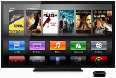
Alongside the 3rd Generation iPad, Apple also introduced a new version of the Apple TV that supports 1080P video. With it came an updated interface for the set-top box, (shown above) with icon-based category buttons and large billboard-style artwork for content. The interface was also rolled out to previous 2nd Generation Apple TV owners in a software update.

Margolis goes on to say that "now there is nobody to say 'no' to bad design", referring to Steve Jobs' passing. Some MacRumors readers have complained about the new design, and others felt it was a paving the way for Apple TV apps in the future.

Five years ago (2007), when the design was reportedly "tossed out", Apple's product landscape was quite different. Both the Apple TV and iPhone were first introduced in January of that year, and the App Store would not be launched for another year in mid-2008.

Update: Margolis clarifies what he meant to TheNextWeb:

The new UI shouldn’t come as a surprise to anyone. There is a clear effort at Apple to make everything match the look and feel of their popular iOS products – starting with Lion and increasing momentum with Mountain Lion.

To be clear – he didn’t like the original grid. This was before the iPhone was popular and before the iPad even existed.

Given that the iPad is far more successful than the AppleTV, migrating the AppleTV to look more like the iPad was probably a very smart move – even if some of the users of the old UI don’t prefer the new one.

Update 2: TechCrunch posts a longer response from Margolis who seems to be downplaying his previous tweet:

Steve rejecting a design five years ago isn’t a huge deal. Steve was well known for rejecting ideas, tweaking them, and turning them into something even better. And that’s a very good thing. One of my favorite parts of working at Apple was knowing that SJ said “no” to most everything initially, even if he later came to like it, advocate for it, and eventually proudly present it on stage. This helped the company stay focused and drove people to constantly improve, iterate, and turn the proverbial knob to 11 on everything.

Related Roundup: Apple TV
Buyer's Guide: Apple TV (Don't Buy)

Popular Stories

iphone 16 apple intelligence

Apple Aiming to Release 'Breakthrough' New iPhone Accessory

Wednesday February 18, 2026 12:43 pm PST by
Apple is looking for a "breakthrough" with its push into wearable AI devices, including an "AirTag-sized pendant," according to Bloomberg's Mark Gurman. In a report this week, he said the pendant is reminiscent of the failed Humane AI Pin, but it would be an iPhone accessory rather than a standalone product. The pendant would feature an "always-on" camera and a microphone for Siri voice...
Apple Watch 15 Tips Every Owner Needs to Know Feature

Apple Watch: 15 Tips Every Owner Needs to Know

Thursday February 19, 2026 7:38 am PST by
Apple Watch is now eleven generations in, and packed with useful features that are easy to miss at first glance. To help you get more out of your new device, we've rounded up 15 practical tips you might not have discovered yet, including a few that long-time users often overlook. Bounce Between Two Apps On your Apple Watch, double-press the Digital Crown to see a deck of all currently...
Dynamic Island iPhone 18 Pro Feature

10 Reasons to Wait for Apple's iPhone 18 Pro

Wednesday February 18, 2026 5:12 am PST by
Apple's iPhone development roadmap runs several years into the future and the company is continually working with suppliers on several successive iPhone models at the same time, which is why we often get rumored features months ahead of launch. The iPhone 18 series is no different, and we already have a good idea of what to expect for the iPhone 18 Pro and iPhone 18 Pro Max. One thing worth...
maxresdefault

iPhone Fold: Launch, Pricing, and What to Expect From Apple's Foldable

Friday February 20, 2026 3:21 am PST by
Apple is expected to launch a new foldable iPhone this year, based on multiple rumors and credible sources. The long-awaited device has been rumored for years now, but signs increasingly suggest that Apple will release its first foldable device in 2026. Subscribe to the MacRumors YouTube channel for more videos. Below, we've collated an updated set of key details that have been leaked about ...
Multicolored Low Cost A18 Pro MacBook Feature

Low-Cost MacBook Expected on March 4 in These Colors

Wednesday February 18, 2026 5:42 am PST by
Apple will announce its rumored low-cost MacBook at its event on March 4, with the device coming in a selection of bold color options, according to a known leaker. Earlier this week, Apple announced a "special Apple Experience" for the media in New York, London, and Shanghai, taking place on March 4, 2026 at 9:00am ET. Posting on Weibo, the leaker known as "Instant Digital" said that the...

Top Rated Comments

182 months ago
Apple has 60,000 employees, and Steve was the only person qualified to say "no" to bad design? Give me a break.
Score: 63 Votes (Like | Disagree)
zweigand Avatar
182 months ago
"now there is nobody to say 'no' to bad design"

Uh, yeah there is. They are called consumers.
Score: 45 Votes (Like | Disagree)
Big-TDI-Guy Avatar
182 months ago
I still miss the Tiger-Era Front Row interface. That was wonderful, still miss it today!
Score: 39 Votes (Like | Disagree)
Big-TDI-Guy Avatar
182 months ago
Apple has 60,000 employees, and Steve was the only person qualified to say "no" to bad design? Give me a break.
Steve did not run a democracy, his obsessive nature is what made Apple the company it is today. Just read all the confessions / biographic memos, he sounded like a scary individual.
Score: 35 Votes (Like | Disagree)
182 months ago
Only reason they went with this design is that it scales better with multiple apps than the old software ever did.
Score: 30 Votes (Like | Disagree)
182 months ago
IMHO it's kind of annoying to have to scroll up and down/remember where stuff is. At least with the menu system I knew Netflix/radio/youtube were all "Internet" related things under the Internet menu.
With one quick scroll you can see every single content option on the device represented by big, colorful icons. I don't see how this makes it more difficult than the old software.


This looks like the end of Apple. Without Steve here there is no QA.
Right, because no one ever complained about the old Apple TV interface that Steve did approve. Not that we even know whether Steve saw and approved this design the second time around.
Score: 28 Votes (Like | Disagree)