Apple has released newly updated versions of the iOS iBooks and iTunes U apps, bringing a clean look and feel to the app and getting rid of the wooden bookshelf look that has been a hallmark of the app since it was released.
Other than the new design, the apps do not appear to have gained any new features.
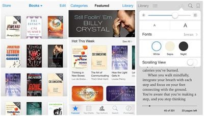
What's New in iBooks Version 3.2
iBooks has been updated with a beautiful new design for iOS 7.
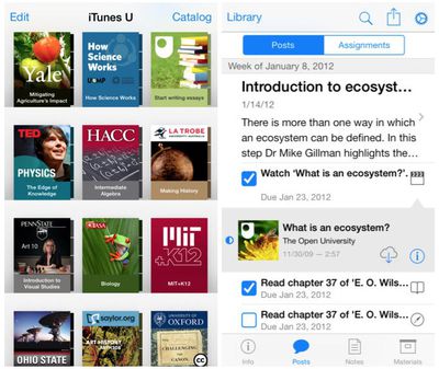
What's New in iTunes U Version 1.4
This version of iTunes U has been updated for iOS 7 with an all-new look and feel.
Apple today launched a new promotion offering new Apple Card holders the chance to earn back the cost of AirPods Pro 3 through monthly cash rebates, but there is a recurring spend requirement attached.
Customers who open a new Apple Card account and purchase AirPods Pro 3 directly from Apple by June 15 will qualify. Starting July 1 and running through April 30, 2027, cardholders can earn $25 ...
Apple's first OLED MacBook Pro models have cleared a major manufacturing hurdle, with panel supplier Samsung Display having reportedly achieved yields above 90 percent on its Gen 8.6 OLED production line.
According to Korean publication The Elec, some individual process stages are now reaching yields as high as 95 percent, a level that the display industry considers "golden yield" territory ...
Trial production of Apple's long-anticipated foldable iPhone, likely called the "iPhone Ultra," has run into a significant engineering hurdle centered on hinge reliability, according to a known leaker.
The leaker known as "Instant Digital" posted on Weibo that the foldable device's hinge is consistently failing to meet Apple's quality control standards under conditions of prolonged,...
So, I've been pretty vocal in my career (I write iOS apps) as to how much I don't like the "deference" argument in iOS 7. I mean, look at how ugly that list view is? That list view in the right image (for the posts/assignments) is just awful. It doesn't look clean, or minimal. It seems cluttered and extremely noisy.
Am I the only one who thinks so? So many blue artifacts makes the use of the color pointless. You can select certain blue things. Certain blue things are just more blue indicating they are selected and some things have such a minimal use of blue that the only think you can do is just try tapping on everything with blue to see if anything happens. It's awful. Again, IMHO. :(
+1 for removing the goofy 2007-era wooden bookshelves
-1 for blinding white background
-1 for thin light blue text on white background
-1000 for replacing clean, instantly recognizable icons with disjointed text that must be read