Mac OS X 10.5 Leopard 9A499 Icons and Screenshots
ThinkSecret has published another gallery of images from the latest build of Mac OS X 10.5 (Leopard) with a focus on many of the new Finder icons which are displayed in high resolution screenshots.
They note that Apple's Leopard icons support higher resolution icons than the 128x128 pixel size limit in previous versions of Mac OS X. Accordingly many of the Finder icons resolutions have been increased.
Popular Stories
iOS 18 is expected to be the "biggest" update in the iPhone's history. Below, we recap rumored features and changes for the iPhone. iOS 18 is rumored to include new generative AI features for Siri and many apps, and Apple plans to add RCS support to the Messages app for an improved texting experience between iPhones and Android devices. The update is also expected to introduce a more...
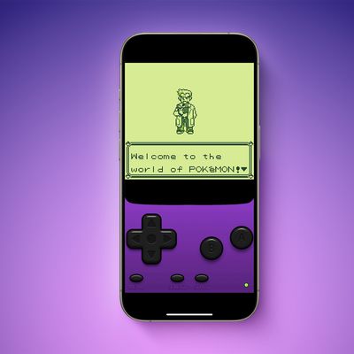
A week after Apple updated its App Review Guidelines to permit retro game console emulators, a Game Boy emulator for the iPhone called iGBA has appeared in the App Store worldwide. The emulator is already one of the top free apps on the App Store charts. It was not entirely clear if Apple would allow emulators to work with all and any games, but iGBA is able to load any Game Boy ROMs that...
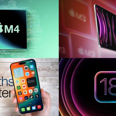
Apple's hardware roadmap was in the news this week, with things hopefully firming up for a launch of updated iPad Pro and iPad Air models next month while we look ahead to the other iPad models and a full lineup of M4-based Macs arriving starting later this year. We also heard some fresh rumors about iOS 18, due to be unveiled at WWDC in a couple of months, while we took a look at how things ...
Best Buy this weekend has a big sale on Apple MacBooks and iPads, including new all-time low prices on the M3 MacBook Air, alongside the best prices we've ever seen on MacBook Pro, iPad, and more. Some of these deals require a My Best Buy Plus or My Best Buy Total membership, which start at $49.99/year. In addition to exclusive access to select discounts, you'll get free 2-day shipping, an...
Apple today said it removed Game Boy emulator iGBA from the App Store for violating the company's App Review Guidelines related to spam (section 4.3) and copyright (section 5.2), but it did not provide any specific details. iGBA was a copycat version of developer Riley Testut's open-source GBA4iOS app. The emulator rose to the top of the App Store charts following its release this weekend,...
Apple's first set of new AI features planned for iOS 18 will not rely on cloud servers at all, according to Bloomberg's Mark Gurman. "As the world awaits Apple's big AI unveiling on June 10, it looks like the initial wave of features will work entirely on device," said Gurman, in the Q&A section of his Power On newsletter today. "That means there's no cloud processing component to the...