Apple Continues Promoting iOS 26 and macOS 26 Liquid Glass With Updated Design Gallery - MacRumors
Skip to Content

Apple Continues Promoting iOS 26 and macOS 26 Liquid Glass With Updated Design Gallery

Apple is continuing to highlight the Liquid Glass aesthetic that it introduced in iOS 26, iPadOS 26, and macOS 26. The company has shared an updated Liquid Glass Design Gallery that shows off Liquid Glass in third-party apps.
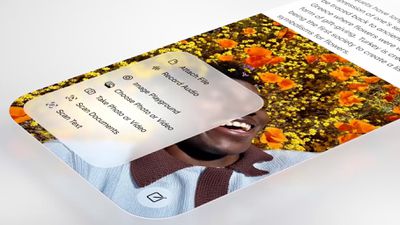
apple liquid glass design
The visual gallery features several iPhone and iPad apps, with screenshots that show the difference between app design in iOS 18 and ‌iOS 26‌.

In the latest edition of our new design gallery, find out how teams of all sizes are taking advantage of the new design and Liquid Glass to create natural, responsive experiences across Apple platforms.

Apps included in the gallery have adopted Liquid Glass for elements like tab bars, navigation buttons, bottom toolbars, and more. Apple also highlights pop-out menu interfaces and the separate search buttons that some apps have implemented, both of which are Liquid Glass design elements that Apple has added to its own apps.

AllTrails, Carrot Weather, Fantastical, Kroger, SketchPro, Trello, and Le Monde are among the apps featured.

Apple previously shared a Liquid Glass gallery after the ‌iOS 26‌ launch, and that gallery provides more Liquid Glass design examples.

Since debuting Liquid Glass, Apple has made small changes like adding a slider bar to the Lock Screen clock for adjusting the Liquid Glass level, but no major updates have been introduced. Rumors suggest that iOS 27, iPadOS 27, and macOS 27 will continue to feature the Liquid Glass aesthetic with little change, but Apple could also add a system-wide slider bar for Liquid Glass opacity adjustments.
Related Roundups: iOS 26, iPadOS 26, macOS Tahoe
Related Forums: iOS 26, macOS Tahoe

Popular Stories

iOS 26

Apple Seeds Second Public Betas of iOS 26.6, macOS Tahoe 26.6 and More

Tuesday June 16, 2026 10:18 am PDT by
Apple today provided public beta testers with the second betas of iOS 26.6, iPadOS 26.6, macOS Tahoe 26.6, watchOS 26.6, and tvOS 26.6, with the software coming a day after Apple seeded the betas to developers and three weeks after the first public betas. After signing up to beta test the software updates on Apple's beta site, public beta testers can download the new software using the...
iOS 26

Apple Releases iOS 26.5.2 With Security Fixes

Monday June 29, 2026 10:21 am PDT by
Apple today released iOS 26.5.2 and iPadOS 26.5.2, minor updates to the iOS and iPadOS 26 operating systems that came out in September. iOS 26.5.2 comes a month after the launch of iOS 26.5.1, an update that added a charging fix for the iPhone Air and iPhone 17 models. iOS 26.5.2 and iPadOS 26.5.2 can be downloaded on eligible iPhones and iPads over-the-air by going to Settings > General >...
iOS 26

Apple Seeds Third iOS 26.6 and iPadOS 26.6 Betas to Developers

Monday June 29, 2026 10:10 am PDT by
Apple today seeded the third betas of upcoming iOS 26.6 and iPadOS 26.6 updates to developers for testing purposes, with the software coming two weeks after Apple seeded the second betas. Registered developers can download the betas from the Settings app on the iPhone or iPad by going to the General section and selecting Software Update. With iOS 27 set to launch in September, Apple is...

Top Rated Comments

14 weeks ago
Please just give us a toggle to opt out altogether. Then we’re all happy.
Score: 77 Votes (Like | Disagree)
turbineseaplane Avatar
14 weeks ago
Marketing it more won't help.

Making it a lot better, and with more optionality and customization available to the user, will.

It's also a little weird to be "marketing" your UI.
A well designed and functional UI shouldn't be a point of focus.
Score: 75 Votes (Like | Disagree)
turbineseaplane Avatar
14 weeks ago
On the right .. having the popup menu be translucent adds literally nothing other than making it harder to read.

This is NOT GOOD UI/UX DESIGN.

omg ..
UGH

Attachment Image
Score: 58 Votes (Like | Disagree)
14 weeks ago
Spend the time and money into polishing the UI instead of ads please.
Score: 54 Votes (Like | Disagree)
Avenged110 Avatar
14 weeks ago
My primary issue with the redesign isn't the glass effect itself (it makes controls more difficult to read, which is dumb, but Apple does amusingly offer the toggle to tone that effect down), but the horrible toolbar/button changes. Everything is huge, sometimes providing fewer controls in the same space, and removes the toolbar backgrounds so the content distractingly bleeds all around the controls, destroying any visual separation between the two planes (UI chrome/controls and content). And that's not even touching on the content-driven on-the-fly light/dark mode changes to chrome in places like Safari or the 'occasionally-compressing' toolbar button layouts. On a slightly different note, I still find it rather laughable that we were forced into offensively large screens, but then those screens were filled with oversized controls, useless whitespace, and ridiculously high corner radii so that we're not really getting a whole lot more, if any, usable content than on the smaller screens.
Score: 37 Votes (Like | Disagree)
14 weeks ago

It’s quite a minor change compared to iOS 18. I think Liquid Glass is an improvement over what we had before though. It gives more usable screen real estate and pulls us ever so slightly away from the years of flat design and back to something that’s as usable but more interesting to look at (in my opinion).

I know others don’t agree with me, I’m simply expressing my opinion. My opinion isn’t the right one for everyone (I’d not deign to speak for everyone), it’s just what I prefer. I think it's funny, however, when others express their opinion as if it's valid for all people.
Some like liquid glass, some don't We don't need to agree. What we need is an on/off switch.
Score: 35 Votes (Like | Disagree)